
 Came across this quite brilliant pack of typographic playing cards the other week. They’re the work of Jim Sutherland at hat-trick design, who I’m lucky enough to be working with on the 2010 Royal Mail Yearbook. Though they’re being used as piece of self-promotion for the consultancy, they’re actually an immaculately realized piece of personal work. The handling of the type is really witty and elegant, with negative and positive space used to act out suits, royals and numbers. Away from commercial and brand imperatives, the cards eloquently show a true love of type and pure graphics. Can’t wait to get my hands on a pack. There’s a YouTube clip here where you can see all 54 of them in action.


Professionally, the ability to spot errors is a blessing. Personally, it’s perhaps something of a curse. But without meaning to come over all Lynne Truss, spelling mistakes really irk me. I don’t mean the odd slip of the keyboard. We all do that. But real howlers like something being ‘highly sort after’, or ‘blacks and graze’. Spectacular gaffes that leave the poor helpless spell check for dust. (both are real examples from shopping sites).
English, we all know, is a difficult beast. The written word often seems to bear little relation to the spoken one. You can see why every so often pressure groups press for spelling reform to make things simpler and more logical. But to counter that argument, it’s also an incredibly rich and vibrant language, full of light and shade, of heritage and personality. Remove its foibles and eccentricities and you remove its character. Straighten the kinks and the road is far less interesting. You can’t have it both ways.
Many of the graphic designers I work with are less than comfortable with words. Which is perhaps surprising, as they deal with them all the time. That puts the onus right back on the writer to make sure everything’s tickety-boo. You could argue that’s not really our job – we’re here to come up with verbal ideas and tell stories. But someone’s got to take responsibility, otherwise you end up with the kind of disasters you’ll find on one of my favourite sites – ‘Cake Wrecks’ (see above). It’s an issue I explore at greater length in my latest Design Week column. In the meantime, be careful how you order those letters.

The set features classic British record sleeves, including the seminal London Calling by The Clash, Bowie’s Ziggy Stardust, Blur’s Parklife and Led Zeppelin II. I was among of a group of designers and music journalists to help draw up a shortlist for Royal Mail, and I’m glad to see that several of my suggestions made the cut. Mike Dempsey has cleverly played with the form of both the stamp and the sleeve, with a small crescent of record poking out of the right-hand side. Let’s hope the younger audience appreciate what this curious black stuff is.
Personally, I’ll be buying as many Clash stamps as I can get my hands on. The iconic Pennie Smith photo of Paul Simenon smashing his bass still has immense power, and the type design by Ray Lowry – a homage to an earlier Elvis album – creates the perfect frame. Along with his many other achievements – bassist, artist, coolest man on Earth – Simenon becomes one of the first recognisable living people to appear on a British stamp. Until recently, only members of the Royal Family were accorded that honour. To see all the other classic British album sleeve stamps, check the Creative Review blog. God Save the Queen.
 It’s finally out. The mighty, 64-page 2009 Royal Mail Yearbook represents around four months of Jim’s working life across this year and last – and goes some way to account for the recent dearth of entries on this section of the website.
But flicking through page after handsome page, the effort seems more than worthwhile. This year’s 14 stamp issues included British Design Classics, Mythical Creatures, Naval Uniforms and the Industrial Revolution, and the Yearbook delves into many of their more interesting nooks and crannies. We came up with the title ‘Feed Your Mind – A Great British Miscellany’ because of the bite-size editorial style, which cherry picks obscure facts and stories to bring each subject to life. It also fits in with the slightly unsettling custom-made phrenology head on the front and back covers.
The designers, hat-trick, have done a grand job… they went for a ‘more is more’ approach, scatter-gunning many smaller subjects around a central theme and packing each spread with visual interest and graphic wit. The result is busy and intriguing, a dippable smorgasbord of a book rather than a meaty read.
The results speak for themselves, but the ambitious approach made for a research-intensive project, with Jim needing to get to grips with from everything from the rules of jousting, to the myth of the Giant’s Causeway, to the most people to fit into a phone box, to the Burns poem Tam O’Shanter. And plenty more besides. We’ll be posting more spreads and details when we get them.
This is Jim’s fifth Royal Mail Yearbook, and he’s just been commissioned to write his sixth for next year. Hat-trick will be designing again. You can get hold of your very own copy here.

This is my 10-year-old son Lukje’s latest homework assignment, which was to design an eco-friendly vehicle. It wasn’t so much the concept and drawing as the naming and copy which caught the eye. In case you can’t make out the body text it reads:
‘You’ll be round
the rainforest in
no time with this
solar powered
two seater!’
It has a real economy, rhythm, and an engaging tone of voice. There’s even a nifty bit of alliteration in there. He’ll be troubling the pages of the D&AD Annual before you know it.
That’s my boy.
 Thought this would be the perfect date to share one of my all-time favourite pieces of packaging. I’ve had it quite a few years now, and picked it up at my local Budgens, so I have no idea who was responsible. It certainly makes a change from the usual flimsy string bag – and shows eloquently how tapping into a shared mythology can add character and humour, even to a humble bulb of garlic. The gradiated colour, gothic type and creative folding techniques are great. The die-cut crucifix lifts it into the realms of pure genius.
I’ve just realised the past three posts have all been a tad ghoulish. Pure co-incidence, I assure you. ’Scuse me... just off for a quick pint of the red stuff.
Happy Halloween everyone.
Jim will once again be taking his place as one of the judges for this year’sDesign Week Awards. He’ll be working on the Print jury for two days in early December with a brief to take a close look at the overall standard of writing.
It’s always a real eye-opener to take a look back at the year’s best print graphics as a body of work. Having tables and tables of work spread out before you can be daunting, but it’s a rare opportunity to see trends emerging and to measure one piece against another. In these tough economic times, it will be interesting to see whether designers are managing to pull out the stops creatively to compensate for smaller production budgets. There will certainly be no hiding behind extravagant print techniques and fancy finishes. It’s back to basics time – which in some ways is no bad thing.
Other jurors this year include friends to totalcontent like Malcolm Garrett,Adrian Shaughnessy and Sea’s Bryan Edmondson, as well as design industry luminaries including Simon Waterfall, Apple’s Harriet Devoy and Boots’ Jon Turner. You can find full details here, and the winners will be revealed at London’s Hilton Hotel on 2 March 2010.

As it happened, we also inadvertently created our first piece of external branding for the totalcontent franchise. Look carefully at the photo on the right and see if you can guess where we’re probably beavering away as we speak. The clue’s most definitely in the colour.
With a view of autumn-kissed lime trees and the town’s 12th century church spire, we’re calling it the studio, because we hope our creative juices will get truly fired up in there. The colour scheme – you may not be surprised to hear – is white with bright splashes of orange. Just a few pictures to hang and we’ll be right at home.
Many thanks to the multi-talented Tony, our highly obliging next-door neighbour, for 24-hour tech-support and the all-action photo.

 Film title sequences have become a mini art form in their own right, with the incomparable Saul Bass showing the way in the 1960s and more recent exponents like Kyle Cooper breaking new boundaries with his work on Se7en. Budget constraints have meant that TV has been left lagging behind, especially in the UK, where you immediately think of the perennially wet, sloping roofs across Manchester’s Coronation Street or the stock footage of a lumbering tortoise that heralds the opening of ‘One Foot in the Grave’. But True Blood, HBO’s excellent swamp-goth vampire series, has significantly raised the bar. The sublime opening credits, by Seattle’s Digital Kitchen, create an evocative visual tableau that perfectly sets the scene for what’s to follow. Fast cuts of slo-mo snakes and bloody roadkill are skilfully juxtaposed with Pentecostal rapture, sleazy sexual encounters and ancient car wreckage. Decay, blood, religion, voodoo, and the brooding intensity the Deep South, seep through in 65 masterfully edited shots. Jace Everett’s sweetly sinister country song ‘Bad Things’ provides a fitting soundtrack. Catch it if you can – the series starts on C4 on 7 October.
True Blood Main Titles from DIGITALKITCHEN on Vimeo.

“Here at Kromland Farm, we’ve been cultivating rooibos since 1902. But that's nothing – South Africa’s indigenous Khoisan people have been enjoying its rich flavour and potent heath benefits for millennia”.
Unfortunately, it seems I won’t be. Sainsbury’s seem to have stopped stocking Kromland Farm.

In case you’re interested, Bob and Roberta's cards are available – along with efforts by David Shrigley, Magda Archer and Vic Reeves – at www.politecards.com.

What won me over to the city and its people (apart from feeling incredibly safe as I trod unfamiliar streets, even at the dead of night) was its endearing quirkiness. For example, after said workshop, Kokoro & Moi, the buzzy design company who’d hosted the workshop, invited us to a totally mad ‘cake party’, organised as part of Helsinki Design Week. Fashion, architectural and graphic designers had been challenged to create a conceptual piece (of cake). These were exhibited to a discerning crowd of designery types at a chi-chi furniture store. Among the various entrants were a cake as a giant coin, a loose self-portrait, and a chocolate offering shaped as a poo. Kokoro & Moi’s effort was a ‘build-it-yourself’ cake – plain sponge slices on which you could plaster jam, cream or hundreds and thousands with the provided plastic spades. A flouring of self-expression, you could say.


Work spills surprisingly over into life too, like it did recently when Deb and I made our annual pilgrimage to Amsterdam a few weeks ago. I’m not generally in the habit of visiting churches, but we had ten minutes to spare and were in the neighbourhood, so we slipped into the 17th-century Westerkerk. It boasts the tallest tower in the city and Rembrandt is said to be buried there, although no one’s actually found the great man’s grave. I’d just been researching stained glass windows for the forthcoming Royal Mail Yearbook, and writing in glowing terms about the ethereal atmosphere they create. The thing about the Westerkerk though is that there’s no stained glass at all, just these massive domed windows that let in incredible light, even on the dullest day. You’d expect this no-frills approach in a country where the ‘low church’ predominates, but it struck me that natural light is a far more powerful metaphor for God than man-made imagery, no matter how beautiful. Even as an unbeliever, I was impressed.

 Well, nothing was going to live up to last year’s Black Pencil at the D&AD Awards. But we were chuffed enough to have had another piece of work accepted into the 2009 annual in the Writing for Design section.
 ‘The Yellow Book – A Prototype Wayfinding System for London’ was one of only 13 to make it into the hallowed pages this year, so that’s pretty good going. Particularly when you consider how many of the successful entries were self-promotional projects, where the writer had no client to answer to and could really cut loose (see totalblog for details). The Yellow Book, by contrast, had to satisfy four clients – Transport for London, the Mayor’s Office, the London Development Agency and ORB (Oxford Street, Regent Street & Bond Street Action Plan). Not to mention AIG, the information designers who developed the prototype and got Jim in to write the text.
The Yellow Book’s accolade at D&AD follows a top prize for promotional brochures at the Design Week Awards. You can download a full pdf version of the Yellow Book and see what all the fuss was about here.


 The votes have been counted, the nominations and in-books have been revealed… so I can safely share some thoughts about judging Writing for Design without fear of vicious reprisals from the D&AD police. First of all, entries were up (though surprisingly there was not a single digital entry), and the overall standard was far superior to four years ago, the last time I donned the old horse-hair wig. We also had two quite brilliant, stand-out nominations in Nick Asbury’s Corpoetics booklet and the Christopher Doyle™ Identity Guidelines.
In Corpoetics, Nick takes boring ‘about us’ sections from web sites and mission statements and transforms them into poetry. He does this simply by changing the order of the words around, editing some and repeating others. The results are astonishing – telling, poignant, and amusing – and oddly, they often convey the spirit of the company better than the original.
Our foreman, Adrian Shaughnessy quite rightly asked the question ‘what’s the point of this, what’s it trying to say?’ To which I’d answer, it shows that there’s poetry hidden somewhere – in even the most mundane paragraph – if only you know how to find it. It’s also a wonderful calling card for Nick – without puffing out his chest and telling everyone how great he is, he’s demonstrated that he has a talent for an original idea and a great appreciation of words. Corpoetics really is one of those ‘wish I did that’ pieces.
Christopher Doyle™ Identity Guidelines is a beautifully observed, po-faced spoof of corporate guidelines. The eponymous hero of the piece is an Australian graphic designer, who stars on every page. The tone of voice is spot on, totally undercutting the language of the genre and the hackneyed notion that a brand is like a person. “This is a guide to how I should look, feel and sound as a person; a guide that should serve as an aid for myself and for those around me in ensuring my identity remains clear, consistent and correct.” My two favourite bits are a photo of Christopher packing some weight a few years ago captioned “My identity as it appeared between 2001and 2006 in Extra Bold”, and him sitting cross-legged on a chair captioned “Full Colour Seated_Casual”.
While I’m a huge fan of both these projects, my only slight niggle is that the only two nominations in the section went to self-initiated, self-promotional projects. (And there were others that made the book too like Mike Reed’s ‘And…’ and Radley Yeldar’s ‘The sad story’). You have to admire the initiative and effort involved in getting these pieces out there, but when there’s no client to answer to and no commercial imperative, such quietly subversive, lateral work is far more achievable.
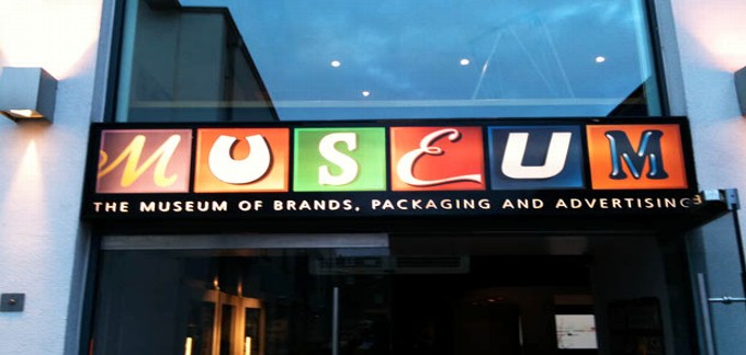
Tucked away in a corner mews, MoBPaA is home to a regiment of glass cabinets housing countless pieces of old packaging carefully arranged in date order. Being of a certain age, the 1970s and 1980s stuff had most resonance. I found it refreshingly direct, without the trills and swirls of the older stuff, or the show-off 3D rendering and glitzy metallic foils of today’s computer-fuelled graphics. The no-nonsense bright orange 70s Crunchie packaging with its punchy sans type was a particular favourite.
What was really curious, however, was seeing these everyday, disposable objects treated with such awe and reverence. We can’t deny that the Curly Wurly wrapper or Branston Pickle jar represents a small part of our heritage, but it’s only a small step away from regarding supermarkets as contemporary art galleries. That Andy Warhol was on to something.

Yesterday in the Swedenborg Hall, Holborn, a thorny debate raged long into the night. It was the latest 26 event ‘Words and Design – The Best of Enemies’, and around 80 people showed up to hear design luminaries Malcolm Garrett, Jonathan Barnbrook and Simon Esterson discuss how the visual and the verbal joust and jostle, and how they might become better friends in the future. The questions were ably put by Patrick Burgoyne, editor of Creative Review, and there was healthy contribution from the floor.
I’d organised the do, and roped my old mates into doing it. Considering the event was rather ‘organic’, and no-one quite knew what to expect, the conversation was remarkably free flowing, touching on everything from building closer relationships, to the old advertising model, to standards in education. Catching up informally at the Old Crown afterwards was a real pleasure too. Many thanks to everyone involved.

Now the burning question is, would this have been better without the title and artist top left, or would that just have been gratuitous?


Basically, John has taken a piece of generic corporate writing – the ‘base text’, and rewritten it in 26 different ways, each following a particular constraint. For example, as a fairy story; without using the letter ‘e’; written in the style of Dickens; as a letter to a friend; as a six word story; as a sonnet. It’s surprising just how revealing this exercise can be.
There’s also an engaging themed web site to promote the book, where John has asked 26 of the UK’s leading commercial writers to write in the tone of voice of a fruit. I chose banana, for its obvious comic potential, and created a laid back, West Indian tone of voice. You can see my efforts, and check out the other fruity offerings here.

As usual, Podge was a chance to catch up with friends old and new, to do a welcome spot of networking, and enjoy a couple of drinks in top company. For me the moment of the day was talking to Nick Bell, now visiting professor of graphic design at Royal College of Art, who reminded me of a comment I’d made in an article about him many years ago. “You said my sock drawer was probably immaculate… and the thing is, you were right.”
As a Design Week columnist, I’d been asked to write a small tribute to Lynda, which was printed on the Podge menu. Here’s what it said…
“Feisty, friendly, formidable… but enough about me. Over the past 20 years, Lynda has become part of our lives, supporting us (always), cajoling us (where necessary), telling it like it is. She’s never less than honest in her opinions, and has our best interests at heart, collectively and individually. What’s more, she’s a great friend and drinking companion. We’re all lucky to have Lynda around.”

Howies’ copywriting is always spot on too, particularly their emails and collectable quarterly catalogue. And they use every opportunity – from labels in jeans to blogs and booklets – to spread the word. The writing is never over-chummy, but has a simple, easy-going tone of voice, which is difficult to resist. A recent wheeze is the T-shirt of the week… a limited edition by an artist or illustrator available only for seven days, and hand printed in Howies’ customised shed in deepest West Wales. Thought-provoking, smile-inducing, and seriously good-looking, they’re a regular graphic treat.

In the meantime, here’s a taster. Our second annual report for the Jersey-based law and fiduciary firm Bedell Group is nearing completion. We’re also steaming ahead with the 2009 Royal Mail Year Book (our fifth) and have already tackled early chapters on British Design Classics, Charles Darwin and Robbie Burns – we can tell you all about those as they are already in the public domain. We were also delighted to be offered a contract for a day’s work a week for the next six months by one of our favourite (though most secretive) clients, to develop exploratory verbal ideas and benchmark communications for the brand’s future strategic positioning. All exciting stuff.
Subscribe to:
Comments (Atom)