Showing posts with label design. Show all posts

Touch of glass... at once primitive and sophisticated.

After years of conscientious, selfless research, I’m pleased to announce that I have finally discovered the perfect wine glass. It’s called Essence, and was designed by Alfredo Häberli for the celebrated Finnish glassware and ceramics company Iittala.

What’s so great about it? Working on a book about modern Finnish design for Nokia a couple of years ago, I came to appreciate the beautiful functional simplicity inherent in all manner of products from that part of the world. As I wrote at the time, Finnish design has “a touching, unpretentious simplicity that is at once primitive and sophisticated; lines, forms and materials aligned to the natural world; a purity and integrity that speaks directly to the soul.” Sounds good... shame it never made it to the printers.
It all started with a slightly skewed phrase that popped into my head one day for no reason... ‘A leopard never changes his spats’. This conjured a comical image of a dapper feline with an immaculate top hat and cane but inexplicably dirty footwear. A children's illustrator could have a field day, I thought.


Building on the theme, I racked my brain for more well-known sayings, and made a rule for myself... each idiom could only be changed by a single letter. And then I came up with a title that explained the concept by almost acting it out — ‘From Idioms to Idiots — How One Letter Can Make All The Difference’.
To the letter... publicity poster for the fictitious 'Dig It Festival', calligraphy by Ann Bowen
It’s been a while since I took part in a collaborative project with 26, the writer’s group I co-founded with seven others ten years ago. ‘26 Words’, was a kind of reprise of ‘26 Posters’, one of our very first efforts, which randomly paired writers with designers, gave them a letter of the alphabet and asked them to go off and produce a poster together. Back then I got editorial design legend Derek Birdsall and the letter I. Both wonderful.

This time round 26 writers were paired with 26 lettering artists from the crafts-based lettering association Letter Exchange. I was teamed with the hugely talented calligrapher Ann Bowen and given the letter D, but there was also a twist this time. In a slightly shamanistic ceremony held in the basement of the Betsy Trotwood pub in Clerkenwell, we were asked to stick a knife into a dictionary to pick out a word starting with our given letter. In our case, the tip of knife pointed to ‘dig’.
Christmas seems to have come early at totalcontent. Last week we brought you Royal Mail's Madonna and Child stamp presentation pack. This week, we unwrap the children's Christmas stamp competition pack, charmingly designed by our good friends at NB Studio.

Here, we were asked to tell the story of the nationwide hunt for designs striking enough to grace first- and second-class during the 2013 festive period. The challenge was open to children in the UK aged 4–11, and there were prizes of £100, £500 and £1000 to be won. This is only the third time Royal Mail have staged a kids' stamp competition, and the response was overwhelming, with over 240,000 entries covering all kinds of Yuletide subject matter in every conceivable style.
I’m really pleased to have contributed to this rather classy pack showcasing this year’s Madonna and Child Christmas stamps. The set of five (plus two extended large-letter stamps) feature depictions of the Virgin Mary and Jesus through the ages, as well as a specially commissioned (and strikingly beautiful) new painting by neo-Coptic artist Fadi Mikhail, which sits on the £1.88 stamp. I helped Royal Mail tell Fadi’s story, including his tutelage under neo-Coptic master Isaac Fanous; his process and thinking; and the heavy symbolism of this very prescribed genre of painting. On the reverse side of the sheet, there’s a potted history of Madonna and Child paintings by art historian Rowena Loverance. You can get hold of a special Christmas presentation pack, designed by Robert Maud and Sarah Davies here. Or of course, pick up Christmas stamps for all your cards from your local Post Office.

Supple and demand... Jamie Ellul’s clean, copy-focused website
A small-but-satisfying job for the newly formed Supple Studio. This is the latest incarnation of the hugely talented and affable Jamie Ellul, latterly of Magpie. Branching out on his own and making the move to Bath from London, naturally enough, he needed a website to set up stall and tout his wares.

Jamie already had a pretty clear idea of what he wanted to say, but brought us in to refine, edit and add our own thoughts to his rough draft. We tried to keep the overall tone friendly-yet-professional, confident without being arrogant.

We particularly like the simplicity of the Supple website, and how the bold words take centre stage. The Supple logo, based on a section sign glyph in the typeface Bella, is pretty smart too.

Often, writing for designers can be tortuous. I remember a certain ‘About Us’ paragraph taking six months to get approval as it did the rounds of everybody at the agency. Fortunately, this project went beautifully smoothly. We hope Jamie’s exciting new venture does the same.

Just a quick nudge to let you know that the new Repeat Repeat website has gone live. Our friends Mark Faulkner and Gill Naylor have run this wonderful design and ceramics company since they left college back in the 1980s, producing fine bone china mugs and crockery with a quirky contemporary twist. It’s all beautifully hand made in Staffordshire, the heart of the Potteries.

totalcontent were delighted to help out with words for the website, and especially taken with the new Alphabet range, which we’re sure will go down a storm with letter-crazy graphic designers. In case you’re wondering, the typeface is Orator (all lower case apart from the L, which looked decidedly odd). And you can order a gross of them for your studio here.
I held off from listening to the new David Bowie single for as long as I could. I wanted the media noise to die down and to make up my own mind. But I was also worried about being disappointed. Like the retired boxer’s ill-judged comeback, or the faded matinee idol who can’t resist another movie, there was a distinct possibility that Bowie had lost it, or was finally a man out of time. The longer I kept away from ‘Where Are We Now?’, the longer Bowie’s spell would remain intact.

Digitised... Bowie and friend reminisce about the old Berlin days.
But when I finally took the plunge, I was relieved. The song itself had a haunting, elegiac quality, an evocation of lost love and lost times. Where once Bowie cut up random phrases to create an overblown world of sci-fi fantasy and psychodrama, here we had low-key fragments of memory — faraway places and faraway people, faded and muffled. The man’s many masks had been removed at last… he was seemingly speaking from the heart rather than through some artfully constructed character. All rather beautiful and touching.
The Royal Mail Year Pack is the feisty little brother of the Year Book. It includes all the past year’s pictorial stamps, plus a quick run-down on the subject that inspired them. This is the tenth one I’ve written, and while it’s not a Marathon like the Year Book, it’s still a testing 1500 metres. You have around 200 words to cover anything from Space Science to Charles Dickens to British comics. Which means keeping the words punchy yet informative, finding an interesting angle, and casting a small but incisive spotlight on the subject in hand.

For the designer, it’s an equally demanding task. They need to encapsulate the visual spirit of 100 or so stamps on the front and back of a simple fold-out. This year, Magpie Studio did a sterling job of not only of bringing such disparate material together, but also in expressing a sense of British pride in the year of the Golden Jubilee and the Olympic Games.
Bye-bye to bylines... in commercial writing your words aren’t your own
A couple of years ago, I spoke at a D&AD copywriting event. During the Q&A session at the end, I was asked whether I felt threatened by a new generation of talent coming through. In a rare and rash moment of of bravado, I answered “no, of course not”. But having had a few months to chew it over, I think a more balanced (if less illuminating) answer would be “I don’t know”. 

The point is, in commercial writing the author is very rarely credited. I occasionally read copy that makes me smile or prompts a pang of envy. I read plenty that makes me cringe. But, unless I happen to know who’s ‘in’ with the client or design company involved, I have little idea who to pat on the back or poke in the eye.
“You might think the Olympic Games are all about being number one. But that’s only a small fraction of the story…”

How timely... on Day 5 of the London Games, we bring you our latest effort for Royal Mail. Part of a series of commemorative philatelic goodies, ‘Welcome to the 2012 Olympic Games’ is a special stamp pack that takes a look at the impressive facts and figures behind the XXX Olympiad, and the city of London itself. It houses a miniature sheet with four stamps designed by hat-trick, who also created the pack. I was charged with writing a narrative which tied all the key numbers together in an enlightening and entertaining way. If you want to read the full text (you know you do), you can view a pdf on the downloads page of this site. And if you’re suitably impressed, you can always buy the pack from the Royal Mail shop.
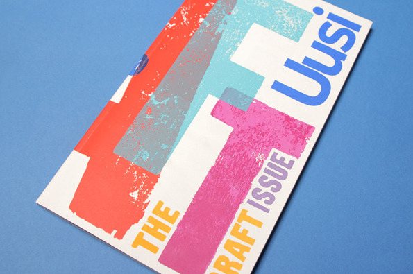
For a large proportion of 2011 and the beginning of this year, we were working with Nokia’s Head of Art Direction Richard Crabb and DesignStudio on Uusi magazine. It’s a quarterly brand publication that goes to Nokia internal marketing types and external agencies to keep them up to speed with all the creative work that’s going on in different parts of the world… and to get them fired up.

Kitching cabinet... cover art by the master of letterpress
In an odd way, it’s been like going back to our roots working on design publications — only Uusi is more creatively ‘out there’ than most regular industry mags. DesignStudio’s background is more branding than editorial, so their take on magazine design is pretty expressive and experimental, all held together by a modernist, grid-based aesthetic.
Stefan Sagmeister and Jessica Walsh... as nature intended
Stefan Sagmeister has his kit off again. This time to announce that his New York design practice is becoming Sagmeister & Walsh, with 24-year-old designer Jessica Walsh getting her name on the door and her very own naked photo alongside the great man.

Of course this bare-faced stunt prompted all kinds of barbs from the design industry… Alan Aboud tweeted “designers reaching new extreme depths in self promotion. Awful.”, Rob Ball of The Partners weighed in with “you know what would be eye-catching? Something involving Sagmeister without his cock in it #tiresome”.

What most struck me though was how grumpy Sagmeister and Walsh looked. There seemed to be no joy in the occasion, just a sense of morose resignation and even boredom. Sagmeister had left his socks on, Walsh perched on a stack of magazines, they stare straight at camera, stark miserably naked. You’re just left wondering what’s the point and what’s the fuss?

Newcastle studio onebestway on dress-down Friday 
A couple of years ago I wrote a Design Week column (no innuendo intended) centred around onebestway, an eight-strong Newcastle design agency who went naked for a day on the advice of a business psychologist. Their publicity photo was more ‘Carry On Designing’ than a po-faced art piece, with strategically placed laptops, chairs and fruit bowls hiding their modesty. Mind that stapler. At least they seemed to be enjoying themselves.

There’s certainly nothing clever about taking your clothes off... I strip every day and barely give it a second thought. And it’s been done so many times and in so many contexts, that as a gesture it’s barely provocative any more. But I think the reason that Sagmeister has ruffled so many feathers this time is that designers feel they should be judged by their work rather than talent for exposure. After all, they’re supposed to drive the car, rather than pose naked on the bonnet.

It almost goes without saying that being foreman of this year’s D&AD Writing for Design jury was the next best thing to shaking Johan Cruyff’s hand. As you walked into the vaulted expanse of Olympia, with the sun shining through the latticed ceiling, it felt like you were in some kind of creative heaven — only without the blessed harps and angels. There was table after groaning table of the best work in the world, stretching off into the horizon, a seemingly endless feast of ideas and perspiration.

On our six tables, there were 70-odd entries including books, bottles, posters, mailers, annual reports, leaflets, cards, websites, three bikinis and a pair of vibrators. My fellow jurors (Nick Asbury, Fiona Thompson, Chris Doyle, Lisa Desforges, John Weich and Anelia Varela) were as keen as I was to get stuck in, to be inspired and informed, amused and amazed. But it soon became apparent that, although the overall standard was well above middling, there was very little to make the soul rejoice and the heart sing. Yes, there was plenty of perfectly accomplished, lively, well-crafted writing, but very little with the glimmer of greatness required for the pages of the hallowed D&AD Annual.
When I was around 17, I had the best pair of jeans. I wore them virtually every day for three years, and by the end of that time, there was more patchwork repair than original material. To this day I remember my mother compaining they ‘gave her the pip’, as she spent so much time sewing them up. Which sounded hilarious in her Dutch accent.

I remember they were Wrangler drainpipes, but I have no idea where they were bought or made. I liked the Ws stitched on to the back pockets — maybe it was a latent appreciation of typography which was to kick in properly a few years later. But the point is, I truly loved them, and they were always with me whatever I happened to be doing.
Just been doing some research into the semiotics and visual language of packaging for a piece Im writing for Uusi, the Nokia brand magazine. In the course of this rooting around, I came across some interesting stuff about Marlboro cigarettes.

Firstly, that these macho tabs were originally marketed at women back in the 1950s, real men scoffed (or coughed) at filters. They came in a soft, white packet, covered in a foil wrapper with lots of feminine script lettering.

The brand was utterly transformed in 1955, when a designer called Frank Gianninoto came up with a design that had to look good on black-and-white television. The white arrow jutting into the red space at the top was simple, bold and graphic, and seemingly never went out of fashion. But it was the new-fangled flip-top box that broke the mould, contributing to the brands built-for-the-tough outdoors image. It became an enduring symbol of Americana, and only 20 years ago was pronounced the most valuable brand in the world.

But whod have thought that the Marlboro man had had a sex change?

In his book The Total Package, Thomas Hine notes: Everybody knows, intellectually at least, that great packages dont always hold good things. But that is a truth that the best packages try to make people forget.”
Groovy Man. So here it is, the latest foray into the obscure nether reaches of graphic design by my old mate Norman Hathaway (with Dan Nadal).

You really can’t accuse Norm of tackling the obvious subjects. A couple of years ago, his brilliant book ‘Overspray’ brought us the super-slick, sexually charged excesses of 1970s US West Coast airbrush art. And now, ‘Electrical Banana’ takes us on an LSD-fuelled journey into 1960s psychedelic art, “the look that defined a decade”, according to the blurb.

He may be right … Any Beatles fan will already be familiar with the trippy, exaggerated comic book aesthetic and garish tapestry-like landscapes of Heinz Edlemann, the illustrator behind Yellow Submarine. But the work of the other six artists, whose shared influences are apparent, seems strangely resonant too. Generously illustrated, with insightful interviews, this is a rare and fascinating glimpse into a colourful lost world of sex, music, mayhem and mild peril. And look out for the introductory Q&A featuring Macca himself, offering his take (or should that be toke?) on the psychedelic era.

From the inside flap:
Heinz Edelmann... a pre-release drawing from Twen magazine

The artists include MARIJKE KOGER, the Dutch artist responsible for dressing THE BEATLES; MATI KLARWEIN, who painted the cover for MILES DAVIS’ BITCHES BREW; KEIICHI TANAAMI, the Japanese master of psychedelic posters; HEINZ EDELMANN, the German illustrator and designer of the YELLOW SUBMARINE animated film; TADANORI YOKOO, whose prints and books defined the '60s in Japan; DUDLEY EDWARDS, a painter, car decorator, and graphic embellisher for the London scene, and the enigmatic Australian MARTIN SHARP, whose work for CREAM and the underground made him a hippie household name in Europe.

Electrical Banana
By Norman Hathaway and Dan Nadal
Damani
£17.55 on Amazon


Remember the Higsons, spiky purveyors of ‘funk-punk? Back in the 1980s, studying publishing at the London College of Printing, I was a huge fan, avidly following their progress in the NME and buying every single the day it came out.

And then this great silk-screen poster appeared on the LCP refectory wall. I was too law-abiding to pinch it myself, but luckily a friend of mine was more than happy to do the deed on my behalf. Just call me ‘the Don’.

Ever since then, frontman Charlie Higson has been something of a hero. He just kept popping up everywhere producer, performer, comedy writer, Vic and Bob, Fast Show, Have I Got News For You, QI, and many more. And now my boys are huge fans of his Young James Bond and vampire books. A prolific and versatile talent.

Some 30 years later, it turns out we have a mutual friend Andy Altmann of Why Not Associates. Earlier this week, I told Andy about my coveted poster, and he forwarded this pic on to Charlie. His response “Wow. that’s a lovely poster wish I had one!

Probably the only time Charlie Higson will be envious of me.
I’m delighted to have been asked to be foreman of D&AD’s Writing for Design jury this year. On 16 April, I’ll be getting together with friends and fellow copywriters Nick Asbury, Lisa Desforges and Fiona Thompson, as well as John Weich of Lemon Scented Tea and Interbrand Sydney’s Christopher Doyle, to look over likely contenders.

It struck me that I should get my thoughts together and set down a marker ahead of the judging. Not only what I’ll be looking for on the day, but what I believe it takes to be successful in the writing for design world. So I’ve put together a 12-point ‘manifesto’ based on my personal observations and experience. Some points are pretty obvious, others maybe less so, but I hope they add fuel to the debate around this particular form of writing. Feel free to agree or disagree.


A writer’s dozen
Jim Davies’ 12-point manifesto on writing for design


1— Remember, all designers are different
There are some designers out there who really can write. There are others who appreciate good writing when they see it. And then there are those who can’t and don’t. The level of dyslexia among designers is astonishingly high — that’s probably why they’re designers and not writers. So the way your writing is perceived and received depends on not only how good it is, but who you’re dealing with. Maybe your words will transport the reader with unfettered delight, but on the other hand, be prepared to explain yourself or fight your corner. Just bear in mind that different designers (and clients) have different expectations and perspectives.

2— Know your place
A lot of writers moan about words not being given the respect they deserve. But they are missing the point. Good words deserve respect, bad words don’t. Besides, you can’t expect to be the star of the show in every performance — different design projects involve major or minor roles for the writer. You need to establish the part you’re expected to play from the outset. If you’re Hamlet, grab the opportunity with both hands. But if you’re Rozencrantz, make sure it’s a Rozencrantz to remember. And certainly, don’t let Guildenstern get a look in.

3— See your words
If a woman in a boilersuit and a man in a tutu utter exactly the same words, the effect is completely different. So before you start writing, it’s important to visualise what your words will look like when the reader sees them. How will the text and images relate to each other? What typeface will they be set in? What’s the format and medium? Too often, words and visuals inhabit the same world but look in totally different directions. Whereas they should be embracing like childhood friends.

4— Be yourself…
Of course you should be able to modify your tone and adopt different voices. One of the joys of writing for different brands is slipping into a variety of personas and being someone else for the day. But it’s also worth remembering that you’ve been asked to contribute for a reason — because the client wants a piece of you. Something about your personality or writing style has made an impression, otherwise they’d have asked someone else to do the job. Be a chameleon, by all means, but don’t be invisible.

5— …but don’t take it personally
No matter who you are, your drafts will be rejected and your best lines will be cut. You’ll be asked to write the same sentence over and over before the client decides he likes the first one best after all. Days will be long, repetitious and frustrating. You’ll have occasion to feel ignored, bullied and belittled. But most of the time, this will have absolutely nothing to do with you or the quality of your work. So you just need to keep smiling and do what you do until the sun comes out again.

6— Keep a lid on it
Too many punch lines can leave the reader punch drunk. Just like a good joke, writing for design is all about rhythm and timing, keeping it natural, not trying too hard. No one likes a show off, so try to curb your instinctive lexical dexterity. Of course, the odd clever analogy or deft turn of phrase doesn’t go amiss, but context is all. Think of a Paul Smith suit — impeccably tailored, but with a perfectly judged twist. Be disciplined, but know the precise moment to let go.

7— Be a stickler
When I worked on newspapers and magazines, there was a small army of sub-editors and fact checkers to make sure everything I wrote was correct — right down to the last dotted i. But writing for a brand or design company, the buck stops with you. You can argue as much as you like that spelling, grammar and punctuation don’t really matter anymore, but research has shown that a single spelling mistake can cut a website’s online sales by half. Punters equate shoddy spelling with shoddy service. It undermines your client’s credibility, making them look inept and even dodgy. So whether you like it or not, it’s your job to stop those typos in their tracks.

8— Break rules for a reason
Heeeey, I’m such a linguistic rebel. ‘And’ is my favourite way to start a sentence, and if there’s an infinitive around to mercilessly split, I’m your axe man. I’m not some kind of Trussed-up grammarian, but it’s almost become a rule to break the rules. Casual flouting is so commonplace that any impact or interest has long gone. It’s like swearing — do it all the time and it just wafts unnoticed into the fuggy atmosphere of expletives. Choose your moment carefully and it cuts like a blade. Sure, break the rules… but when you do, make it count.

9— Keep your distance
Call me old fashioned, but I like a bit of formality. I may not insist on being called ‘sir’ in a restaurant, but ‘are you guys ready to order?’ sticks in my craw. Similarly, the kind of ‘chattytastic’, over-familiar brand writing that’s become prevalent over the past few years is really starting to rankle. It’s like some irrepressibly cheeky chappie you’ve just met down the pub plonking himself on your sofa and telling you what you should be watching on TV. Too much of this writing is cocky, presumptuous and downright annoying. We keep being told that the modern consumer is a highly sophisticated creature, so maybe it’s time to show a bit of class and restraint. You know who you are.

10— Don’t jettison jargon
Once upon a time, I thought the merest whiff of jargon was unacceptable. If a word couldn’t be understood by the ‘man in the street’, I consigned it to the gutter. Often this meant using three words instead of one, or writing a really clunky sentence for the sake of common parlance. But actually, I’ve come to realise, it’s all about audience. If you’re writing for carpenters, call a skew chisel a skew chisel. A sailor will know what a baggywrinkle is. And similarly, if the business community feel comfortable with their resources and collateral and bottom lines, they can have them (up to a point). Only I draw the line at ‘leverage’.

11— Cut yourself short
I’ve tried to keep each of these segments to eight sentences or less. Any more would be a bore. Remember, commercial writing is uninvited and usually unwanted, people are time-starved and impatient. You need to make your point as quickly, convincingly and charmingly as possible. Preamble and mood setting are generally a luxury. Say what you need to say in as few words as possible, and say it well. Edit, edit, and then edit again.

12— Work, don’t shirk
This may sound a bit homespun, but you’ve got to put in the hours. In his book ‘Outliers’, Malcom Gladwell actually puts a figure on it… 10,000. That’s 20 hours a week for 10 years — just what the Beatles did. No matter how naturally talented you are, you need to hone and perfect that rough diamond until it shines like the Koh-i-Noor. The best writers for design are slightly obsessive types — brutally self-critical, they agonise over the small details, and are never satisfied with their work. If they’re not putting a shift in for clients, they’re busying themselves with personal projects. You’ve got to really want it, because if you don’t, someone else will. 
Damon Albarn clearly has his hands full collecting lifetime achievement BRIT awards and preparing for Blur’s Hyde Park show to mark the closing of the Olympics this year. (Or maybe he’s hastily booking some singing lessons.)

Anyway, it’s good to see Gorillaz collaborator and comic-book artist Jamie Hewlett is keeping the wolf from the door too. We particularly loved his quirky, inimitable London-thru-the-ages Absolut Vodka bottle design (available exclusively from Selfridges). And you can be sure my eldest will be saving his pennies for a pair of these limited-edition Gorillaz Converse All Stars. The business, if we may be so bold.