Showing posts with label publishing. Show all posts
It all started with a slightly skewed phrase that popped into my head one day for no reason... ‘A leopard never changes his spats’. This conjured a comical image of a dapper feline with an immaculate top hat and cane but inexplicably dirty footwear. A children's illustrator could have a field day, I thought.


Building on the theme, I racked my brain for more well-known sayings, and made a rule for myself... each idiom could only be changed by a single letter. And then I came up with a title that explained the concept by almost acting it out — ‘From Idioms to Idiots — How One Letter Can Make All The Difference’.
What a 17-year-old book on the language of technology means today.

On Saturday mornings, I’ll often be found in Leamington’s Oxfam Books and Music on Regent Street. It’s a great place to pick up second-hand vinyl and old Penguin paperbacks, and you never quite know what you’re going to find.

The other day I snaffled ‘Wired Style — Principles of English Usage in the Digital Age’ for a couple of quid, which got me thinking not only how rapidly English is evolving now, but how technology is constantly changing the way we write and speak. It was ever thus, I suppose, but these days it’s happening at warp speed. Doing what I do, I’m a bit of a sucker for style guides, and own everything from the Economist and the Guardian, to Oxford and Fowler’s. But ‘Wired Style’ has a different agenda, proclaiming itself a celebration of writing that “jacks us into the soul of a new society”.
That’s my Coy... the face that launched a thousand ads
On Wednesday afternoon, I skipped along to IPC’s offices just behind Tate Modern, to hear a talk by my old mate, the commercials director Mark Denton. As you may or may not know, Mark is one of Adland’s brightest and most enduring talents, or as he puts it, “just about getting the hang of this advertising lark after 30 years playing around at it”. 

Although Mark has been perfecting his highly entertaining spiel at various ad agencies in London and New York over the past months, this was the first time he’s been let loose on a non-advertising audience, and he was moderately nervous at the prospect.

Never knowingly understated, Mark cut his typical dash in a tailored navy suit, fairground bling rings, and finely tweaked moustache. Following a loose structure, he spoke without notes for 90 minutes, charming, amusing and (yes) inspiring a packed auditorium with his anecdotes and observations.

I was already very familiar with Mark’s bulging portfolio, so I won’t list his greatest hits here, but rather recall six pearls of wisdom he served up. Bear in mind that these are just the pointers that I came away with, and they were by no means delivered in such regimented style.

1 Advertise yourself. Though steeped in advertising, many creative teams are surprisingly lax about getting themselves noticed. Mark has developed a series of ploys and strategems to help him stand apart… if he’s visiting a client he often wears a bespoke track suit with  ‘Denton’ in fairground type emblazoned across the back, so everyone knows who he is. When his commercials company Coy has news, he sends out a bill poster, tied to a rubber brick with a ribbon. 

2 Do your own thing. Mark can’t resist a personal project. He’s brought out a range of tweed jeans, two magazines, several exhibitions, and a book on Mexican wrestling. Though he never skimps, generally he hasn’t lost money… they’ve either been picked up, fed into paid work, or developed an unexpected life of their own. Like the portraits of ‘Edwardian footballer’ Nobby Bottomshuffle (Mark dressed up), which ended up in the National Football Museum in Preston.

3 Let your love shine through. As a child, Mark was obsessed with telly adverts, comics, and his John Bull printing set, and these have continued to inform and inspire his work. His style often has a kitschy, overblown quality to it — always combined with a knowing wink. He describes his natural aesthetic as “schoolboy jokes with a high-end finish”. Actually, this look is very prevalent at the moment, but Mark’s almost painful attention to detail sets his work apart.

4 Don’t be afraid to ask. Mark rather disingenuously claimed that he had no particular talent, but knows a lot of people he can rope in as necessary. Creative people will jump at the chance to be creative — ask them to contribute to an exciting project (even for free), and the chances are they’ll say yes. When he was putting together a magazine, Mark not only sold all the ad space, but persuaded some of London’s top teams to create one-off ads.

5 Always return a favour. In the creative community, you need the breaks to make your mark, whether that’s a recommendation, or a job, or an introduction. Mark’s talk was full of people popping up when you least expected them… like the recently graduated photographer Mark commissioned, who many years later asked him to become a partner in his commercials company.

6 One thing leads to another. Mark’s career has been full of wonderful happenstance, curious connections and seeming to be at the right place at the right time. It’s like a spider’s web of opportunity, magically spinning out from the centre. But there’s a reason for this… Mark doesn’t just talk about doing things, he actually does them. Once they are out there, they take on a life of their own, propelled by the force of his personality.

As announced at the talk, I'll be writing a book on Mark's work later this year. He said so, which means it's definitely going to happen. Can’t wait. 

Mark Denton is a founder and director at Coy Communications. 
At this time of year, when the print edition of Design Week was still around, I’d often be found rounding up the best and the worst of the Christmas cards on offer. I would have been checking out the goods for personal consumption anyway, so this was the perfect way to kill two partridges with one stone.

But rather than beat around the holly bush over 350 words here, I’ll reveal my chosen designs for 2012 without the sound of drummers drumming or pipers piping. The chosen are from Oxfam, who’ve come up with the ingenious idea of not only recycling paper, but recycling designs too. Taking a dip back into their seasonal archive, they’ve plucked out some old favourites, which they’ve branded ‘vintage’ cards.

The two that particularly caught my festive eye were an illustration of the Magi by Douglas Hart from 1972, and a graphic star with some nifty blind embossing by an uncredited designer from 1987. These, we’re informed on the back, have been re-released to celebrate 50 years of Oxfam Christmas cards.

Last year alone, Christmas card sales helped the charity raise the equivalent of a two-year programme in Bangladesh, helping over 11,000 people to earn a better living and protect themselves during emergencies. So delete the impersonal e-cards, dust off your old fountain pen, and help Oxfam celebrate half a century of graphics and good works.

If you are looking for a seasonal round-up of 2012 Christmas cards, you could try this one from Red magazine. The retro family card from the V&A gets my vote.


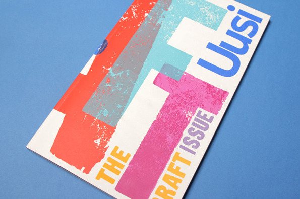
For a large proportion of 2011 and the beginning of this year, we were working with Nokia’s Head of Art Direction Richard Crabb and DesignStudio on Uusi magazine. It’s a quarterly brand publication that goes to Nokia internal marketing types and external agencies to keep them up to speed with all the creative work that’s going on in different parts of the world… and to get them fired up.

Kitching cabinet... cover art by the master of letterpress
In an odd way, it’s been like going back to our roots working on design publications — only Uusi is more creatively ‘out there’ than most regular industry mags. DesignStudio’s background is more branding than editorial, so their take on magazine design is pretty expressive and experimental, all held together by a modernist, grid-based aesthetic.
Groovy Man. So here it is, the latest foray into the obscure nether reaches of graphic design by my old mate Norman Hathaway (with Dan Nadal).

You really can’t accuse Norm of tackling the obvious subjects. A couple of years ago, his brilliant book ‘Overspray’ brought us the super-slick, sexually charged excesses of 1970s US West Coast airbrush art. And now, ‘Electrical Banana’ takes us on an LSD-fuelled journey into 1960s psychedelic art, “the look that defined a decade”, according to the blurb.

He may be right … Any Beatles fan will already be familiar with the trippy, exaggerated comic book aesthetic and garish tapestry-like landscapes of Heinz Edlemann, the illustrator behind Yellow Submarine. But the work of the other six artists, whose shared influences are apparent, seems strangely resonant too. Generously illustrated, with insightful interviews, this is a rare and fascinating glimpse into a colourful lost world of sex, music, mayhem and mild peril. And look out for the introductory Q&A featuring Macca himself, offering his take (or should that be toke?) on the psychedelic era.

From the inside flap:
Heinz Edelmann... a pre-release drawing from Twen magazine

The artists include MARIJKE KOGER, the Dutch artist responsible for dressing THE BEATLES; MATI KLARWEIN, who painted the cover for MILES DAVIS’ BITCHES BREW; KEIICHI TANAAMI, the Japanese master of psychedelic posters; HEINZ EDELMANN, the German illustrator and designer of the YELLOW SUBMARINE animated film; TADANORI YOKOO, whose prints and books defined the '60s in Japan; DUDLEY EDWARDS, a painter, car decorator, and graphic embellisher for the London scene, and the enigmatic Australian MARTIN SHARP, whose work for CREAM and the underground made him a hippie household name in Europe.

Electrical Banana
By Norman Hathaway and Dan Nadal
Damani
£17.55 on Amazon


Port or starburst? You decide
While there’s been a recent a boom in niche independent magazine publishing, it appears to be  ‘time gentlemen please’ for the so-called ‘lad mag’. Loaded, which epitomised the 1990s phenomenon, reported a 30.2% year-on-year drop in sales, down to a paltry 34,505. At its height, 20-odd years ago, the title was selling over ten times that amount, at around 450,000 copies a month.

And another book cover. This for journalist and all-round wit Craig Brown’s ‘One on One’, a book of unlikely meetings and connections. (Terence Stamp advises Edward Heath, Frank Lloyd Wright designs a house for Marilyn Monroe, that sort of thing). Brown calls it a daisy chain of 101 true encounters, each 1001 words long. Sounds not unlike a 26 project.

Who’s zooming who?
The dust jacket is a lovely typographic doodle in black and orange, wrapped all around the book with different styles of arrow linking the various protagonists. It captures the idea of ‘six degrees of separation’ perfectly. The print appears to be letterpress (though I think it’s actually a clever simulation), so it has a lovely tactile quality and is rather beautifully done. I searched high and low but couldn’t find a design credit. Makes a change, in my line of work, it’s usually the writer who gets overlooked.
Nothing better than a sweater
This little beauty goes to prove you don’t have to be a brilliant illustrator to come up with a brilliant book cover. You just need a strong, graphic idea. Designer William Ruoto clearly knows his Peanuts, and has come up with a neat, punchy wrapper for this recent biography of evergreen cartoonist Charles M Schulz. The homage typography is carried on inside.