Showing posts with label Design Week. Show all posts
I’ve written plenty of words about stamps for Royal Mail, and I’ve contributed to Design Week’s Vox Pop several times. But you could have knocked me down with a feather when my name appeared in an answer to the question...

‘Who in the design industry would you like to see celebrated in stamp form?

Here’s what Phil Jones, founder of Real Time Consultancy and old friend had to say:

I live in Bloomsbury and my house has a blue plaque on it for the writer Dorothy Sayers who lived here in the 1930s. Other houses around my area have the same blue plaques recognising great writers, Charles Dickens in the next road to me for instance. Wouldn’t it be nice if we recognised the writers who make the design industry tick? Every annual report, brochure, ad campaign is written by great wordsmiths and many of them are unsung heroes. People like Patrick Baglee, Jim Davies, Tim Rich etc., are worth their weight in gold and how nice if we saw them smiling back at us from a stamp?


Thanks Phil, always good to feel appreciated.

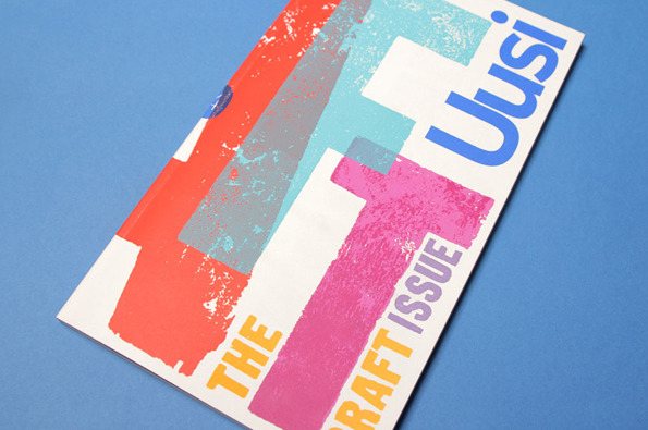
For a large proportion of 2011 and the beginning of this year, we were working with Nokia’s Head of Art Direction Richard Crabb and DesignStudio on Uusi magazine. It’s a quarterly brand publication that goes to Nokia internal marketing types and external agencies to keep them up to speed with all the creative work that’s going on in different parts of the world… and to get them fired up.

Kitching cabinet... cover art by the master of letterpress
In an odd way, it’s been like going back to our roots working on design publications — only Uusi is more creatively ‘out there’ than most regular industry mags. DesignStudio’s background is more branding than editorial, so their take on magazine design is pretty expressive and experimental, all held together by a modernist, grid-based aesthetic.
My Private View columns in ‘Design Week’ occasionally touched a nerve. In December 2008, I berated the laziness and impersonality of e-Christmas cards. A student of sustainable design called Harry Wilson got particularly hot under the collar accusing me of an “archaic way of thinking” in the following week's letters page. Perhaps the line “to hell with deforestation” was a step too far, but of course my tongue was firmly placed in my cheek when I wrote it.

Top trunks... this year’s retro pick, courtesy of Oxfam

It was unfortunate too that one of my then best clients sent me an e-Christmas card between the time of filing the article and publication. For some reason they went pretty quiet on me in 2009.

On twitter yesterday, fellow copywriter Nick Asbury came up with the neologism “Sanctimoanemail: (n) An email sent to say you’ve donated to charity the money you would have spent on an environmentally unsound Xmas card.” And it’s exactly that kind of public outpouring of smugness (environmental or otherwise) that really sticks in my craw.

Personally, I love the annual agony of finding the right off-the-shelf card for friends and designers, or designer-friends. Something typographic or ironic, simple or amusing that stands out in the racks of predictable festive fodder. Back in the day when I had world enough and time, I used to design and make my own. A miserable-looking Bryan Ferry in a Santa hat with the line ‘Ferry Christmas’ was an instant classic.

And it struck me as I wrote my (recycled charity) Christmas cards last week that it’s the time you devote to writing them that’s important. Two minutes or so thinking about your friends or colleagues, is two minutes of silent communion. You’re with them in spirit, remembering your shared past, the times and projects you had in common. Stained-glass stamps, coloured envelopes and stuffing cards into an overfilled post box just before the last posting date are an essential part of Christmas.

You can’t compare it to just pressing send. ’Scuse my archaic way of thinking.
You do judge a book by its cover shock
I know, I know... I’ve been a bit remiss about posting a regular Private View column without Lynda to badger me anymore. Pressure of work and all that. But here’s a piece on US author and journalist Malcolm Gladwell’s ‘Blink’ and the effect rapid cognition might have on our appreciation of graphic design. Look out for my next Private Blog in early December. 

Admittedly, I cottoned on Malcolm Gladwell’s ‘Blink’ rather late in the day, but the instant I saw it winking at me on the charity shop bookshelf, I’d made up my mind. To be honest, I had little inkling about its subject matter and was just taking a punt on the basis of the cover and few of the good man’s articles in the New Yorker. This, and the fact that at a princely £1.10, I had little to lose.

In case you’re unfamiliar, ‘Blink’ puts the case that first impressions are often valid. Just like mine were in the charity shop. In fact, there are many cases where your initial instincts may be more worthwhile than months of painstaking research. These, the author argues, can just muddy the waters.

Gladwell pieces together various scientific studies, interviews and news stories to make his case. He speaks to top car salesmen and eminent psychologists, military strategists, archaeologists, food tasters and the police. And his findings are weirdly fascinating — he discovers that in given situations, our unconscious minds can ‘thin slice’ exactly the information we need. Instinctively, we ditch all the clutter and extraneous stuff and get straight to the nub. It’s only when we start to analyse and weigh up the pros and cons that all the muddle and uncertainty kick in.

First of all, a word about Gladwell’s writing. On the face of it, this isn’t the sexiest of subjects. You’d stomach a 1,000-word article, perhaps, but not a whole 260-page book. And yet, he manages to make you want to dig on and get to the bottom of the conundrum. His prose is easy yet detached, always insightful, occasionally funny. He never blinds you with science or over intellectualising. Like a good TV documentary, he seems to know when to remind you of salient points and previous examples.

However, I really wanted to look at Gladwell’s ‘Blink’ theory from another angle — the context of graphic design. And to suggest that we’ve made our mind up about a piece from the split second we see it.

In the case of posters or street messages, it’s likely that your first impression is your only impression, so clearly that’s true. But even when the viewer is taking in something at leisure, it’s the very first sighting that sets the tone and colours the attitude from then on. You’re more likely to start reading an unfamiliar book from a table-top display if the cover grabs you. Or persevere with a website if the look of it pleases you (particularly when your broadband’s playing up). If someone hands you a groovy business card, you’ll probably feel better inclined towards them than the person who hands you a dull one.

Instant Wim... one look at Crouwel is enough
Superficial? Well, not according to Gladwell. Our first impressions are actually quite sophisticated. They’re built from our previous experiences, and the copious mental notes we’ve taken over the years. (They can also harbour our fears and prejudices, but that’s another story). Called into action, these sparks from our past compute and react in a snap, and most of the time they’re bang on. But when we stop to ask ourselves ‘why?’, that moment of subconscious magic disappears.

In exactly the same way, our taste is learned, but becomes second nature over time. So our first response to a piece of graphics is really quite profound. Which probably accounts for my perennial experience of design awards judging… however many times you go round the houses, you always seem to end up with the same opinion you struck in the first place.

In his first post-Design Week Private View, Jim Davies considers his relationship with Amsterdam, and how this squares with the Dutch perspective on design.

I’m always threatening to spend time in some of the great European cities — Florence, Barcelona, Berlin, Vienna. But somehow, when it comes round to it, I end up back in Amsterdam.

I’ve never actually lived in Holland, but because I’m half Dutch, I’ve visited the country virtually every year since I was born. The canals and bikes, the cobbled streets and low skyline, the cadence of the language, are both familiar and exhilarating. And of course I drool over the vernacular graphics, the street posters, local packaging and shop signage. Around every corner there’s déjà vu, I hear echoes of my childhood, remember my mother, feel a real or imagined connection with my forbears. Even in doing the most mundane things, have an almost spiritual experience.

Bridging the gap: View from our hotel window, The Toren on Prinsengracht


To me, that’s something deeper and more precious than traipsing round the most wonderful cathedral or art gallery in one of the more rarefied European capitals. And because I now know the place reasonably well, I’ve moved beyond the obvious — the Museumplein, canal boat cruises, Anne Frank etc — and have started to explore the next layer down, revelling in the quirkiness of the place, embracing its peccadillos and peculiarities, coming to understand why it is what it is.

Hello boys: The peccadillos and peculiarities of Amsterdam windows


It struck me that my evolving relationship with Amsterdam has similarities to the way the Dutch view and explain design.

Design is such a nebulous term, it can mean virtually anything we want it to. The word can be used in relation to a CD cover or an Airbus, a city signage system or a chair. Ask a hundred people to define it, and you’ll dredge up a hundred and one different answers. The extra one being from the person who couldn’t quite make his mind up.

For most non-practitioners however, design implies a surface sheen or prettification — anything from the cod-Georgian flounce Lawrence Llewelyn Bowen might dream up for one of those tiresome home décor TV shows, to the garish colourways on the latest pair of Nikes.

In Holland — perhaps to counteract this one-dimensional response — they have settled on two words for design (three if you include the English word, which is also in common usage.) The first is vormgeving, which literally means ‘to give form’, and refers to the more aesthetic side of design — making things pleasing to the eye and desirable. The other is ontwerpe, which is more about function and making things work properly — the less glamorous but essential nuts-and-bolts aspect of design.

It’s not exactly form and function, but not far off. Dutch designers who want to be taken seriously (and most do) tend to align themselves with the ontwerpe camp, even if they’re involved in primarily visual disciplines like graphics or packaging. Vormgeving tends to be looked down upon as vapid and superficial — a distantly related dumb blonde no one wants to be associated with.

Urinal or mine? Functional, down-to-earth design


This attitude is culturally typical. From the outside, the Dutch may appear to be laid back and easy going. But actually, they are quite angst-ridden and deep. They agonise over the smallest details and take themselves surprisingly seriously. Unlike the British, who tend to skirt around difficult issues like Darcy and Elizabeth Bennett at a formal dance, the Dutch are far more direct and always prepared to ask frank, probing questions. Which is probably why the more down-to-earth ontwerpe has so much more kudos than the flaky vormgeving in Holland.

As for me, I sheepishly admit to liking a bit of both… I’m only half Dutch after all.
Like many, I was first shocked and then saddened by the news that Design Week (or at least the good old paper version) ceased publishing last week. I’d literally just stepped off the plane from a wicked weekend in Amsterdam, switched my mobile back on, and there was a message from editor Lynda Relph Knight saying she wouldn’t be needing my column this month. Or evermore, for that matter.

Volume 26/Number 26 – the final issue of DW


Deborah remarked that I looked as though someone had died when I picked up the message. Wan and somewhat perturbed. And in a way, that’s the case. There’s no argument that the magazine had been an integral part of the UK design landscape for the past quarter of a century. The only weekly design publication in the world, it had seen off plenty more pretentious pretenders, including my own monthly ‘alma maga’, Direction.

My first thoughts, of course, are with Lynda, who has tirelessly steered the good ship DW for over 20 years, and been instrumental in creating a lively, coherent design community in this country. She’s also been a great friend and supporter of mine, ever since I met her at an IBM press junket in Berlin ten years ago, when I was writing about design for the Daily Telegraph.

And for the past eight years, Design Week had become a regular part of my life too, as I scratched my head to come up with a suitably catchy or contentious Private View column each month. I was just two shy of my 100th effort, which would have been a satisfying personal milestone — but overall, I just feel lucky to have had such a good run.

My 98th and – though I didn’t realise it at the time – last column (online version)


I’d always tried to keep my Private Views slightly tongue in cheek, to poke some affectionate fun at the penchants and peccadillos of designers, to use my daily contact with the species to feed various gently amusing insights and observations. Over the years, I’d publicly chewed over traffic and toilet design, colour and crowdsourcing, mergers and modernism. I hope I raised a smile and occasionally touched on some home truths.

The PV subjects that really raised the temperature of the letters’ page, however, were the ones on free pitching, the lack of women in design, and perhaps less obviously, my rant against e-Christmas cards two years ago, which prompted one outraged reader to denounce my “archaic way of thinking”.

Perhaps he was right. Digital Christmas cards, digital magazines… maybe those Scandinavian pine forests have a right to rest easy. But of course Centaur’s decision to close Design Week doesn’t have a lot to do with embracing new media or a green agenda. It’s all about the commercial imperative.

The magazine was becoming more emaciated by the week. Without feature advertising, there were fewer features. And those that did appear were crammed on to a page or a spread at best. Even within the framework of Sam Freeman’s excellent redesign, it was impossible to give the work the space it deserved, especially compared to the lush ten-pagers in Eye magazine. So the balance tipped far more towards news, opinion and comment. Which, you could argue, is more suited to the immediacy of an online publication. That’s certainly the line Centaur are taking.

Almost by second nature, this blog post is running to 580 words, the length of a Private View column. I’ve decided to keep writing them. If anyone wants to publish them, great. If not, they’ll be appearing here, on the third Thursday of each month as usual.

I’ll miss you Design Week.
Our work with Chadwick Nott, the UK’s largest legal recruitment consultancy, has been featured in the news pages of Design Week. totalcontent were brought in by branding consultancy Deep to develop an intelligent-yet-accessible tone of voice to complement their rebrand work, and help set the ambitious agency apart from the competition. 

The guiding principle for all the work was to see things from candidates’ and clients’ perspectives, rather than trot out empty about claims about past achievements. And the tone needed to be sharp, well-informed and occasionally entertaining — appealing to an audience of lawyers. 

We created language guidelines, example headlines and copy, and and are currently editing Chadwick Nott’s rather extensive website.
Following my moan about the dearth of decent 2010 calendars in Design Week, I was delighted to receive the latest offering from the good people at Airside. (It was a real oversight on my part not to have given these bold, bright and quirkily illustrated numbers a name check in the first place). Airside calendars are developing a serious rep in the design community, and have become highly collectable – people are still buying the 2004 model. This year’s features two weeks to view, and – though there’s plenty of graphic variety on display – the main theme is playful bold silhouettes and merged perspectives. The dates are particularly interestingly handled – crude, bitmapped type displayed in Escher-like columns, creating intriguing patterns and visual illusions. Many thanks to Nat Hunter for popping one in the post. You can get hold of a (highly recommended) copy here.
Finding a suitable 2010 calendar has been a struggle. Usually I’m lucky enough to receive some beautiful unsolicited designer offering through the post, but as we all know, times are tough, and this year nothing has been forthcoming. After much internet trawling, and a couple of near misses, I finally settled on the Central Illustraton Agency’s ‘Ace’ calendar. This dinky little number features a new illustration a week by eminent pencil-wielders like David Hughes, Brian Grimwood, Ian Bilbey and Max Ellis. It’s printed on grey recycled paper with vegetable-based inks and is a limited edition run of 600 – so you can feel green and exclusive at the same time. Oh, and my latest Design Week column is all about the trials and tribulations of finding the perfect designery calendar. Pencil it in.