Here’s the cutely animated result of a short script we wrote recently to explain QuidCycle, a new ethical peer-to-peer lending programme. totalcontent was brought in by branding agency Collider to help with launch materials for this new venture — and to write their website too. The aim was to take the fear factor out of money by using reassuringly friendly, accessible language.
Showing posts with label writing. Show all posts
Showing posts with label writing. Show all posts

Strange yet gratifying when something you've written pops into your email inbox unexpectedly. Here's a little something we crafted recently for Godiva, the luxury Belgian chocolatier. Sweet.


Over the past 18 months or so, we’ve been working extensively with branding consultancy Bostock & Pollitt, mainly on (London) property projects. Their particular strength is unearthing something unique about a given development, and then bringing this to life through their branding ideas. We’ve been helping out by expressing B&P’s creative theme in words, naming, straplines, developing an appropriate tone of voice, and then creating copy for digital and printed collateral.
One of these projects was Devonshire Square, an architecturally diverse campus with 630,000 sq ft of office space, shops, homes, restaurants and bars, tucked between the City and Shoreditch.
One of these projects was Devonshire Square, an architecturally diverse campus with 630,000 sq ft of office space, shops, homes, restaurants and bars, tucked between the City and Shoreditch.
It all started with a slightly skewed phrase that popped into my head one day for no reason... ‘A leopard never changes his spats’. This conjured a comical image of a dapper feline with an immaculate top hat and cane but inexplicably dirty footwear. A children's illustrator could have a field day, I thought.

Building on the theme, I racked my brain for more well-known sayings, and made a rule for myself... each idiom could only be changed by a single letter. And then I came up with a title that explained the concept by almost acting it out — ‘From Idioms to Idiots — How One Letter Can Make All The Difference’.

We were drafted in by design company hat-trick to provide words around the theme of a 'day in the life' of the college, quite a radical approach for an institution of this kind. In reality, the times of the day became pegs on which to hang different aspects of the school, from its emphasis on 'co-curricular' activities, to the benefits of boarding, to its impressive facilities. Underlying all this was the idea of promoting a broad, joined-up education, which offered more than just academic excellence.
 Christmas seems to have come early at totalcontent. Last week we brought you Royal Mail's Madonna and Child stamp presentation pack. This week, we unwrap the children's Christmas stamp competition pack, charmingly designed by our good friends at NB Studio.
Here, we were asked to tell the story of the nationwide hunt for designs striking enough to grace first- and second-class during the 2013 festive period. The challenge was open to children in the UK aged 4–11, and there were prizes of £100, £500 and £1000 to be won. This is only the third time Royal Mail have staged a kids' stamp competition, and the response was overwhelming, with over 240,000 entries covering all kinds of Yuletide subject matter in every conceivable style.
 I’m really pleased to have contributed to this rather classy pack showcasing this year’s Madonna and Child Christmas stamps. The set of five (plus two extended large-letter stamps) feature depictions of the Virgin Mary and Jesus through the ages, as well as a specially commissioned (and strikingly beautiful) new painting by neo-Coptic artist Fadi Mikhail, which sits on the £1.88 stamp. I helped Royal Mail tell Fadi’s story, including his tutelage under neo-Coptic master Isaac Fanous; his process and thinking; and the heavy symbolism of this very prescribed genre of painting. On the reverse side of the sheet, there’s a potted history of Madonna and Child paintings by art historian Rowena Loverance. You can get hold of a special Christmas presentation pack, designed by Robert Maud and Sarah Davies here. Or of course, pick up Christmas stamps for all your cards from your local Post Office.
What a 17-year-old book on the language of technology means today.
On Saturday mornings, I’ll often be found in Leamington’s Oxfam Books and Music on Regent Street. It’s a great place to pick up second-hand vinyl and old Penguin paperbacks, and you never quite know what you’re going to find.
The other day I snaffled ‘Wired Style — Principles of English Usage in the Digital Age’ for a couple of quid, which got me thinking not only how rapidly English is evolving now, but how technology is constantly changing the way we write and speak. It was ever thus, I suppose, but these days it’s happening at warp speed. Doing what I do, I’m a bit of a sucker for style guides, and own everything from the Economist and the Guardian, to Oxford and Fowler’s. But ‘Wired Style’ has a different agenda, proclaiming itself a celebration of writing that “jacks us into the soul of a new society”.
On Saturday mornings, I’ll often be found in Leamington’s Oxfam Books and Music on Regent Street. It’s a great place to pick up second-hand vinyl and old Penguin paperbacks, and you never quite know what you’re going to find.
The other day I snaffled ‘Wired Style — Principles of English Usage in the Digital Age’ for a couple of quid, which got me thinking not only how rapidly English is evolving now, but how technology is constantly changing the way we write and speak. It was ever thus, I suppose, but these days it’s happening at warp speed. Doing what I do, I’m a bit of a sucker for style guides, and own everything from the Economist and the Guardian, to Oxford and Fowler’s. But ‘Wired Style’ has a different agenda, proclaiming itself a celebration of writing that “jacks us into the soul of a new society”.
 |
| Bucket... just add content |
Suddenly, it seems, our 12-year-old company name has (global) currency.
As it happens, I’m a bit conflicted about totalcontent these days. Because, as with so many words (or conjunctions of words), its context and meaning has changed. As someone who spends a good deal of time naming things for clients — we’ve come up with everything from shirts to colleges to mobile phones and a cheese — it’s perhaps something I should be more wary of… but on the other hand, there’s not a jot you can do about it.
‘Content’ has an entirely different connotation than it did a dozen years ago. I originally homed in on it because of the slight play on ‘content’ = ‘what is contained’, and ‘content = ‘peaceful happiness’. But today it tends to just mean stuff, filler, goop… if a website is a bucket, then content is the stuff you fill it with — generic pictures, words, headlines, links etc. It’s become a tag with no romance or resonance — you buy content by the yard, it fills the space, no more no less.
But clearly, this doesn’t put too many people off. Content services have come to contaminate the Internet, selling words as a commodity — off-the-shelf articles ‘optimised for SEO’, or new material ‘competitively priced’ by length or quality level. A quick Google search unearths Content Now, Star Content, Constant Content, Pure Content, Snappy Content Writing (could be snappier), Content Equals Money, Content Proz, and many, many more. Occasionally I get emails from similarly named companies offering to help out with my content. Thanks for that.
I’m not going to throw stones in the dark. For all I know, Content Equals Money may have the verbal virtuosity of Jane Austen. I’ll just observe that there’s a difference between buying a suit from Burton or Savile Row. Ours tend to fit a lot better and don’t fall apart at the seams so readily.
The word ‘copy’ is one step up from ‘content’ — functional and commercial, but at least honed and targeted. And ‘writing’, of course, implies real craft and dexterity, the ability to create light and shade, achieve emotional nuance, make people chuckle or empathise.
So all in all, the service we offer couldn’t be further removed from providing ‘content’. You’d hope that people think of our name as a kind of knowing, post-modern joke, a clever anti-name that flies in the face of the word’s current meaning. Like Andy Warhol’s Factory or Factory Records, hotbeds of creativity and originality with a wink in their nomenclature.
Next week, maybe we’ll move on to the ‘total’ bit.
 |
| That’s my Coy... the face that launched a thousand ads |
Although Mark has been perfecting his highly entertaining spiel at various ad agencies in London and New York over the past months, this was the first time he’s been let loose on a non-advertising audience, and he was moderately nervous at the prospect.
Never knowingly understated, Mark cut his typical dash in a tailored navy suit, fairground bling rings, and finely tweaked moustache. Following a loose structure, he spoke without notes for 90 minutes, charming, amusing and (yes) inspiring a packed auditorium with his anecdotes and observations.
I was already very familiar with Mark’s bulging portfolio, so I won’t list his greatest hits here, but rather recall six pearls of wisdom he served up. Bear in mind that these are just the pointers that I came away with, and they were by no means delivered in such regimented style.
1 Advertise yourself. Though steeped in advertising, many creative teams are surprisingly lax about getting themselves noticed. Mark has developed a series of ploys and strategems to help him stand apart… if he’s visiting a client he often wears a bespoke track suit with ‘Denton’ in fairground type emblazoned across the back, so everyone knows who he is. When his commercials company Coy has news, he sends out a bill poster, tied to a rubber brick with a ribbon.
2 Do your own thing. Mark can’t resist a personal project. He’s brought out a range of tweed jeans, two magazines, several exhibitions, and a book on Mexican wrestling. Though he never skimps, generally he hasn’t lost money… they’ve either been picked up, fed into paid work, or developed an unexpected life of their own. Like the portraits of ‘Edwardian footballer’ Nobby Bottomshuffle (Mark dressed up), which ended up in the National Football Museum in Preston.
3 Let your love shine through. As a child, Mark was obsessed with telly adverts, comics, and his John Bull printing set, and these have continued to inform and inspire his work. His style often has a kitschy, overblown quality to it — always combined with a knowing wink. He describes his natural aesthetic as “schoolboy jokes with a high-end finish”. Actually, this look is very prevalent at the moment, but Mark’s almost painful attention to detail sets his work apart.
4 Don’t be afraid to ask. Mark rather disingenuously claimed that he had no particular talent, but knows a lot of people he can rope in as necessary. Creative people will jump at the chance to be creative — ask them to contribute to an exciting project (even for free), and the chances are they’ll say yes. When he was putting together a magazine, Mark not only sold all the ad space, but persuaded some of London’s top teams to create one-off ads.
5 Always return a favour. In the creative community, you need the breaks to make your mark, whether that’s a recommendation, or a job, or an introduction. Mark’s talk was full of people popping up when you least expected them… like the recently graduated photographer Mark commissioned, who many years later asked him to become a partner in his commercials company.
6 One thing leads to another. Mark’s career has been full of wonderful happenstance, curious connections and seeming to be at the right place at the right time. It’s like a spider’s web of opportunity, magically spinning out from the centre. But there’s a reason for this… Mark doesn’t just talk about doing things, he actually does them. Once they are out there, they take on a life of their own, propelled by the force of his personality.
As announced at the talk, I'll be writing a book on Mark's work later this year. He said so, which means it's definitely going to happen. Can’t wait.
Mark Denton is a founder and director at Coy Communications.
As announced at the talk, I'll be writing a book on Mark's work later this year. He said so, which means it's definitely going to happen. Can’t wait.
Mark Denton is a founder and director at Coy Communications.

 The Royal Mail Year Pack is the feisty little brother of the Year Book. It includes all the past year’s pictorial stamps, plus a quick run-down on the subject that inspired them. This is the tenth one I’ve written, and while it’s not a Marathon like the Year Book, it’s still a testing 1500 metres. You have around 200 words to cover anything from Space Science to Charles Dickens to British comics. Which means keeping the words punchy yet informative, finding an interesting angle, and casting a small but incisive spotlight on the subject in hand.
For the designer, it’s an equally demanding task. They need to encapsulate the visual spirit of 100 or so stamps on the front and back of a simple fold-out. This year, Magpie Studio did a sterling job of not only of bringing such disparate material together, but also in expressing a sense of British pride in the year of the Golden Jubilee and the Olympic Games.
 |
| Bye-bye to bylines... in commercial writing your words aren’t your own |
The point is, in commercial writing the author is very rarely credited. I occasionally read copy that makes me smile or prompts a pang of envy. I read plenty that makes me cringe. But, unless I happen to know who’s ‘in’ with the client or design company involved, I have little idea who to pat on the back or poke in the eye.
We’re delighted to have played a part in the recent
relaunch of Reeve. They’re wood flooring and fittings specialists based
in Norfolk, who work extensively with architects and designers.

That’s how they fell in with the good folks at Felt Branding, who duly
persuaded them to undertake a complete brand overhaul that would chime better
with their main client base. Felt created a light, contemporary identity
system, making it easier for clients to understand the Reeve range and specify
accordingly. The rebrand included an ingenious ‘r’ logo that also
manages to look like a tree.

It fell to totalcontent to develop Reeve’s tone of voice and write website and sample book copy. We wanted to put over the company’s deep appreciation of wood as a material, as well as their knowledge and experience. All wrapped up in a friendly accessible style, of course. The website was developed by Mesh London, while the sample book was immaculately printed by Generation Press, the go-to printers for the design cognoscenti.
It was great to get a write up and name check on the CreativeReview blog too.

How timely... on Day 5 of the London Games, we bring you our latest effort for Royal Mail. Part of a series of commemorative philatelic goodies, ‘Welcome to the 2012 Olympic Games’ is a special stamp pack that takes a look at the impressive facts and figures behind the XXX Olympiad, and the city of London itself. It houses a miniature sheet with four stamps designed by hat-trick, who also created the pack. I was charged with writing a narrative which tied all the key numbers together in an enlightening and entertaining way. If you want to read the full text (you know you do), you can view a pdf on the downloads page of this site. And if you’re suitably impressed, you can always buy the pack from the Royal Mail shop.

‘Who in the design industry would you like to see celebrated in stamp form?
Here’s what Phil Jones, founder of Real Time Consultancy and old friend had to say:
I live in Bloomsbury and my house has a blue plaque on it for the writer Dorothy Sayers who lived here in the 1930s. Other houses around my area have the same blue plaques recognising great writers, Charles Dickens in the next road to me for instance. Wouldn’t it be nice if we recognised the writers who make the design industry tick? Every annual report, brochure, ad campaign is written by great wordsmiths and many of them are unsung heroes. People like Patrick Baglee, Jim Davies, Tim Rich etc., are worth their weight in gold and how nice if we saw them smiling back at us from a stamp?
Thanks Phil, always good to feel appreciated.
 |
| Bleedin’ ’eck... the ink went straight through |
My preference is for an A5 hardcover (orange if possible) with 90gsm gridded paper. Quo Vadis Havanas are particularly durable and satisfying to write on, and I’m also partial to Rhodia Webnotebooks, which come in a really great dot gridded option. As a work essential that you’re going to live with for six or so months, it’s worth plumping for something with decent quality paper that can take all kinds of inks and abuse.
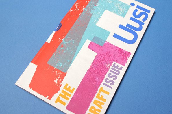
For a large proportion of 2011 and the beginning of this year, we were working with Nokia’s Head of Art Direction Richard Crabb and DesignStudio on Uusi magazine. It’s a quarterly brand publication that goes to Nokia internal marketing types and external agencies to keep them up to speed with all the creative work that’s going on in different parts of the world… and to get them fired up.
In an odd way, it’s been like going back to our roots working on design publications — only Uusi is more creatively ‘out there’ than most regular industry mags. DesignStudio’s background is more branding than editorial, so their take on magazine design is pretty expressive and experimental, all held together by a modernist, grid-based aesthetic.
 |
| Kitching cabinet... cover art by the master of letterpress |
 |
| By George... this looks damn familiar |
If you’ve read Paul Arden’s ‘Whatever You Think, Think The Opposite’ and ‘It’s Not How Good You Are, It’s How Good You Want To Be’, you’ll get the gist. It’s a collection of snappy, from-the-horse’s-mouth pointers on how to be creative. In fact, the format is remarkably similar — standard paperback size, white cover with bold black type. Inside, brutally straightforward, sometimes irreverent headlines, accompanied by a couple of paragraphs of wisdom or anecdote, and a carefully chosen image that colours or juxtaposes the point being made.
The pace is staccato and relentless. You feel you’re being hit over the head with page after page of ‘damn good advice’ — ‘Make your surroundings a metaphor for who you are’, ‘Never eat shit’, ‘A trend is always a trap’, ‘Tell the Devil’s Advocate in the room to go to hell’, ‘Speak up, goddammit!’. For full effect shout rapidly in a Noo Yoik accent.
The first few pages are fine, inspiring even. You’re thinking, right on, don’t compromise, fight the good fight, believe in yourself, stick it to the man. But as they keep coming (and coming) small seeds of doubt start creeping in. Firstly, it starts to become apparent that a lot of the ‘damn good advice’ is pretty self evident. Like ‘Don’t sleep your life away’, and ‘Don’t expect a creative idea to pop out of your computer’. You can’t argue with either, but most people will have worked this out for themselves. Unless they were sleeping, of course.
 |
| Arden fast rules... an adman’s wisdom |
Of course be determined, confident and original. Of course stick up for your ideas and take inspiration from wherever you find it. And I tip my hat to Lois for his single-mindedness, chutzpah and towering achievement. But, I can’t help feeling that if there were 100s of creative people out there following this credo, we’d have mayhem on our hands. The point is, we’re all creative in different ways, and realising this is the first step on the path to originality.
‘Damn Good Advice’ is a damn good ad for George Lois, but you need to take it with a pinch of salt. Or as he might put it ‘You can't be creative if someone has to tell you how’.
 It almost goes without saying that being foreman of this year’s D&AD Writing for Design jury was the next best thing to shaking Johan Cruyff’s hand. As you walked into the vaulted expanse of Olympia, with the sun shining through the latticed ceiling, it felt like you were in some kind of creative heaven — only without the blessed harps and angels. There was table after groaning table of the best work in the world, stretching off into the horizon, a seemingly endless feast of ideas and perspiration.
On our six tables, there were 70-odd entries including books, bottles, posters, mailers, annual reports, leaflets, cards, websites, three bikinis and a pair of vibrators. My fellow jurors (Nick Asbury, Fiona Thompson, Chris Doyle, Lisa Desforges, John Weich and Anelia Varela) were as keen as I was to get stuck in, to be inspired and informed, amused and amazed. But it soon became apparent that, although the overall standard was well above middling, there was very little to make the soul rejoice and the heart sing. Yes, there was plenty of perfectly accomplished, lively, well-crafted writing, but very little with the glimmer of greatness required for the pages of the hallowed D&AD Annual.
 When I was around 17, I had the best pair of jeans. I wore them virtually every day for three years, and by the end of that time, there was more patchwork repair than original material. To this day I remember my mother compaining they ‘gave her the pip’, as she spent so much time sewing them up. Which sounded hilarious in her Dutch accent.
I remember they were Wrangler drainpipes, but I have no idea where they were bought or made. I liked the Ws stitched on to the back pockets — maybe it was a latent appreciation of typography which was to kick in properly a few years later. But the point is, I truly loved them, and they were always with me whatever I happened to be doing.
Subscribe to:
Posts (Atom)