Showing posts with label typography. Show all posts
It all started with a slightly skewed phrase that popped into my head one day for no reason... ‘A leopard never changes his spats’. This conjured a comical image of a dapper feline with an immaculate top hat and cane but inexplicably dirty footwear. A children's illustrator could have a field day, I thought.


Building on the theme, I racked my brain for more well-known sayings, and made a rule for myself... each idiom could only be changed by a single letter. And then I came up with a title that explained the concept by almost acting it out — ‘From Idioms to Idiots — How One Letter Can Make All The Difference’.
To the letter... publicity poster for the fictitious 'Dig It Festival', calligraphy by Ann Bowen
It’s been a while since I took part in a collaborative project with 26, the writer’s group I co-founded with seven others ten years ago. ‘26 Words’, was a kind of reprise of ‘26 Posters’, one of our very first efforts, which randomly paired writers with designers, gave them a letter of the alphabet and asked them to go off and produce a poster together. Back then I got editorial design legend Derek Birdsall and the letter I. Both wonderful.

This time round 26 writers were paired with 26 lettering artists from the crafts-based lettering association Letter Exchange. I was teamed with the hugely talented calligrapher Ann Bowen and given the letter D, but there was also a twist this time. In a slightly shamanistic ceremony held in the basement of the Betsy Trotwood pub in Clerkenwell, we were asked to stick a knife into a dictionary to pick out a word starting with our given letter. In our case, the tip of knife pointed to ‘dig’.
Just a quick nudge to let you know that the new Repeat Repeat website has gone live. Our friends Mark Faulkner and Gill Naylor have run this wonderful design and ceramics company since they left college back in the 1980s, producing fine bone china mugs and crockery with a quirky contemporary twist. It’s all beautifully hand made in Staffordshire, the heart of the Potteries.

totalcontent were delighted to help out with words for the website, and especially taken with the new Alphabet range, which we’re sure will go down a storm with letter-crazy graphic designers. In case you’re wondering, the typeface is Orator (all lower case apart from the L, which looked decidedly odd). And you can order a gross of them for your studio here.
“You might think the Olympic Games are all about being number one. But that’s only a small fraction of the story…”

How timely... on Day 5 of the London Games, we bring you our latest effort for Royal Mail. Part of a series of commemorative philatelic goodies, ‘Welcome to the 2012 Olympic Games’ is a special stamp pack that takes a look at the impressive facts and figures behind the XXX Olympiad, and the city of London itself. It houses a miniature sheet with four stamps designed by hat-trick, who also created the pack. I was charged with writing a narrative which tied all the key numbers together in an enlightening and entertaining way. If you want to read the full text (you know you do), you can view a pdf on the downloads page of this site. And if you’re suitably impressed, you can always buy the pack from the Royal Mail shop.
Looking for the perfect Valentines Day gift for the designer man in your life? Something with a bit of sauce but not too much cheese? Never mind the bollocks, heres the Sex Pistol stretch boxer trunk from Bjorn Börg. You dont have to mind your Ps and Qs in these beauties. Just the job for well heeled-punks and anyone whos read Simon Garfields Just My Type. And available until stocks last with 40% off at www.underu.com. New balls please.
I must admit, I’ve been sorely tempted by a MassimoVignelli Stendig calendar for some time. Designed in 1966, it’s still the most brutally beautiful thing imaginable. You can just picture it hanging artfully on the exposed brickwork of a Shoreditch warehouse studio. But at 3 by 4 feet, you need some serious wall real estate to accommodate it. And I can’t help thinking this huge expanse of paper is less than eco friendly, even though the makers playfully suggest you use the discarded months as wrapping paper.
Stendig alone: Massimo by name, massive by nature

The alternative is the slightly more adventurous Pentagram calendar (though it’s actually designed by alumnus Kit Hinrichs). This keeps the same format, but rings the typographic changes each year, and will feature examples of vernacular type for 2012. It comes in two sizes, so it’s more manageable, but you can’t get hold of it in the UK, and shipping charges from the US are astronomical.

Let’s year it for Pentagram’s moveable typographic feast 

For these reasons, I’ve plumped for the book-like Typodarium calendar (available on Amazon for £14.76) this year. You can keep it plonked horizontally on your desk or hang it up vertically. I’m not sure how useful it will be as a calendar, but it features a different typeface for each day of the year, along with information on the back. And you can keep the torn off pages in a handy box to peruse at your leisure. As you can probably tell, there’s ever a dull moment around here.

Every day’s a bit different with Typodarium
And another book cover. This for journalist and all-round wit Craig Brown’s ‘One on One’, a book of unlikely meetings and connections. (Terence Stamp advises Edward Heath, Frank Lloyd Wright designs a house for Marilyn Monroe, that sort of thing). Brown calls it a daisy chain of 101 true encounters, each 1001 words long. Sounds not unlike a 26 project.

Who’s zooming who?
The dust jacket is a lovely typographic doodle in black and orange, wrapped all around the book with different styles of arrow linking the various protagonists. It captures the idea of ‘six degrees of separation’ perfectly. The print appears to be letterpress (though I think it’s actually a clever simulation), so it has a lovely tactile quality and is rather beautifully done. I searched high and low but couldn’t find a design credit. Makes a change, in my line of work, it’s usually the writer who gets overlooked.
Parp, parp. I’m the kind of person who just about knows one end of a car from the other. You certainly wouldn’t catch me waxing lyrical about alloy wheels or torque. Or watching Top Gear.


That’s why I’d given the Heritage Motor Centre at Gaydon a wide berth, despite it being a mere 10-minute ride from the totalcontent studio. However, they’d recently laid on a one-off exhibition called ‘Science Fiction at the Movies’, which promised plenty of Star Wars and Dr Who relics — the kind of thing my boys are deeply into. And we had friends coming for the weekend, so it seemed an ideal opportunity to check the place out.


Parked in the middle of a former RAF base, in the middle of nowhere, the imposing circular building looks like a covert high-security government headquarters. You might expect to find all kinds of Roswell-like experiments going on in there, but actually it’s packed with over 200 significant British cars — from decidedly the humble, to land-speed record breakers and James Bond stalwarts. But it’s not at all fetishistic or petrol-heady. In fact, the place offers more of a social and cultural history, the outer perimeter representing a road travelling through time, with the earliest cars at one end, gradually making way for more contemporary fare.


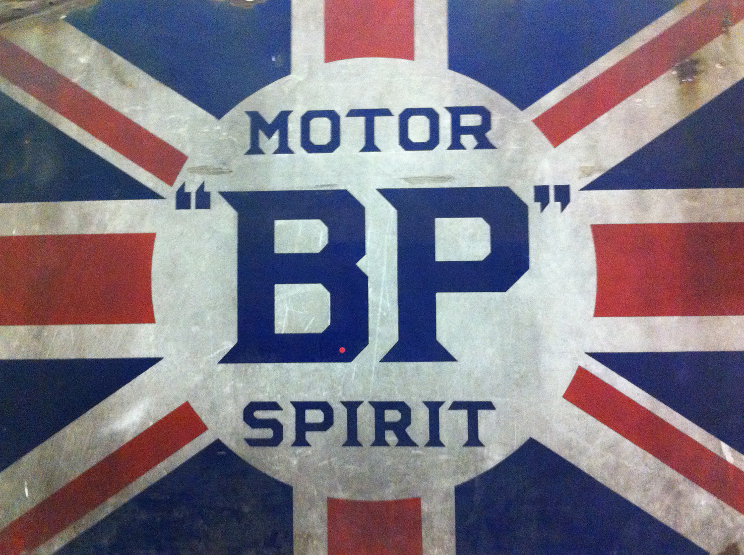
For me — apart from the astonishing FAB 1, Lady Penelope’s pearly-pink wheels from the 2004 live-action Thunderbird’s movie — the great revelation was the trove of retro type and ephemera. The place was chock full of posters, ads, signage, logos and hand-rendered typography. I found myself slavishly photographing walls, grilles and odd bits of lettering, and reminding myself not to be so closed-minded in future. Particularly loved a poster for Dunhills’ Bobby Finders, glasses-cum-binoculars which promised to “spot a policeman at half a mile even if disguised as a respectable man”.


Cars, whether we like it or not, are a telling symbol of progress and popular culture. With headlights on full beam, Gaydon took us on a nostalgic and occasionally quirky tour of Britishness through the ages. I’ll be jumping into my car with a better camera for a return visit soon.

In November last year I got a call from Ben Casey at The Chase asking if I’d help out with some posters they were putting together for the photographer Paul Thompson.


The idea was brilliantly simple. Pick a photo from Paul’s online portfolio and write 1000 words inspired by it. Anything that took my fancy. These 1000 words would then be used on promotional posters, postcards and T-shirts with a sign-off line pertaining to the old ‘picture paints a 1000 words’ chestnut. Friend and fellow writer Nick Asbury, as well as Ben and Lionel Hatch from the Chase would be writing 1000 words too.


Choosing was the hard part. Paul’s website was packed with intriguing stuff — slightly odd looking portraits of people who’s heads and bodies didn’t seem to match; eerie landscapes; curious moments captured in time. His work has a sense of the surreal, as if something’s not quite as it should be.

I eventually plumped for an image of a slightly forlorn-looking park bench. There were no people around, and it looked like a perfectly grey, hum-drum day. There was something remarkable in the ordinariness of the shot.


It struck me that this park bench must have witnessed all kinds of things, if only it could articulate them. So I gave it a slightly curmudgeonly voice and set about telling a kind of first-person day in the life, which gradually spirals out of control.

The Chase then set the words beautifully to the shape of the picture. The results not only look rather fine, but gently subvert the idea of a photographer’s mailer. They work just as a grey block of text, or if you go in and actually read the pieces, which are remarkably different from each other. It was a great brief, and I’m really chuffed to have been involved in a project like this. And I’m pleased to say the project was picked up by the Creative Review blog too.

You can read my 1000 words by clicking on the image below.


I’m pretty sure this has never happened to me before, and it’s unlikely to happen again. I’d just treated myself to a copy of new book, entitled ‘Alphabets: A Miscellany of Letters’, and was idly flicking through its handsome pages. It’s a charming, quirky compendium of applied letterforms, arranged in themed chapters — B for ‘Bestiary’, F for ‘Found’, H for ‘Hand’, J for ‘Journey’, and so on. It features games, posters, signage, packaging, furniture… in fact, virtually anything’s considered fair game so long as it references the alphabet.

And there, staring back at me on page 56, was something that looked decidedly familiar. A poster I’d worked on with the great Derek Birdsall back in 2004. You could have knocked me down with a feather (shaped like a letter f, perhaps). Our effort was based on the letter i, and featured in a exhibition at the British Library organised by 26. Originally, it was printed on a reflective surface, so that people would see their faces in the poster as they read the text, picking up of the idea of I as shorthand for identity.

Here’s what some of the text in ‘Alphabets’ says about the poster: “Birdsall is an influential book designer who, therefore, works closely with letters in his day-to-day work. Davies, a writer, has contributed works of fiction and non-fiction to a variety of publications, and his humorous interpretation of the letter’s history is characteristic of his work. The letter is given a pompous voice and lists its many uses in language and technology, drawing attention to its strong aesthetics, which make it suited to graphic art.”

After I’d recovered from the surprise, I felt pretty pleased with myself. But on reflection I thought, shouldn’t someone have at least asked first?

‘Alphabets: A Miscellany of Letters’ is published by Black Dog. You can pick it up on Amazon for £16.96.
I’ve got out of the habit of reading much poetry recently, but I’m having a bit of a Paul Auster phase, so this caught my eye. It was the cover typography as much as the thought that Auster no doubt has his own slant on the genre. Jenny Grigg’s lettering hints at the process of writing, yet avoids the more flowery excesses of some calligraphy. And the way she’s subtly woven the ‘A’ and ‘U’ of Paul and Auster suggest some of the structural gymnastics that the author is known for. The design, printed on nice quality craft paper, is deceptively simple, but still manages to convey an understated elegance and graphic wit. Right, better read some now... you know what they say about books and covers.
OK, I’ll come clean, numbers are not my forté. To me, they’re just confusing marks best left to bookkeepers and accountants. Actually, I’m beginning to think I suffer from a mild form of number dyslexia, often transposing digits and being perennially useless with PIN numbers and phone numbers. So Word Clock, by the ingenious digital designer Simon Heys (currently working at the Times), is a welcome antidote to the number fascism of time. It’s a rather beautiful screen saver (for Mac, PC or iPhone), which tells you the time in written out words, which change… well… every second. You can set it as a full screen of words or a rather elegant spiral, you can change the colours or the typeface. It’s wonderfully mesmerising watching time click by in words. And you can get hold of one for yourself right here.
Came across this quite brilliant pack of typographic playing cards the other week. They’re the work of Jim Sutherland at hat-trick design, who I’m lucky enough to be working with on the 2010 Royal Mail Yearbook. Though they’re being used as piece of self-promotion for the consultancy, they’re actually an immaculately realized piece of personal work. The handling of the type is really witty and elegant, with negative and positive space used to act out suits, royals and numbers. Away from commercial and brand imperatives, the cards eloquently show a true love of type and pure graphics. Can’t wait to get my hands on a pack. There’s a YouTube clip here where you can see all 54 of them in action.
Although I wasn’t exactly sure what rooibos tea was when I bought this, the packaging (designed by the good people at Pearlfisher) made it irresistible. And actually, as it turns out, I really quite like the stuff. Apart from the background being a perfect shade of orange, the anthropomorphic, hand-drawn type has an arresting, child-like quality, which cleverly suggests the tea’s natural, organic provenance. The doodle-like illustrations not only convey energy and fun, but show you that you’re about as far away from a slick, processed drink as you could be. The copy wasn’t bad either, personable without trying too hard:

“Here at Kromland Farm, we’ve been cultivating rooibos since 1902. But that's nothing – South Africa’s indigenous Khoisan people have been enjoying its rich flavour and potent heath benefits for millennia”.

Unfortunately, it seems I won’t be. Sainsbury’s seem to have stopped stocking Kromland Farm.
With a couple of hours to kill in Helsinki, I wandered into the Museum of Contemporary Art Kiasma, an intriguingly shaped glass-and-zinc building designed by the US architect Steven Holl. The exhibits were a mix of Finnish and international modern art, which were beautifully set off by the gentle, organic shapes of the rooms. Of course, you can always judge an art gallery by its gift shop, and Kiasma’s was packed with curious gems. Though I was sorely tempted to trade my Euros for various arty, esoteric books, I held back to retain my hand-luggage only status on the flight back. I did, however, pick up this card designed by a pair of English illustrators – Bob and Roberta Smith. Of course I agree entirely with the sentiment, but I’m also busy trawling through Chris Salewicz’s mighty biography of Joe Strummer, so I just had to have it.

In case you’re interested, Bob and Roberta's cards are available – along with efforts by David Shrigley, Magda Archer and Vic Reeves – at www.politecards.com.
 For those of us who like to judge a book by its cover, here’s a wry-yet-chirpy blog comparing and contrasting book cover design from around the world, along with suitably pithy commentary.

What’s really intriguing is the way different styles are adopted for different markets and how covers are refreshed from one edition to the next. But the real eye-opener is how your reaction is so easily manipulated, even before you’ve read a word. You can’t underestimate how a cover sets the tone for a book, or influences your frame of mind as you start delving into the writing.

Shown here, a new Faber & Faber edition of Paul Auster’s ‘New York Trilogy’ designed by the fabulously talented Jonathan Gray (who also did the ‘Common Ground’ cover for 26). And Art Spiegelman’s cover for the Penguin Deluxe Classics Edition of the same book. Get under the covers at www.thebookdesignreview.com.
I’m not too sure about Alphabeat’s music, it’s a just a bit too unashamedly ‘pop’ for me. You might remember the inane but infectiously catchy ‘Boyfriend’ from last year. Even if you don’t, when I tell you that the Danish band’s influences are Wham! and Abba, you’ll get the picture. Having said that, the cover for their debut UK CD, ‘This is Alphabeat’, is a graphic designer’s wet dream. With echoes of Peter Blake, Victorian poster type and nursery building blocks, it’s colourful, quirky and nostalgic. Which begs two questions. Firstly, would you buy a CD on the strength of its cover art? And secondly, anyone out there know who designed this little beauty?
I’m always a sucker for a bit of ‘vernacular’ type. That is, street lettering that’s been hand-rendered by someone with little training, but a lot of enthusiasm. So this CD cover from Californian funksters Tower of Power immediately struck a chord. I’m still not sure how much of it has been ‘staged’ and is therefore an elaborate double bluff, but even so, this really is a case of so bad it’s good. (And I just love “T-bone 75c. With meat $5”).