At this time of year, when the print edition of Design Week was still around, I’d often be found rounding up the best and the worst of the Christmas cards on offer. I would have been checking out the goods for personal consumption anyway, so this was the perfect way to kill two partridges with one stone.

But rather than beat around the holly bush over 350 words here, I’ll reveal my chosen designs for 2012 without the sound of drummers drumming or pipers piping. The chosen are from Oxfam, who’ve come up with the ingenious idea of not only recycling paper, but recycling designs too. Taking a dip back into their seasonal archive, they’ve plucked out some old favourites, which they’ve branded ‘vintage’ cards.

The two that particularly caught my festive eye were an illustration of the Magi by Douglas Hart from 1972, and a graphic star with some nifty blind embossing by an uncredited designer from 1987. These, we’re informed on the back, have been re-released to celebrate 50 years of Oxfam Christmas cards.

Last year alone, Christmas card sales helped the charity raise the equivalent of a two-year programme in Bangladesh, helping over 11,000 people to earn a better living and protect themselves during emergencies. So delete the impersonal e-cards, dust off your old fountain pen, and help Oxfam celebrate half a century of graphics and good works.

If you are looking for a seasonal round-up of 2012 Christmas cards, you could try this one from Red magazine. The retro family card from the V&A gets my vote.


The Royal Mail Year Pack is the feisty little brother of the Year Book. It includes all the past year’s pictorial stamps, plus a quick run-down on the subject that inspired them. This is the tenth one I’ve written, and while it’s not a Marathon like the Year Book, it’s still a testing 1500 metres. You have around 200 words to cover anything from Space Science to Charles Dickens to British comics. Which means keeping the words punchy yet informative, finding an interesting angle, and casting a small but incisive spotlight on the subject in hand.

For the designer, it’s an equally demanding task. They need to encapsulate the visual spirit of 100 or so stamps on the front and back of a simple fold-out. This year, Magpie Studio did a sterling job of not only of bringing such disparate material together, but also in expressing a sense of British pride in the year of the Golden Jubilee and the Olympic Games.

Bye-bye to bylines... in commercial writing your words aren’t your own
A couple of years ago, I spoke at a D&AD copywriting event. During the Q&A session at the end, I was asked whether I felt threatened by a new generation of talent coming through. In a rare and rash moment of of bravado, I answered “no, of course not”. But having had a few months to chew it over, I think a more balanced (if less illuminating) answer would be “I don’t know”. 

The point is, in commercial writing the author is very rarely credited. I occasionally read copy that makes me smile or prompts a pang of envy. I read plenty that makes me cringe. But, unless I happen to know who’s ‘in’ with the client or design company involved, I have little idea who to pat on the back or poke in the eye.

A Fieldingesqe romp set in belle epoque Amsterdam, Pleasure Seeker is the story of devilishly handsome country boy Piet Barol’s introduction to the mores (sexual and otherwise) of the big, bad city. An incorrigible charmer who manages to turn any situation to his advantage, the libidinous Barol is hired as a tutor to the son of a wealthy hotelier, and quickly sets pulses racing upstairs and downstairs. South African novelist Richard Mason writes with a deftness of touch and fine eye for historical detail. One online reviewer described HoaPS as “smutty and pretentious”, which is probably why I enjoyed it so much. The cover is excellent too. A sequel is apparently already in the works, and if it isn’t made into a movie soon, I’m a Dutchman.


Were delighted to have played a part in the recent relaunch of Reeve. Theyre wood flooring and fittings specialists based in Norfolk, who work extensively with architects and designers.

Thats how they fell in with the good folks at Felt Branding, who duly persuaded them to undertake a complete brand overhaul that would chime better with their main client base. Felt created a light, contemporary identity system, making it easier for clients to understand the Reeve range and specify accordingly. The rebrand included an ingenious r logo that also manages to look like a tree.


It fell to totalcontent to develop Reeves tone of voice and write website and sample book copy. We wanted to put over the companys deep appreciation of wood as a material, as well as their knowledge and experience. All wrapped up in a friendly accessible style, of course. The website was developed by Mesh London, while the sample book was immaculately printed by Generation Press, the go-to printers for the design cognoscenti.

It was great to get a write up and name check on the CreativeReview blog too.

“You might think the Olympic Games are all about being number one. But that’s only a small fraction of the story…”

How timely... on Day 5 of the London Games, we bring you our latest effort for Royal Mail. Part of a series of commemorative philatelic goodies, ‘Welcome to the 2012 Olympic Games’ is a special stamp pack that takes a look at the impressive facts and figures behind the XXX Olympiad, and the city of London itself. It houses a miniature sheet with four stamps designed by hat-trick, who also created the pack. I was charged with writing a narrative which tied all the key numbers together in an enlightening and entertaining way. If you want to read the full text (you know you do), you can view a pdf on the downloads page of this site. And if you’re suitably impressed, you can always buy the pack from the Royal Mail shop.

How does it eel?... smoker at work
totalcontent is just back from its annual away-weekend in Holland. This time we took in the Stanley Kubrick show at Eye, the impressive new film museum on the north bank of the Ij, as well as a noteworthy North Sea Jazz Festival in Rotterdam.

But it was one of those chance, totally bizarre encounters that lingers in the memory. Or should that be nostrils? On the Sunday between showers, we decided to take a stroll through Monnickendam, one of a series of picturesque medieval villages perched on the banks of the Ijsselmeer.

Apart from its less-than-charitable attitude towards witches in the olden days, Monnickendam is best known for its ancient tradition of fish smoking. And this happened to be the day of the annual smoke off, when over 100 competitors from the Amsterdam area converged to see who could smoke the tastiest eel (paling) or mackerel.

stamp of approval.


I’ve written plenty of words about stamps for Royal Mail, and I’ve contributed to Design Week’s Vox Pop several times. But you could have knocked me down with a feather when my name appeared in an answer to the question...

‘Who in the design industry would you like to see celebrated in stamp form?

Here’s what Phil Jones, founder of Real Time Consultancy and old friend had to say:

I live in Bloomsbury and my house has a blue plaque on it for the writer Dorothy Sayers who lived here in the 1930s. Other houses around my area have the same blue plaques recognising great writers, Charles Dickens in the next road to me for instance. Wouldn’t it be nice if we recognised the writers who make the design industry tick? Every annual report, brochure, ad campaign is written by great wordsmiths and many of them are unsung heroes. People like Patrick Baglee, Jim Davies, Tim Rich etc., are worth their weight in gold and how nice if we saw them smiling back at us from a stamp?


Thanks Phil, always good to feel appreciated.


Bleedin’ ’eck... the ink went straight through 
The writer’s trustiest companion is his notebook. Over the years I’ve become something of an aficionado, and when I occasionally stray from the tried-and-trusted path, I usually regret it. Like this seemingly attractive £2 sale bargain from Sainsbury’s (top), which turned out to have a really bad case of bleed through and was abandoned after just six pages.

My preference is for an A5 hardcover (orange if possible) with 90gsm gridded paper. Quo Vadis Havanas are particularly durable and satisfying to write on, and I’m also partial to Rhodia Webnotebooks, which come in a really great dot gridded option. As a work essential that you’re going to live with for six or so months, it’s worth plumping for something with decent quality paper that can take all kinds of inks and abuse.

For a large proportion of 2011 and the beginning of this year, we were working with Nokia’s Head of Art Direction Richard Crabb and DesignStudio on Uusi magazine. It’s a quarterly brand publication that goes to Nokia internal marketing types and external agencies to keep them up to speed with all the creative work that’s going on in different parts of the world… and to get them fired up.

Kitching cabinet... cover art by the master of letterpress
In an odd way, it’s been like going back to our roots working on design publications — only Uusi is more creatively ‘out there’ than most regular industry mags. DesignStudio’s background is more branding than editorial, so their take on magazine design is pretty expressive and experimental, all held together by a modernist, grid-based aesthetic.

Stefan Sagmeister and Jessica Walsh... as nature intended
Stefan Sagmeister has his kit off again. This time to announce that his New York design practice is becoming Sagmeister & Walsh, with 24-year-old designer Jessica Walsh getting her name on the door and her very own naked photo alongside the great man.

Of course this bare-faced stunt prompted all kinds of barbs from the design industry… Alan Aboud tweeted “designers reaching new extreme depths in self promotion. Awful.”, Rob Ball of The Partners weighed in with “you know what would be eye-catching? Something involving Sagmeister without his cock in it #tiresome”.

What most struck me though was how grumpy Sagmeister and Walsh looked. There seemed to be no joy in the occasion, just a sense of morose resignation and even boredom. Sagmeister had left his socks on, Walsh perched on a stack of magazines, they stare straight at camera, stark miserably naked. You’re just left wondering what’s the point and what’s the fuss?

Newcastle studio onebestway on dress-down Friday 
A couple of years ago I wrote a Design Week column (no innuendo intended) centred around onebestway, an eight-strong Newcastle design agency who went naked for a day on the advice of a business psychologist. Their publicity photo was more ‘Carry On Designing’ than a po-faced art piece, with strategically placed laptops, chairs and fruit bowls hiding their modesty. Mind that stapler. At least they seemed to be enjoying themselves.

There’s certainly nothing clever about taking your clothes off... I strip every day and barely give it a second thought. And it’s been done so many times and in so many contexts, that as a gesture it’s barely provocative any more. But I think the reason that Sagmeister has ruffled so many feathers this time is that designers feel they should be judged by their work rather than talent for exposure. After all, they’re supposed to drive the car, rather than pose naked on the bonnet.


As Englebert Humperdink gets cosy with the throat gargle on the eve of tomorrow’s Eurovision Song Contest, I thought I’d take a quick delve into the Netherlands’ fortunes over the years.

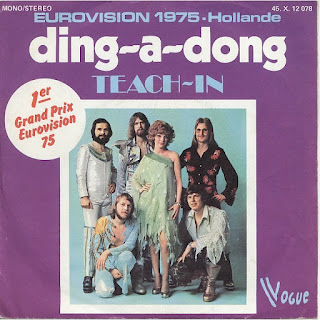
Like the UK, the Dutch glory days were the 1970s, notably when Teach-In scooped the top prize in 1975 with the quintessential Eurovision ditty ‘Ding-A-Dong’, and various other patriotic crooners snaffled second and third places. There have been another three Dutch winners all told, but you have to go right back to the 1950s and 1960s to sniff those out.

Some of the more curious names to represent the Netherlands include Frizzle Sizzle (1986), Mrs Einstein (1997), Mouth & MacNeal (1974), Hind (2008) and the curiously British-sounding Humphrey Campbell (1992). In latter years entries have tended to be sung in English, though personally I feel ‘Een speeldoos’ (‘A Musical’), ‘De mallemolen’ (‘The Whirligig’) and ‘Blijf zoals je bent’ (‘Stay As You Are’) have a certain authentic ring to them.

However, Teach-In’s strategy of using catchy but meaningless words clearly doesn’t always pay off… in 1967, Thérèse Steinmetz came last and managed only two points with ‘Ring-dinge-ding’.

The 2012 entry ‘You and Me’ by Joan Franka didn’t make the cut, which means the Netherlands have failed to make the Saturday night final for eight years on the trot. Still, so long as the boys in orange make it to the other Euro final, who cares?


Size matters... The Sweet touted the more obvious side of Glam
Last year ‘Electric Warrior’, T-Rex’s seminal sixth album turned 40. This year ‘Ziggy Stardust and the Spiders from Mars’, Bowie’s breakthrough record hit the same milestone. So I thought I’d quickly doff my spandex cap to Glam Rock, the genre that made it OK for boys to deviate musically and sartorially… and make the odd foray into their girlfriends’ make-up bags.

Of course, not all the lads were comfortable with the Glam look. Word magazine ran a picture last month of Trevor Bolder and Woody Woodmansey from Bowie’s original backing band, looking more like Men from C&A than Spiders from Mars. They revealed that Bowie’s sideman Mick Ronson hated the clothes so much, “he packed and left for Beckenham Station”. ‘The Great’ Paul Thompson, drummer with Roxy Music, former apprentice welder at the Palmers shipyard in Jarrow, was another who had something of an allergic reaction to glitter and platforms.

While Bowie, Bolan and Roxy have stood the test of time and remain hugely credible artists, I’d like to put a quiet word in for The Sweet. Unashamedly poppy, with brazenly catchy songs written by the prolific Nicky Chinn and Mike Chapman, they scored an amazing 13 top 20 hits during the 1970s, with ‘Blockbuster’ topping the charts in 1973. Though the title of highly successful 2006 BBC time-warp series ‘Life on Mars’ nods to a Bowie song, its 1970s soundtrack, tellingly enough, was dominated by The Sweet.

With it’s rejection of hippie mores and free licence to experiment, Glam paved the way for its spiky younger sibling Punk… and for that, we a have a lot to be grateful for.


By George... this looks damn familiar
I’ve just been reading a book by the celebrated US art director George Lois. Lois was not only responsible for some of the most seminal ads of the 1960s and 1970s, but his extraordinary covers for Esquire magazine are now on permanent display in New York’s MoMA. The slim volume is called ‘Damn Good Advice (for people with talent!)’, and consists of a series of illustrated lessons culled from his many years in advertising and publishing.

If you’ve read Paul Arden’s ‘Whatever You Think, Think The Opposite’ and ‘It’s Not How Good You Are, It’s How Good You Want To Be’, you’ll get the gist. It’s a collection of snappy, from-the-horse’s-mouth pointers on how to be creative. In fact, the format is remarkably similar — standard paperback size, white cover with bold black type. Inside, brutally straightforward, sometimes irreverent headlines, accompanied by a couple of paragraphs of wisdom or anecdote, and a carefully chosen image that colours or juxtaposes the point being made.

The pace is staccato and relentless. You feel you’re being hit over the head with page after page of ‘damn good advice’ — ‘Make your surroundings a metaphor for who you are’, ‘Never eat shit’, ‘A trend is always a trap’, ‘Tell the Devil’s Advocate in the room to go to hell’, ‘Speak up, goddammit!’. For full effect shout rapidly in a Noo Yoik accent.

The first few pages are fine, inspiring even. You’re thinking, right on, don’t compromise, fight the good fight, believe in yourself, stick it to the man. But as they keep coming (and coming) small seeds of doubt start creeping in. Firstly, it starts to become apparent that a lot of the ‘damn good advice’ is pretty self evident. Like ‘Don’t sleep your life away’, and ‘Don’t expect a creative idea to pop out of your computer’. You can’t argue with either, but most people will have worked this out for themselves. Unless they were sleeping, of course.

Arden fast rules... an adman’s wisdom
Secondly, if I took every leaf out of Lois’s book, I’m pretty sure my clients would run a mile. For example, he recalls a time when he stood on a window ledge and threatened to jump unless his poster idea was accepted. Or dropped the biggest book he could find on the floor when his boss was ignoring him. It’s the kind of ‘maverick’ behaviour that pervaded UK advertising in the 1980s, ‘crazy creative guys’ throwing more and more outrageous stunts to get noticed.

Of course be determined, confident and original. Of course stick up for your ideas and take inspiration from wherever you find it. And I tip my hat to Lois for his single-mindedness, chutzpah and towering achievement. But, I can’t help feeling that if there were 100s of creative people out there following this credo, we’d have mayhem on our hands. The point is, we’re all creative in different ways, and realising this is the first step on the path to originality.

‘Damn Good Advice’ is a damn good ad for George Lois, but you need to take it with a pinch of salt. Or as he might put it ‘You can't be creative if someone has to tell you how’.


It almost goes without saying that being foreman of this year’s D&AD Writing for Design jury was the next best thing to shaking Johan Cruyff’s hand. As you walked into the vaulted expanse of Olympia, with the sun shining through the latticed ceiling, it felt like you were in some kind of creative heaven — only without the blessed harps and angels. There was table after groaning table of the best work in the world, stretching off into the horizon, a seemingly endless feast of ideas and perspiration.

On our six tables, there were 70-odd entries including books, bottles, posters, mailers, annual reports, leaflets, cards, websites, three bikinis and a pair of vibrators. My fellow jurors (Nick Asbury, Fiona Thompson, Chris Doyle, Lisa Desforges, John Weich and Anelia Varela) were as keen as I was to get stuck in, to be inspired and informed, amused and amazed. But it soon became apparent that, although the overall standard was well above middling, there was very little to make the soul rejoice and the heart sing. Yes, there was plenty of perfectly accomplished, lively, well-crafted writing, but very little with the glimmer of greatness required for the pages of the hallowed D&AD Annual.

When I was around 17, I had the best pair of jeans. I wore them virtually every day for three years, and by the end of that time, there was more patchwork repair than original material. To this day I remember my mother compaining they ‘gave her the pip’, as she spent so much time sewing them up. Which sounded hilarious in her Dutch accent.

I remember they were Wrangler drainpipes, but I have no idea where they were bought or made. I liked the Ws stitched on to the back pockets — maybe it was a latent appreciation of typography which was to kick in properly a few years later. But the point is, I truly loved them, and they were always with me whatever I happened to be doing.

Frazier Crane... undisputed king of the wisenheimers
Don’t get me wrong, I’m a big fan of Twitter. It can be fun, informative, timely and even occasionally inspiring. I like the way it punctuates the day with little morsels of interest — quips, links and banter — although admittedly I’m sometimes a little too easily distracted by it.

But there’s one thing that really, really annoys me. And that’s people who use it as yet another platform for self-congratulation. Wisenheimer is an Americanism, but I was struggling to find a noun which so perfectly summed up this kind of pompous, self-regarding type. Someone who constantly has to reaffirm their greatness and superiority, who assumes the world is interested enough to want five-minute bulletins on their majestic progress. It’s the digital equivalent of the dreaded Christmas round robin letter.

At least it’s short, I hear you say. Short but incessant, death by a thousand pats on the back.


Just been doing some research into the semiotics and visual language of packaging for a piece Im writing for Uusi, the Nokia brand magazine. In the course of this rooting around, I came across some interesting stuff about Marlboro cigarettes.

Firstly, that these macho tabs were originally marketed at women back in the 1950s, real men scoffed (or coughed) at filters. They came in a soft, white packet, covered in a foil wrapper with lots of feminine script lettering.

The brand was utterly transformed in 1955, when a designer called Frank Gianninoto came up with a design that had to look good on black-and-white television. The white arrow jutting into the red space at the top was simple, bold and graphic, and seemingly never went out of fashion. But it was the new-fangled flip-top box that broke the mould, contributing to the brands built-for-the-tough outdoors image. It became an enduring symbol of Americana, and only 20 years ago was pronounced the most valuable brand in the world.

But whod have thought that the Marlboro man had had a sex change?

In his book The Total Package, Thomas Hine notes: Everybody knows, intellectually at least, that great packages dont always hold good things. But that is a truth that the best packages try to make people forget.”

Groovy Man. So here it is, the latest foray into the obscure nether reaches of graphic design by my old mate Norman Hathaway (with Dan Nadal).

You really can’t accuse Norm of tackling the obvious subjects. A couple of years ago, his brilliant book ‘Overspray’ brought us the super-slick, sexually charged excesses of 1970s US West Coast airbrush art. And now, ‘Electrical Banana’ takes us on an LSD-fuelled journey into 1960s psychedelic art, “the look that defined a decade”, according to the blurb.

He may be right … Any Beatles fan will already be familiar with the trippy, exaggerated comic book aesthetic and garish tapestry-like landscapes of Heinz Edlemann, the illustrator behind Yellow Submarine. But the work of the other six artists, whose shared influences are apparent, seems strangely resonant too. Generously illustrated, with insightful interviews, this is a rare and fascinating glimpse into a colourful lost world of sex, music, mayhem and mild peril. And look out for the introductory Q&A featuring Macca himself, offering his take (or should that be toke?) on the psychedelic era.

From the inside flap:
Heinz Edelmann... a pre-release drawing from Twen magazine

The artists include MARIJKE KOGER, the Dutch artist responsible for dressing THE BEATLES; MATI KLARWEIN, who painted the cover for MILES DAVIS’ BITCHES BREW; KEIICHI TANAAMI, the Japanese master of psychedelic posters; HEINZ EDELMANN, the German illustrator and designer of the YELLOW SUBMARINE animated film; TADANORI YOKOO, whose prints and books defined the '60s in Japan; DUDLEY EDWARDS, a painter, car decorator, and graphic embellisher for the London scene, and the enigmatic Australian MARTIN SHARP, whose work for CREAM and the underground made him a hippie household name in Europe.

Electrical Banana
By Norman Hathaway and Dan Nadal
Damani
£17.55 on Amazon


Remember the Higsons, spiky purveyors of ‘funk-punk? Back in the 1980s, studying publishing at the London College of Printing, I was a huge fan, avidly following their progress in the NME and buying every single the day it came out.

And then this great silk-screen poster appeared on the LCP refectory wall. I was too law-abiding to pinch it myself, but luckily a friend of mine was more than happy to do the deed on my behalf. Just call me ‘the Don’.

Ever since then, frontman Charlie Higson has been something of a hero. He just kept popping up everywhere producer, performer, comedy writer, Vic and Bob, Fast Show, Have I Got News For You, QI, and many more. And now my boys are huge fans of his Young James Bond and vampire books. A prolific and versatile talent.

Some 30 years later, it turns out we have a mutual friend Andy Altmann of Why Not Associates. Earlier this week, I told Andy about my coveted poster, and he forwarded this pic on to Charlie. His response “Wow. that’s a lovely poster wish I had one!

Probably the only time Charlie Higson will be envious of me.

I’m delighted to have been asked to be foreman of D&AD’s Writing for Design jury this year. On 16 April, I’ll be getting together with friends and fellow copywriters Nick Asbury, Lisa Desforges and Fiona Thompson, as well as John Weich of Lemon Scented Tea and Interbrand Sydney’s Christopher Doyle, to look over likely contenders.

It struck me that I should get my thoughts together and set down a marker ahead of the judging. Not only what I’ll be looking for on the day, but what I believe it takes to be successful in the writing for design world. So I’ve put together a 12-point ‘manifesto’ based on my personal observations and experience. Some points are pretty obvious, others maybe less so, but I hope they add fuel to the debate around this particular form of writing. Feel free to agree or disagree.


A writer’s dozen
Jim Davies’ 12-point manifesto on writing for design


1— Remember, all designers are different
There are some designers out there who really can write. There are others who appreciate good writing when they see it. And then there are those who can’t and don’t. The level of dyslexia among designers is astonishingly high — that’s probably why they’re designers and not writers. So the way your writing is perceived and received depends on not only how good it is, but who you’re dealing with. Maybe your words will transport the reader with unfettered delight, but on the other hand, be prepared to explain yourself or fight your corner. Just bear in mind that different designers (and clients) have different expectations and perspectives.

2— Know your place
A lot of writers moan about words not being given the respect they deserve. But they are missing the point. Good words deserve respect, bad words don’t. Besides, you can’t expect to be the star of the show in every performance — different design projects involve major or minor roles for the writer. You need to establish the part you’re expected to play from the outset. If you’re Hamlet, grab the opportunity with both hands. But if you’re Rozencrantz, make sure it’s a Rozencrantz to remember. And certainly, don’t let Guildenstern get a look in.

3— See your words
If a woman in a boilersuit and a man in a tutu utter exactly the same words, the effect is completely different. So before you start writing, it’s important to visualise what your words will look like when the reader sees them. How will the text and images relate to each other? What typeface will they be set in? What’s the format and medium? Too often, words and visuals inhabit the same world but look in totally different directions. Whereas they should be embracing like childhood friends.

4— Be yourself…
Of course you should be able to modify your tone and adopt different voices. One of the joys of writing for different brands is slipping into a variety of personas and being someone else for the day. But it’s also worth remembering that you’ve been asked to contribute for a reason — because the client wants a piece of you. Something about your personality or writing style has made an impression, otherwise they’d have asked someone else to do the job. Be a chameleon, by all means, but don’t be invisible.

5— …but don’t take it personally
No matter who you are, your drafts will be rejected and your best lines will be cut. You’ll be asked to write the same sentence over and over before the client decides he likes the first one best after all. Days will be long, repetitious and frustrating. You’ll have occasion to feel ignored, bullied and belittled. But most of the time, this will have absolutely nothing to do with you or the quality of your work. So you just need to keep smiling and do what you do until the sun comes out again.

6— Keep a lid on it
Too many punch lines can leave the reader punch drunk. Just like a good joke, writing for design is all about rhythm and timing, keeping it natural, not trying too hard. No one likes a show off, so try to curb your instinctive lexical dexterity. Of course, the odd clever analogy or deft turn of phrase doesn’t go amiss, but context is all. Think of a Paul Smith suit — impeccably tailored, but with a perfectly judged twist. Be disciplined, but know the precise moment to let go.

7— Be a stickler
When I worked on newspapers and magazines, there was a small army of sub-editors and fact checkers to make sure everything I wrote was correct — right down to the last dotted i. But writing for a brand or design company, the buck stops with you. You can argue as much as you like that spelling, grammar and punctuation don’t really matter anymore, but research has shown that a single spelling mistake can cut a website’s online sales by half. Punters equate shoddy spelling with shoddy service. It undermines your client’s credibility, making them look inept and even dodgy. So whether you like it or not, it’s your job to stop those typos in their tracks.

8— Break rules for a reason
Heeeey, I’m such a linguistic rebel. ‘And’ is my favourite way to start a sentence, and if there’s an infinitive around to mercilessly split, I’m your axe man. I’m not some kind of Trussed-up grammarian, but it’s almost become a rule to break the rules. Casual flouting is so commonplace that any impact or interest has long gone. It’s like swearing — do it all the time and it just wafts unnoticed into the fuggy atmosphere of expletives. Choose your moment carefully and it cuts like a blade. Sure, break the rules… but when you do, make it count.

9— Keep your distance
Call me old fashioned, but I like a bit of formality. I may not insist on being called ‘sir’ in a restaurant, but ‘are you guys ready to order?’ sticks in my craw. Similarly, the kind of ‘chattytastic’, over-familiar brand writing that’s become prevalent over the past few years is really starting to rankle. It’s like some irrepressibly cheeky chappie you’ve just met down the pub plonking himself on your sofa and telling you what you should be watching on TV. Too much of this writing is cocky, presumptuous and downright annoying. We keep being told that the modern consumer is a highly sophisticated creature, so maybe it’s time to show a bit of class and restraint. You know who you are.

10— Don’t jettison jargon
Once upon a time, I thought the merest whiff of jargon was unacceptable. If a word couldn’t be understood by the ‘man in the street’, I consigned it to the gutter. Often this meant using three words instead of one, or writing a really clunky sentence for the sake of common parlance. But actually, I’ve come to realise, it’s all about audience. If you’re writing for carpenters, call a skew chisel a skew chisel. A sailor will know what a baggywrinkle is. And similarly, if the business community feel comfortable with their resources and collateral and bottom lines, they can have them (up to a point). Only I draw the line at ‘leverage’.

11— Cut yourself short
I’ve tried to keep each of these segments to eight sentences or less. Any more would be a bore. Remember, commercial writing is uninvited and usually unwanted, people are time-starved and impatient. You need to make your point as quickly, convincingly and charmingly as possible. Preamble and mood setting are generally a luxury. Say what you need to say in as few words as possible, and say it well. Edit, edit, and then edit again.

12— Work, don’t shirk
This may sound a bit homespun, but you’ve got to put in the hours. In his book ‘Outliers’, Malcom Gladwell actually puts a figure on it… 10,000. That’s 20 hours a week for 10 years — just what the Beatles did. No matter how naturally talented you are, you need to hone and perfect that rough diamond until it shines like the Koh-i-Noor. The best writers for design are slightly obsessive types — brutally self-critical, they agonise over the small details, and are never satisfied with their work. If they’re not putting a shift in for clients, they’re busying themselves with personal projects. You’ve got to really want it, because if you don’t, someone else will. 

Museum piece... there's life in the old bag yet
On Wednesday, totalcontent tied a few goodies into a polka-dotted hanky and headed off to Oxford. First stop was the Ashmolean Museum where we spent a couple of happy hours among the old stones, ancient jewellery and rarely seen words like canopic and gneiss*.

Museum gift shops are almost as interesting as the endless lines of cabinets themselves. In these public funding-starved times, they play an important role in generating cash, so they really need to know their market. First they need plenty of kid-friendly stationery — colourful branded rubbers, rulers and pencils. Printed ephemera next — books, postcards, posters, and the like, featuring the museum’s greatest hits and special exhibitions.

After that you’re getting into the slightly dangerous territory of gifting — mugs, plates, scarves, key rings, puzzles and so on. Some can carry off a reproduction of a grizzled statue or detail from an Old Master… others just look contrived and tacky. Water-lily print tie anyone? Baseball cap with King Tut logo? Perhaps not.

But there was something that caught my eye in the Ashmolean shop. They’d taken a leaf out of Freitag’s book and produced a small range of up-cycled bags from the huge canvas exhibition banners that once advertised forthcoming shows. I loved the way these feature random fragments of type and imagery, each one unique and slightly weathered. And it seemed somehow appropriate that a museum should be reinterpreting the past.

*In case you’re still wondering what gneiss means, it’s a type of metamorphic rock used for ancient Egyptian statuary.

Italian lesson... shared tastes, better results
So here it is, totalcontents very first foreign word of the week. Even if your Italians a bit rusty, youve probably figured out that antipatico* means roughly the opposite of simpatico, a word thats become common English parlance over the past few years. I say roughly, because actually it means “unpleasant, odious, unsympathetic or crabby”. But then, if someone fits that description, its highly unlikely youll be simpatico with them.

Recently Ive been finding that in a work context, like-mindedness is a real blessing. Of course you should be open, co-operative and respectful, whoever youre working with. But if you share similar interests and cultural reference points, its a real bonus and will only make for a better working relationship. It means you can develop a deeper understanding more quickly, youre more likely to enjoy each others company and be thinking along the same lines. 

But if youre antipatico, you simply wont be ordering from the same menu.

*Thanks to Paula at Form for introducing me to the word on Wednesday.

Damon Albarn clearly has his hands full collecting lifetime achievement BRIT awards and preparing for Blur’s Hyde Park show to mark the closing of the Olympics this year. (Or maybe he’s hastily booking some singing lessons.)

Anyway, it’s good to see Gorillaz collaborator and comic-book artist Jamie Hewlett is keeping the wolf from the door too. We particularly loved his quirky, inimitable London-thru-the-ages Absolut Vodka bottle design (available exclusively from Selfridges). And you can be sure my eldest will be saving his pennies for a pair of these limited-edition Gorillaz Converse All Stars. The business, if we may be so bold.


Most of the time, you complete a writing project and that’s the end of it, your words disappear off into the ether… but occasionally it’s good to know they’re out there actually doing the business for someone — quite literally.

Two brands we worked on a couple or so years ago fared well at this week’s DBA Effectiveness Awards. Chewits won a Silver in the Interactive & Digital category, while Bottle Green struck Gold in Packaging.

Port or starburst? You decide
While there’s been a recent a boom in niche independent magazine publishing, it appears to be  ‘time gentlemen please’ for the so-called ‘lad mag’. Loaded, which epitomised the 1990s phenomenon, reported a 30.2% year-on-year drop in sales, down to a paltry 34,505. At its height, 20-odd years ago, the title was selling over ten times that amount, at around 450,000 copies a month.


Mind your own biscuit... retrotastic packaging from Crabtree & Evelyn
Better late than never. Here's a project that I worked on with the wonderful Kate Shaw, Global Creative Director at Crabtree & Evelyn quite a few months ago. The words I contributed are pretty minimal, but I love the mad abandon of the packaging. Those flying Highland cattle on the shortbread pack in particular. The design was by Smith & Milton, but if the imagery looks familiar, that's because it had been used before back in the 1980s. This was C&E reestablishing its heritage by delving into its rich visual archive.

From Mark Farrow to Peter Saville, two designers from the same Factory. In the light of this week’s shenanigans at the FA, I though it would be worth revisting Saville’s recent redesign of the England football shirt. If you recall, the former Creative Director of the City of Manchester took the bold step of introducing some colour to the national team’s traditionally pristine white kit.


I dont know how Mark Farrow does it. Year after year, he produces standout graphic design, sweeping young pretenders aside in his majestic wake. If anyone wants a lesson in immaculate modernism, they should look no further than Format, his latest collaboration with pop stalwarts Pet Shop Boys.
Strip off the old block... Farrow pulls another rabbit out of the hat
A collection of obscure B-sides and rarities spanning 1996 to 2009, Mark has used the coloured spines of the original release formats to inform the stripy illustration on the cover. A graphic device, of course, that harks back to previous PSB releases, notably 1998s Introspective and 2008s Yes.

(By the way, there are some great song titles on Format The Truck Driver and his Mate, Sexy Northerner, Were All Criminals Now, I Didnt Get Where I Am Today, and Gin and Jag.)

Like Peter Saville at Factory Records or Vaughan Oliver at 4AD, a long-standing, hugely productive relationship has helped Mark develop a formidable house style for PSB. But its his perfectly judged graphic restraint and ferocious attention to detail that always sets the work apart. Design critic Adrian Shaughnessy believes Farrow was the first record sleeve designer to master the art of designing for CD, a bold but justifiable claim.

I was lucky enough to get to know Mark in the 1980s, just after hed come down from Manchester and was working in a small studio above a shop in Neal Street, Covent Garden. At the time, he was working closely with restauranteur/entrepreneur Oliver Peyton (still a client) on press ads for Sapporo Japanese lager. It struck me that Marks work is like sushi – delicate, dextrous and extremely tasty.

After a 20 year hiatus, I’ve invested in a new needle and some cleaning fluid, and started buying vinyl again. The first thing you notice is the sky-high price — around £20 for a new album, as opposed to £9 for a CD or £7 for a download. But you forget how much richer and more satisfying the whole experience is.

The vast expanse and beauty of the sleeve; the ritual of undressing the black stuff and placing it in the turntable; the indulgence of listening to a whole side as opposed to the usual fickle flicking from song to song. You actually listen to the music rather than consume it. You give it more attention, approach it with far more generosity of spirit.

And I’m lucky that there’s a half decent Oxfam Books and Music store near me. Last week, seemingly waiting for me, were two of my favourite-ever albums — Stevie Wonder’s ‘Songs in the Key of Life’ and ‘Innervisions’. I’ve never owned them on vinyl before, as I didn’t have much opportunity or cash to buy records when I was at school.

Written discreetly in biro inside the gatefold of ‘Innervisions’ is a date — ‘3 March 1975’. There’s something terribly touching to know that this physical artefact meant something to someone out there, that there’s a story attached to it. It’s been very well looked after, I can tell you that much.

Have a think about that next time you download 89p’s worth of soulless music data from iTunes.

Wonderwall... what goes around comes around

It was Burns Night on Tuesday, so here are some musings on haggis.

South of the border were all a bit sceptical we have a suspicion that these grungy-looking brown balls contain something vaguely intestinal. Perhaps theyre distantly related to a black pudding.

Or so we thought. In fact, haggis ignorance runs far deeper. A 2010 survey by takeaway service Just-Eat.co.uk revealed that 18% of Brits believe haggis is a small beast which roams the Highlands. Another 15% hazard that its a type of Scottish musical instrument, while 4% plump for a Harry Potter character. Some 800 of the 1,623 people interviewed were Scottish, and 14% of them had no idea what a haggis was either (oh the shame).
A flavour to savour... if you’ve got the stomach for it
In fact, the venerated haggis is a concoction of sheeps heart, liver and lungs minced with onions, oatmeal, suet and spices, all stuffed into a sheep stomach. As the 2001 English edition of the Larousse Gastronomique puts it, Although its description is not immediately appealing, haggis has an excellent nutty texture and delicious savoury flavour.

And it is utterly Scottish unlike a few other national icons we could mention.

I researched and wrote the following for the 2009 Royal Mail Year Book, and it appeared in a celebratory chapter on Burns (although the last sentence didn’t make the final edit):
THE REAL MCCOY?
 Theres nothing more Scottish than whisky, is there? Its called Scotch, after all. Actually, whisky was originally invented in China, and was distilled by 15th-century Irish monks before finding its way to Scotland some 100 years later.
 And get this kilts, tartans and bagpipes may not be entirely Scottish either. Theres some evidence that kilts originated in Ireland. Tartan cloth was unearthed in Hallstatt, upper Austria, some of which date to 1200 BC, while 3000-year-old tartan-wearing mummies were found in a Chinese desert. Some historians believe the first bagpipes came from Sumaria.
 Recent genetic studies show that the mutation for red hair may have originated in Central Asia too.

It’s a strange time for luxury brands. Of course they want to be seen out and about as usual, but flaunting it too brazenly could be deemed bad taste in these straitened times. Hence the notion of ‘stealth wealth’, a phrase I came across for the first time this week working for (you guessed it) a luxury brand.

It’s the idea that you’re so utterly comfortable in your millionaire skin that you’re happy to draw a discreet veil over what you’re worth. With your mahogany tan and slightly grizzled sideburns, you dress down in pastel polo shirt, pressed chinos and artfully distressed deck shoes. You may eschew San Tropez, Costa Smeralda, and the other more flashy-trashy Euro hotspots, but you still find a way to quietly enjoy the finer things in life.

Plane sailing... may you be stealthy, weathly and wise
Oddly, the word ‘stealth’ also cropped up on BBC2’s ‘Stargazing Live’, the astronomy programme fronted by the rather unlikely double act of pop-star-turned-professor Brian Cox and physicist-turned-comedian Dara O’Briain. Cox observed that UFO sightings suddenly changed from the traditional flying-saucer shape to triangular after the US military’s introduction of the Stealth Bomber in 1997. But I was probably more intrigued by the thought that they might actually have a Pentagon employee responsible for naming. Or perhaps they draft in the Central Naming Agency (CNA)? Whatever, hat’s off... it’s brilliant.

There’s something wonderfully onomatopoeic and sneaky about the word. It’s redolent of underhandedness and skulduggery. Maybe it’s because the first five letters spell ‘steal’, and you almost seem to be telling someone to ‘shhh!’ when you say it.

Well, probably time to make a stealthy exit.

ace in the hole.


Looking for the perfect Valentines Day gift for the designer man in your life? Something with a bit of sauce but not too much cheese? Never mind the bollocks, heres the Sex Pistol stretch boxer trunk from Bjorn Börg. You dont have to mind your Ps and Qs in these beauties. Just the job for well heeled-punks and anyone whos read Simon Garfields Just My Type. And available until stocks last with 40% off at www.underu.com. New balls please.

Great news, HS2, the new £32m high-speed railway is going full-steam ahead. There’s nothing like progress, I always say. No one can ever call me a NIMBY again, because, whether I want it or not, it’s going literally right through my back yard — about 500 metres away, in fact. It’ll be great… whenever I’m dozing off, editing some turgid copy, a proud symbol of 21-st century Britain will zip past and wake me from my stupor. And regular too, every four minutes, I’ve been told. Just think of the productivity, the positive effect on the GDP.

I’ll cheer and wave when the Birmingham fat cats purr by in a flash of wheels and steel. I may even hoist my best red knickers on a stick like Jenny Agutter in the Railway Children. And I’ll do the same when London mob crash past the other way — although I have a feeling that won’t be quite so often.

A consultation paper of 55,000 people almost unanimously disagreed with everything about the new line. But what do they know? — this will make Britain great again. Though perhaps there’ll be a few less furry creatures and green bits than we used to have.

We’ve been railroaded, no question.

Train drain... not so much a white knight as a white elephant  

The Design Museum this week announced its longlist for  ‘Designs of the Year’. Maybe their description of these awards as the ‘Oscars of the design world’ is pushing it, but the five-year old-scheme comes with enough glitter and gravitas to mean people sit up and take notice.

There are a couple of things that set Designs of the Year apart. 

Firstly, you cant enter work you have to be chosen by a panel of experts. The names of these wise heads havent been revealed yet, but they are usually desperately starry types from different corners of the design universe (and last year, Will Self). The nominations are, as usual, mind-blowingly diverse from Hopkins Architects 2012 Olympic Velodrome, to the BBC websites latest home page, to the Duchess of Cambridges McQueen wedding dress.

Next, its really international buildings in Haiti, Japanese fashion, German furniture, US magazines. Last years winner was Samuel Wilkinsons sculptural Plumen Lightbulb 001, dubbed the worlds first designer eco-bulb. In 2009, Sheperd Fairey’s ‘Hope’ Barack Obama poster got the vote.

Finally, Designs of the Year has its own six-month long exhibition at the Design Museum, running from 8 February to 15 July. Now thats what you call exposure.

So it was with some delight that I found out that three designs close to my heart have made it on to the longlist. Here’s my totally biased opinion, and part in their success (just kidding).

1 Mark Porters iPad app for the Guardian.
Impeccably considered, and downloaded nearly 150,000 times in its first week of release, this sets a new standard in ‘newspaper’ apps. Mark is an old mate of mine — I worked with him many years ago on a design and advertising magazine called Direction, where he was art director. He then went on to greater things, most notably becoming CD of the Guardian and overseeing its redesign to Berliner format in 2005. More recently, I helped craft some words for Mark Porter Associates website, which are going live soon.

Apps off... digging Mark Porter’s digital design  

2 Why Not Associates’ Comedy Carpet in Blackpool.
A collaboration with artist Gordon Young, this beauty was five years in the making and lies in the shadow of the famous Blackpool Tower. It is an exquisitely realized, 1880-square-metre typographic compendium of jokes and catchphrases, cut from solid granite or cobalt blue concrete, arranged into over 300 slabs and then cast into concrete. Lovingly set in the style of a traditional music-hall style playbill, the ‘Comedy Carpet’ is an example of accessible graphic design at its very best. It’s already (and deservedly) picked up the Grand Prix at the prestigious Tokyo Art Directors Club. Ive known Andy Altmann and David Ellis who founded WNA for over 20 years, and collaborate with them fairly regularly (though unfortunately not on this one).

Cutting a rug... Why Not Associates and artist Gordon Young have a laugh in Blackpool

3 Nokia Pure typeface by Dalton Maag
Nokia is my main client at the moment, so Ive been working closely with this font for six months now. I interviewed typographer Bruno Maag about the design process for Uusi, the Nokia brand magazine, so Im fully aware of the effort and rationale behind it. At first I thought it might be a bit safe, but now Im starting to see little quirks and subtleties that I hadnt noticed before. Its definitely grown on me.
It’s a Maag world... purity of idea and execution

I wish everyone good luck on 24 April when the winners are announced. But especially these three.