Another Royal Mail commission for Jim, this one a stamp presentation pack marking the issue of definitive stamps for the London Olympic and Paralympic Games in 2012.

Jim’s pack commentary considers the Games’ broad visual identity and how this reflects its ambitions for inclusivity and legacy. It explores the background and varied application of the much-debated Wolff-Olins designed emblem. It looks back to the circumstances and high points of previous London Olympics. And it picks out classic logos from the past — including every graphic designer’s choice, Otl Aicher’s black-and-white crown of rays for the Munich Olympics of 1972.

The pack was designed by Dana Robertson of Neon Creative, our first collaboration with the former Partners CD. The Olympic and Paralympic definitive stamps will be available from January until the end of the Games in July. And you can buy a copy of the presentation pack here.

My Private View columns in ‘Design Week’ occasionally touched a nerve. In December 2008, I berated the laziness and impersonality of e-Christmas cards. A student of sustainable design called Harry Wilson got particularly hot under the collar accusing me of an “archaic way of thinking” in the following week's letters page. Perhaps the line “to hell with deforestation” was a step too far, but of course my tongue was firmly placed in my cheek when I wrote it.

Top trunks... this year’s retro pick, courtesy of Oxfam

It was unfortunate too that one of my then best clients sent me an e-Christmas card between the time of filing the article and publication. For some reason they went pretty quiet on me in 2009.

On twitter yesterday, fellow copywriter Nick Asbury came up with the neologism “Sanctimoanemail: (n) An email sent to say you’ve donated to charity the money you would have spent on an environmentally unsound Xmas card.” And it’s exactly that kind of public outpouring of smugness (environmental or otherwise) that really sticks in my craw.

Personally, I love the annual agony of finding the right off-the-shelf card for friends and designers, or designer-friends. Something typographic or ironic, simple or amusing that stands out in the racks of predictable festive fodder. Back in the day when I had world enough and time, I used to design and make my own. A miserable-looking Bryan Ferry in a Santa hat with the line ‘Ferry Christmas’ was an instant classic.

And it struck me as I wrote my (recycled charity) Christmas cards last week that it’s the time you devote to writing them that’s important. Two minutes or so thinking about your friends or colleagues, is two minutes of silent communion. You’re with them in spirit, remembering your shared past, the times and projects you had in common. Stained-glass stamps, coloured envelopes and stuffing cards into an overfilled post box just before the last posting date are an essential part of Christmas.

You can’t compare it to just pressing send. ’Scuse my archaic way of thinking.

Back in October, totalcontent helped Nokia Design with the words for an absorbing exhibition called ‘People Made — Nokia Products that Changed the World’. It was held at the Design Museum in Shad Thames, London, and will form the basis for a larger event in Helsinki as part of the city’s World Design Capital celebrations in 2012.

As well as the catalogue, invite and posters, we wrote all the explanatory texts that appeared alongside the exhibits. These included large illuminated panels describing Nokia’s most iconic, breakthrough phones, and explaining why they made such a huge impact at the time of their release. We had to keep things suitably short and entertaining, but at the same time pin-point why and how these products were technologically significant. Our text also explored the four main themes of the show: mobility, patterns, sustainability, and craft.

This is the latest in a series of wonderfully simulating projects for Nokia we’ve helped with over the past few years. Most are covered by NDAs, so we can’t talk about them, but we’re hoping that one or two more will emerge from the woodwork soon.


For the second year on the trot, Jim has written the Royal Mail Year Pack. In case you didn’t know, this is the sprightly baby brother of the Royal Mail Year Book, and tells the stories behind the stamps in super-condensed form (click on the image for a closer look). For 2011, the typically eclectic subject matter included Gerry Anderson’s supermarionation series, William Morris, Musicals, Thomas the Tank Engine and the House of Hanover, all conveyed in a 100 or so words. The Year Pack was designed by our old friends Why Not Associates, and you can get your hands on a copy, which includes all the year’s stamps, here.

Jim also conjured up the introduction and design stories for the more substantial Year Book, designed with some aplomb by the super-talented Magpie Studio. He’d previously authored six entire Year Books, but this year Royal Mail decided to invite eminent subject experts to contribute individual chapters. Year Books are available from Royal Mail’s website.

Magazines, book covers, posters, press ads, annual reports, brochures, children’s books, design criticism, photography. There was little in the world of the commercial art that the late US designer Paul Rand couldn’t turn a brilliant hand too. This is an insightful, well-paced, well-informed book on the man and his work, beautifully presented and generously illustrated. If you’re looking for superb graphic design history or serious inspiration, you couldn’t do much better.

By Stephen Heller
Phaidon
£16.46 on Amazon

I must admit, I’ve been sorely tempted by a MassimoVignelli Stendig calendar for some time. Designed in 1966, it’s still the most brutally beautiful thing imaginable. You can just picture it hanging artfully on the exposed brickwork of a Shoreditch warehouse studio. But at 3 by 4 feet, you need some serious wall real estate to accommodate it. And I can’t help thinking this huge expanse of paper is less than eco friendly, even though the makers playfully suggest you use the discarded months as wrapping paper.
Stendig alone: Massimo by name, massive by nature

The alternative is the slightly more adventurous Pentagram calendar (though it’s actually designed by alumnus Kit Hinrichs). This keeps the same format, but rings the typographic changes each year, and will feature examples of vernacular type for 2012. It comes in two sizes, so it’s more manageable, but you can’t get hold of it in the UK, and shipping charges from the US are astronomical.

Let’s year it for Pentagram’s moveable typographic feast 

For these reasons, I’ve plumped for the book-like Typodarium calendar (available on Amazon for £14.76) this year. You can keep it plonked horizontally on your desk or hang it up vertically. I’m not sure how useful it will be as a calendar, but it features a different typeface for each day of the year, along with information on the back. And you can keep the torn off pages in a handy box to peruse at your leisure. As you can probably tell, there’s ever a dull moment around here.

Every day’s a bit different with Typodarium

You do judge a book by its cover shock
I know, I know... I’ve been a bit remiss about posting a regular Private View column without Lynda to badger me anymore. Pressure of work and all that. But here’s a piece on US author and journalist Malcolm Gladwell’s ‘Blink’ and the effect rapid cognition might have on our appreciation of graphic design. Look out for my next Private Blog in early December. 

Admittedly, I cottoned on Malcolm Gladwell’s ‘Blink’ rather late in the day, but the instant I saw it winking at me on the charity shop bookshelf, I’d made up my mind. To be honest, I had little inkling about its subject matter and was just taking a punt on the basis of the cover and few of the good man’s articles in the New Yorker. This, and the fact that at a princely £1.10, I had little to lose.

In case you’re unfamiliar, ‘Blink’ puts the case that first impressions are often valid. Just like mine were in the charity shop. In fact, there are many cases where your initial instincts may be more worthwhile than months of painstaking research. These, the author argues, can just muddy the waters.

Gladwell pieces together various scientific studies, interviews and news stories to make his case. He speaks to top car salesmen and eminent psychologists, military strategists, archaeologists, food tasters and the police. And his findings are weirdly fascinating — he discovers that in given situations, our unconscious minds can ‘thin slice’ exactly the information we need. Instinctively, we ditch all the clutter and extraneous stuff and get straight to the nub. It’s only when we start to analyse and weigh up the pros and cons that all the muddle and uncertainty kick in.

First of all, a word about Gladwell’s writing. On the face of it, this isn’t the sexiest of subjects. You’d stomach a 1,000-word article, perhaps, but not a whole 260-page book. And yet, he manages to make you want to dig on and get to the bottom of the conundrum. His prose is easy yet detached, always insightful, occasionally funny. He never blinds you with science or over intellectualising. Like a good TV documentary, he seems to know when to remind you of salient points and previous examples.

However, I really wanted to look at Gladwell’s ‘Blink’ theory from another angle — the context of graphic design. And to suggest that we’ve made our mind up about a piece from the split second we see it.

In the case of posters or street messages, it’s likely that your first impression is your only impression, so clearly that’s true. But even when the viewer is taking in something at leisure, it’s the very first sighting that sets the tone and colours the attitude from then on. You’re more likely to start reading an unfamiliar book from a table-top display if the cover grabs you. Or persevere with a website if the look of it pleases you (particularly when your broadband’s playing up). If someone hands you a groovy business card, you’ll probably feel better inclined towards them than the person who hands you a dull one.

Instant Wim... one look at Crouwel is enough
Superficial? Well, not according to Gladwell. Our first impressions are actually quite sophisticated. They’re built from our previous experiences, and the copious mental notes we’ve taken over the years. (They can also harbour our fears and prejudices, but that’s another story). Called into action, these sparks from our past compute and react in a snap, and most of the time they’re bang on. But when we stop to ask ourselves ‘why?’, that moment of subconscious magic disappears.

In exactly the same way, our taste is learned, but becomes second nature over time. So our first response to a piece of graphics is really quite profound. Which probably accounts for my perennial experience of design awards judging… however many times you go round the houses, you always seem to end up with the same opinion you struck in the first place.


More than a glimmer: a memory like an elephant
I confess to being a sucker for a rock biography — the excess and schadenfruede are irresistible. Every year I take one on summer holiday, and 2011 was no exception. Shunning the anticipatory delights of Michael Bracewell’s ‘Roxy: the Band That Invented An Era’, and Chris Salewicz’s ‘BobMarley: The Untold Story’, I was drawn the hottest new bio on the block. That’s right… Keith Richards’ ‘Life’.

At 600-plus pages, it’s a bit of a doorstop, but it certainly didn’t disappoint. On the back cover, Keef archly informs us “Believe it or not, I haven’t forgotten any of it”, and to be fair, he’s very sharp on the early years, though fuzzier as time wears on. The book splits roughly into three: childhood, forming the band and success; the lost, drugged-out years; settling down, family life and Rolling Stones the brand.

The writing is credited to the man himself (with James Fox), and clearly there’s a lot of transcripted material in here, because you can really hear Keef speaking. What comes across is someone who’s hugely dedicated to what he does (at times the book gets deeply technical about guitar playing), and always wears his heart on his piratical sleeve. He’s surprisingly funny, open, self-deprecating and intelligent. And although he runs out of steam at the end (and starts dishing out recipes for bangers and mash), this is right up there with the best in genre. Actually, you’d expect nothing less.

well connected.


And another book cover. This for journalist and all-round wit Craig Brown’s ‘One on One’, a book of unlikely meetings and connections. (Terence Stamp advises Edward Heath, Frank Lloyd Wright designs a house for Marilyn Monroe, that sort of thing). Brown calls it a daisy chain of 101 true encounters, each 1001 words long. Sounds not unlike a 26 project.

Who’s zooming who?
The dust jacket is a lovely typographic doodle in black and orange, wrapped all around the book with different styles of arrow linking the various protagonists. It captures the idea of ‘six degrees of separation’ perfectly. The print appears to be letterpress (though I think it’s actually a clever simulation), so it has a lovely tactile quality and is rather beautifully done. I searched high and low but couldn’t find a design credit. Makes a change, in my line of work, it’s usually the writer who gets overlooked.

Nothing better than a sweater
This little beauty goes to prove you don’t have to be a brilliant illustrator to come up with a brilliant book cover. You just need a strong, graphic idea. Designer William Ruoto clearly knows his Peanuts, and has come up with a neat, punchy wrapper for this recent biography of evergreen cartoonist Charles M Schulz. The homage typography is carried on inside.

Stone Foundation have been plying their tight Mod/Soul sound around the Midlands for around 10 years now, building a loyal following. And they may well be about to move up to the next level, with a confirmed date at Wayne Hemingway’s Vintage Festival next week and a coveted support slot on the upcoming Specials tour.

Joe ‘Pep’ Harris: who are these guys?


But last Friday night at Cox’s Yard in Stratford was all about Joe ‘Pep’ Harris, flown in from Detroit to front the band for a mind-blowing set of soul standards and floor stompers. Stone Foundation — supporting themselves, so to speak — warmed the place up nicely, but when Joe sauntered on in his immaculate, all-white safari suit, the temperature soared.

Even at 70, there’s an extraordinary raw power to his voice. From the moment he hit the first notes of ‘Papa Was a Rolling Stone’ (which he’d cut with the Undisputed Truth before the Temptations), you knew you were in for a rare treat. Looking slightly constrained on a tiny stage, Joe effortlessly moved from sweet-sweet soul to deep-down funk, clearly impressing the band as much as the audience. Highlights were the dramatic ‘Smiling Faces Sometimes’ and the full-on ‘Hole in the Wall’.

The Undisputed Truth: I’ll have to wear a bit of make-up, you say? 


A bit of background on the mighty Joe… after singing with The Preps and The Ohio Players in the 1960s, he moved to Motown to become the voice of the Undisputed Truth in the 1970s. This was producer/songwriter Norman Whitfield’s so-called ‘psychedelic soul’ experiment, which lasted eight years and 10 albums.

Catch him while you can, he’s a true talent.

In his first post-Design Week Private View, Jim Davies considers his relationship with Amsterdam, and how this squares with the Dutch perspective on design.

I’m always threatening to spend time in some of the great European cities — Florence, Barcelona, Berlin, Vienna. But somehow, when it comes round to it, I end up back in Amsterdam.

I’ve never actually lived in Holland, but because I’m half Dutch, I’ve visited the country virtually every year since I was born. The canals and bikes, the cobbled streets and low skyline, the cadence of the language, are both familiar and exhilarating. And of course I drool over the vernacular graphics, the street posters, local packaging and shop signage. Around every corner there’s déjà vu, I hear echoes of my childhood, remember my mother, feel a real or imagined connection with my forbears. Even in doing the most mundane things, have an almost spiritual experience.

Bridging the gap: View from our hotel window, The Toren on Prinsengracht


To me, that’s something deeper and more precious than traipsing round the most wonderful cathedral or art gallery in one of the more rarefied European capitals. And because I now know the place reasonably well, I’ve moved beyond the obvious — the Museumplein, canal boat cruises, Anne Frank etc — and have started to explore the next layer down, revelling in the quirkiness of the place, embracing its peccadillos and peculiarities, coming to understand why it is what it is.

Hello boys: The peccadillos and peculiarities of Amsterdam windows


It struck me that my evolving relationship with Amsterdam has similarities to the way the Dutch view and explain design.

Design is such a nebulous term, it can mean virtually anything we want it to. The word can be used in relation to a CD cover or an Airbus, a city signage system or a chair. Ask a hundred people to define it, and you’ll dredge up a hundred and one different answers. The extra one being from the person who couldn’t quite make his mind up.

For most non-practitioners however, design implies a surface sheen or prettification — anything from the cod-Georgian flounce Lawrence Llewelyn Bowen might dream up for one of those tiresome home décor TV shows, to the garish colourways on the latest pair of Nikes.

In Holland — perhaps to counteract this one-dimensional response — they have settled on two words for design (three if you include the English word, which is also in common usage.) The first is vormgeving, which literally means ‘to give form’, and refers to the more aesthetic side of design — making things pleasing to the eye and desirable. The other is ontwerpe, which is more about function and making things work properly — the less glamorous but essential nuts-and-bolts aspect of design.

It’s not exactly form and function, but not far off. Dutch designers who want to be taken seriously (and most do) tend to align themselves with the ontwerpe camp, even if they’re involved in primarily visual disciplines like graphics or packaging. Vormgeving tends to be looked down upon as vapid and superficial — a distantly related dumb blonde no one wants to be associated with.

Urinal or mine? Functional, down-to-earth design


This attitude is culturally typical. From the outside, the Dutch may appear to be laid back and easy going. But actually, they are quite angst-ridden and deep. They agonise over the smallest details and take themselves surprisingly seriously. Unlike the British, who tend to skirt around difficult issues like Darcy and Elizabeth Bennett at a formal dance, the Dutch are far more direct and always prepared to ask frank, probing questions. Which is probably why the more down-to-earth ontwerpe has so much more kudos than the flaky vormgeving in Holland.

As for me, I sheepishly admit to liking a bit of both… I’m only half Dutch after all.

Like many, I was first shocked and then saddened by the news that Design Week (or at least the good old paper version) ceased publishing last week. I’d literally just stepped off the plane from a wicked weekend in Amsterdam, switched my mobile back on, and there was a message from editor Lynda Relph Knight saying she wouldn’t be needing my column this month. Or evermore, for that matter.

Volume 26/Number 26 – the final issue of DW


Deborah remarked that I looked as though someone had died when I picked up the message. Wan and somewhat perturbed. And in a way, that’s the case. There’s no argument that the magazine had been an integral part of the UK design landscape for the past quarter of a century. The only weekly design publication in the world, it had seen off plenty more pretentious pretenders, including my own monthly ‘alma maga’, Direction.

My first thoughts, of course, are with Lynda, who has tirelessly steered the good ship DW for over 20 years, and been instrumental in creating a lively, coherent design community in this country. She’s also been a great friend and supporter of mine, ever since I met her at an IBM press junket in Berlin ten years ago, when I was writing about design for the Daily Telegraph.

And for the past eight years, Design Week had become a regular part of my life too, as I scratched my head to come up with a suitably catchy or contentious Private View column each month. I was just two shy of my 100th effort, which would have been a satisfying personal milestone — but overall, I just feel lucky to have had such a good run.

My 98th and – though I didn’t realise it at the time – last column (online version)


I’d always tried to keep my Private Views slightly tongue in cheek, to poke some affectionate fun at the penchants and peccadillos of designers, to use my daily contact with the species to feed various gently amusing insights and observations. Over the years, I’d publicly chewed over traffic and toilet design, colour and crowdsourcing, mergers and modernism. I hope I raised a smile and occasionally touched on some home truths.

The PV subjects that really raised the temperature of the letters’ page, however, were the ones on free pitching, the lack of women in design, and perhaps less obviously, my rant against e-Christmas cards two years ago, which prompted one outraged reader to denounce my “archaic way of thinking”.

Perhaps he was right. Digital Christmas cards, digital magazines… maybe those Scandinavian pine forests have a right to rest easy. But of course Centaur’s decision to close Design Week doesn’t have a lot to do with embracing new media or a green agenda. It’s all about the commercial imperative.

The magazine was becoming more emaciated by the week. Without feature advertising, there were fewer features. And those that did appear were crammed on to a page or a spread at best. Even within the framework of Sam Freeman’s excellent redesign, it was impossible to give the work the space it deserved, especially compared to the lush ten-pagers in Eye magazine. So the balance tipped far more towards news, opinion and comment. Which, you could argue, is more suited to the immediacy of an online publication. That’s certainly the line Centaur are taking.

Almost by second nature, this blog post is running to 580 words, the length of a Private View column. I’ve decided to keep writing them. If anyone wants to publish them, great. If not, they’ll be appearing here, on the third Thursday of each month as usual.

I’ll miss you Design Week.

When I got the email asking whether I owned a trilby, the alarm bells started ringing. Shortly afterwards, another appeared enquiring after my stock of 1950s-style shirts, ties and braces. Then a third arrived demanding neck and chest measurements.

I was just after a new mug shot, but Coy! Communications doesn’t work like that.


I’d been using the same promotional photo for around eight years, and to be perfectly honest, had grown a bit ‘older and wiser’ in that time. I’d once heard Bryan Ferry on the radio admitting that he used a ten-year-old picture on one of his solo albums, and remembered thinking what a charlatan he was — albeit a devilishly stylish one. And yet here I was, a photographic hypocrite lagging only two years behind the old slave to love.

However, the final straw was when Greg Quinton of the Partners button-holed me at an awards do, and politely mentioned he was sick of the sight of my profile picture. I’m pretty sure that didn't account for the recent radio silence from his agency, but it was certainly high time for a change.

I probably should have known better, but when my friend the commercials director Mark Denton told me Coy! had a small photographic studio in their new space at Westbourne Studios, I waded right in. “Sure,” he said, “[Fellow commercials director] Sean [de Sparengo] will sort you out.”

Mark, I know only too well, is a man who has his portrait taken as regularly as most of us have hot dinners. He enjoys the glare of the spotlight and the mantle of many guises. A few years ago, he had a series of ‘ancestral’ shots taken by Malcolm Venville for his mock stately home (a basement flat in West London).


These masterpieces included Mark posing as a deranged Viking called Fireguard the Fearless, a lascivious monk, and a fey Gainsborough-esque country squire.

Then there was Mark’s turn as the incomparable Nobby Bottomshuffle, baggy-shorted Edwardian football pin-up, and face of Coffmore cigarettes, whose life of free-kicks and free fags was cut tragically short in the trenches. A collection of comical full-length poses — which make Peter Crouch look as elegant as a prima ballerina — formed the basis of a packed one-off exhibition in Soho (free booze was involved). And Nobby has now found a permanent home in the National Football Museum in Preston.


More recently, Mark has appeared sepia-toned as Il Presidente, the exotic sashed-up and fez’d-up president of the Creative Circle.


If there’s such thing as an embarrassment gene, Mark was seemingly born without one. To compensate, he has a highly developed sense of the ridiculous, and enjoys poking fun at himself. With a very large stick. So I had half an idea of what I was in for, as I made my way to West London, carrying my bubble-wrapped D&AD pencil, which I’d been instructed to bring along as a prop. But I was determined to put any sense of self-consciousness aside and enjoy the ride.


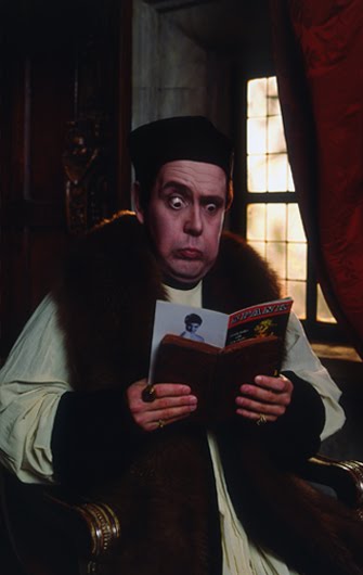
When I got to Coy! and was introduced to Sean, I quickly realised that the shot was being taken slap bang in the middle of the room, as half a dozen disinterested people got on with whatever they were getting on with. Mark handed me a book called ‘Mr Salesman’, a collection of highly stylised 1950s ‘noirish’ portraits by Jamison Handy curated by (of all people) actress Diane Keaton. We were to recreate one of the shots — a film-starrish, bryllantined chap striking a thoughtful, chin-stroking pose (below). This is OK, I thought, forgetting where I was for a moment.


I went to my dressing room (the gents) and donned a white shirt and a striped tie. Mark shook his head. “You don’t wear a tie very often,” he remarked, deftly picking out another of his own, tying a perfect half Windsor, and then handing it to me like a noose. I was instructed to get into the role of an ‘Ace Reporter’, clutching a notebook in one hand and my black pencil in the other at a suitably nerve-wrenching angle.

We started gently. Then Mark and Sean got into a rhythm. The camera clitter-clattered, and I could see image after image appearing on a screen behind through the glare of the lights.

“OK, you’re in a crowd interviewing Elizabeth Taylor, you’re delighted… yes, getting there, getting there…” Fern magically appeared with powder and brush, dusting the shine from my forehead. “Right, you’re interviewing Marilyn Monroe, and she’s just lifted her top up…”

I finally cracked. All semblance of cool or cred went out the window. My face pulled into an idiot grimace, half crazed, half in character. “That’s it! That’s it!” shouted Mark, bursting into uncontrollable laughter.


Yes, I’d been officially Coy!’d. Thanks to everyone for the experience.

book review – ‘How I Write’


Write. Are we sitting comfortably?
The title’s a nod to the famous Orwell essay ‘Why I Write’, but the premise is quite different. This is a mainly visual compilation of the personal crutches, good luck charms, window views and ergonomic quirks that help writers to… well… write. In other words, a rare glimpse into the working environments of authors like Douglas Coupland, Alain de Botton, Michael Faber and Ian Rankin.

Will Self has a wall of regimented Post-It notes, which he uses to arrange ideas and bits of dialogue; Jonathan Letham collects pages and pages of names; Nicolson Baker has drawers full of ear plugs; Jonathan Franzen swears by his squeaky office chair.

Me? Well thanks for asking. I have a pair of bright orange office chairs, and three outsize pin-boards peppered with personal artefacts – a photo of Stevie Wonder in his 70s pomp; a B-52’s badge I had at university; garlic packaging in the shape of a coffin; and a pair of joke eyebrows given to me by typographic designer Jon Barnbrook.

Edited by Dan Crow
Rizzoli, £19.95 list, or £13.97 on Amazon

Just taken delivery of this utterly brilliant limited-edition poster by Rob Ball, creative director of the Partners by day, Super Illustrator Guy by night.

It features Rob’s interpretations of 50 bad-ass baddies from the movies, and comes complete with a niftily designed key, so you can tell who’s who and what film they appeared in. Each face is beautifully observed and rendered, and the printing detail is so good, you’d swear you’re looking at the real thing.

Last year, I commissioned Rob to draw the chimps for totalcontent’s typewriting monkey posters, and he tells me, this has reawakened his inner illustrator. Off to the framers tomorrow. Rob’s baddies will rub shoulders in the studio with a couple of Barnbrooks, a Peter Grundy and a Mark Denton.

You can round up some of your own villains by ordering a poster from here. But hurry, he’s only printed 50 of the blighters. Click on the image for a closer look.

More years ago than I care to remember, I was between jobs and — through a friend of a friend — ended up working a few weeks on that most eminent publication ‘A Taste of Safeway’ magazine. This, I can assure you, was purely a temporary wolf-from-door measure.

The gig’s highlight was probably interviewing professional Scouser and sexpert Margi Clarke about what she had stashed in her fridge (pasta ready meals, Cadbury’s Creme Eggs and a bottle of Jacob’s Crack [sic], for the record). She may have thought I was “dead posh”, but we got on pretty well, particularly after I mentioned I was a great admirer of her husband, punk artist Jamie Reid.

However, this was also around the time ‘A Taste of Safeway’ was putting its Christmas issue to bed, and I was also roped in to doing a spot of (free) modelling, playing the part of a busy dad, getting some shopping together for his family.

Imagine my stinging embarrassment a couple of months later when I was at an über-cool design agency touting for some copywriting work. Right there on one of the Vitra desks was said publication, open on the offending spread showing me laden down with seemingly half a Safeway store, a colander and a teddy bear. Hold that pose and smile please.

By way of explanation, this is part of Nick Asbury’s Creative Amnesty for Creative Review — jobs/projects you’d rather not own up to.

Parp, parp. I’m the kind of person who just about knows one end of a car from the other. You certainly wouldn’t catch me waxing lyrical about alloy wheels or torque. Or watching Top Gear.


That’s why I’d given the Heritage Motor Centre at Gaydon a wide berth, despite it being a mere 10-minute ride from the totalcontent studio. However, they’d recently laid on a one-off exhibition called ‘Science Fiction at the Movies’, which promised plenty of Star Wars and Dr Who relics — the kind of thing my boys are deeply into. And we had friends coming for the weekend, so it seemed an ideal opportunity to check the place out.


Parked in the middle of a former RAF base, in the middle of nowhere, the imposing circular building looks like a covert high-security government headquarters. You might expect to find all kinds of Roswell-like experiments going on in there, but actually it’s packed with over 200 significant British cars — from decidedly the humble, to land-speed record breakers and James Bond stalwarts. But it’s not at all fetishistic or petrol-heady. In fact, the place offers more of a social and cultural history, the outer perimeter representing a road travelling through time, with the earliest cars at one end, gradually making way for more contemporary fare.


For me — apart from the astonishing FAB 1, Lady Penelope’s pearly-pink wheels from the 2004 live-action Thunderbird’s movie — the great revelation was the trove of retro type and ephemera. The place was chock full of posters, ads, signage, logos and hand-rendered typography. I found myself slavishly photographing walls, grilles and odd bits of lettering, and reminding myself not to be so closed-minded in future. Particularly loved a poster for Dunhills’ Bobby Finders, glasses-cum-binoculars which promised to “spot a policeman at half a mile even if disguised as a respectable man”.


Cars, whether we like it or not, are a telling symbol of progress and popular culture. With headlights on full beam, Gaydon took us on a nostalgic and occasionally quirky tour of Britishness through the ages. I’ll be jumping into my car with a better camera for a return visit soon.


A recent poster we worked on for GAP through ycn passed the ultimate test and now hangs proudly on our studio wall. It was a lovely customer giveaway marking a hugely ambitious 3D paper installation in GAP’s Milan superstore, created specially for Milan Furniture Week, which you can read all about here.

totalcontent
 were asked to come up with no more than 50 words to express the sights, sounds and smells of city life. These were then beautifully hand-lettered and illustrated by Jamie Brown, and sit on one side of a poster explaining the genesis and development of the paper sculpture project.

It’s our second collaboration with ycn, whose quirkiness, imaginative flair and tireless championing of illustration we love.

I know, I know… recommending a dictionary probably makes me sound like Lynne Truss’s long-lost half-brother. But, apart from being written in a refreshingly easy-going, contemporary style, a small but genius touch that won me over to the 11th edition of Chambers, published in 2008. The title page for each new letter is set in a different and appropriate typeface – Baskerville for B, Futura for F, Novarese for N, and so on. They give you the full alphabet, plus designer, date and country of origin. A simple, but great idea. 


Chambers Harrap
£21.25 on Amazon

Millington Associates are designer/makers for retail environments. Based in south London, they create spectacular window displays and retail interiors for big brands — everyone from Nike and De Beers to Next and Diesel. Multi-skilled and multi talented, MA’s work is dramatic, ambitious and witty, needing to grab people’s attention as they walk down the street.

We were asked by Thoughtomatic, MA’s branding agency, to write the copy for their rather stylish website. This included coming up with the strapline ‘Imagination made real’, and as many words with MA in them as possible. To take a quick peek at what we came up with, just follow this link.

In November last year I got a call from Ben Casey at The Chase asking if I’d help out with some posters they were putting together for the photographer Paul Thompson.


The idea was brilliantly simple. Pick a photo from Paul’s online portfolio and write 1000 words inspired by it. Anything that took my fancy. These 1000 words would then be used on promotional posters, postcards and T-shirts with a sign-off line pertaining to the old ‘picture paints a 1000 words’ chestnut. Friend and fellow writer Nick Asbury, as well as Ben and Lionel Hatch from the Chase would be writing 1000 words too.


Choosing was the hard part. Paul’s website was packed with intriguing stuff — slightly odd looking portraits of people who’s heads and bodies didn’t seem to match; eerie landscapes; curious moments captured in time. His work has a sense of the surreal, as if something’s not quite as it should be.

I eventually plumped for an image of a slightly forlorn-looking park bench. There were no people around, and it looked like a perfectly grey, hum-drum day. There was something remarkable in the ordinariness of the shot.


It struck me that this park bench must have witnessed all kinds of things, if only it could articulate them. So I gave it a slightly curmudgeonly voice and set about telling a kind of first-person day in the life, which gradually spirals out of control.

The Chase then set the words beautifully to the shape of the picture. The results not only look rather fine, but gently subvert the idea of a photographer’s mailer. They work just as a grey block of text, or if you go in and actually read the pieces, which are remarkably different from each other. It was a great brief, and I’m really chuffed to have been involved in a project like this. And I’m pleased to say the project was picked up by the Creative Review blog too.

You can read my 1000 words by clicking on the image below.