Showing posts with label experience. Show all posts

Touch of glass... at once primitive and sophisticated.

After years of conscientious, selfless research, I’m pleased to announce that I have finally discovered the perfect wine glass. It’s called Essence, and was designed by Alfredo Häberli for the celebrated Finnish glassware and ceramics company Iittala.

What’s so great about it? Working on a book about modern Finnish design for Nokia a couple of years ago, I came to appreciate the beautiful functional simplicity inherent in all manner of products from that part of the world. As I wrote at the time, Finnish design has “a touching, unpretentious simplicity that is at once primitive and sophisticated; lines, forms and materials aligned to the natural world; a purity and integrity that speaks directly to the soul.” Sounds good... shame it never made it to the printers.
You do judge a book by its cover shock
I know, I know... I’ve been a bit remiss about posting a regular Private View column without Lynda to badger me anymore. Pressure of work and all that. But here’s a piece on US author and journalist Malcolm Gladwell’s ‘Blink’ and the effect rapid cognition might have on our appreciation of graphic design. Look out for my next Private Blog in early December. 

Admittedly, I cottoned on Malcolm Gladwell’s ‘Blink’ rather late in the day, but the instant I saw it winking at me on the charity shop bookshelf, I’d made up my mind. To be honest, I had little inkling about its subject matter and was just taking a punt on the basis of the cover and few of the good man’s articles in the New Yorker. This, and the fact that at a princely £1.10, I had little to lose.

In case you’re unfamiliar, ‘Blink’ puts the case that first impressions are often valid. Just like mine were in the charity shop. In fact, there are many cases where your initial instincts may be more worthwhile than months of painstaking research. These, the author argues, can just muddy the waters.

Gladwell pieces together various scientific studies, interviews and news stories to make his case. He speaks to top car salesmen and eminent psychologists, military strategists, archaeologists, food tasters and the police. And his findings are weirdly fascinating — he discovers that in given situations, our unconscious minds can ‘thin slice’ exactly the information we need. Instinctively, we ditch all the clutter and extraneous stuff and get straight to the nub. It’s only when we start to analyse and weigh up the pros and cons that all the muddle and uncertainty kick in.

First of all, a word about Gladwell’s writing. On the face of it, this isn’t the sexiest of subjects. You’d stomach a 1,000-word article, perhaps, but not a whole 260-page book. And yet, he manages to make you want to dig on and get to the bottom of the conundrum. His prose is easy yet detached, always insightful, occasionally funny. He never blinds you with science or over intellectualising. Like a good TV documentary, he seems to know when to remind you of salient points and previous examples.

However, I really wanted to look at Gladwell’s ‘Blink’ theory from another angle — the context of graphic design. And to suggest that we’ve made our mind up about a piece from the split second we see it.

In the case of posters or street messages, it’s likely that your first impression is your only impression, so clearly that’s true. But even when the viewer is taking in something at leisure, it’s the very first sighting that sets the tone and colours the attitude from then on. You’re more likely to start reading an unfamiliar book from a table-top display if the cover grabs you. Or persevere with a website if the look of it pleases you (particularly when your broadband’s playing up). If someone hands you a groovy business card, you’ll probably feel better inclined towards them than the person who hands you a dull one.

Instant Wim... one look at Crouwel is enough
Superficial? Well, not according to Gladwell. Our first impressions are actually quite sophisticated. They’re built from our previous experiences, and the copious mental notes we’ve taken over the years. (They can also harbour our fears and prejudices, but that’s another story). Called into action, these sparks from our past compute and react in a snap, and most of the time they’re bang on. But when we stop to ask ourselves ‘why?’, that moment of subconscious magic disappears.

In exactly the same way, our taste is learned, but becomes second nature over time. So our first response to a piece of graphics is really quite profound. Which probably accounts for my perennial experience of design awards judging… however many times you go round the houses, you always seem to end up with the same opinion you struck in the first place.

In his first post-Design Week Private View, Jim Davies considers his relationship with Amsterdam, and how this squares with the Dutch perspective on design.

I’m always threatening to spend time in some of the great European cities — Florence, Barcelona, Berlin, Vienna. But somehow, when it comes round to it, I end up back in Amsterdam.

I’ve never actually lived in Holland, but because I’m half Dutch, I’ve visited the country virtually every year since I was born. The canals and bikes, the cobbled streets and low skyline, the cadence of the language, are both familiar and exhilarating. And of course I drool over the vernacular graphics, the street posters, local packaging and shop signage. Around every corner there’s déjà vu, I hear echoes of my childhood, remember my mother, feel a real or imagined connection with my forbears. Even in doing the most mundane things, have an almost spiritual experience.

Bridging the gap: View from our hotel window, The Toren on Prinsengracht


To me, that’s something deeper and more precious than traipsing round the most wonderful cathedral or art gallery in one of the more rarefied European capitals. And because I now know the place reasonably well, I’ve moved beyond the obvious — the Museumplein, canal boat cruises, Anne Frank etc — and have started to explore the next layer down, revelling in the quirkiness of the place, embracing its peccadillos and peculiarities, coming to understand why it is what it is.

Hello boys: The peccadillos and peculiarities of Amsterdam windows


It struck me that my evolving relationship with Amsterdam has similarities to the way the Dutch view and explain design.

Design is such a nebulous term, it can mean virtually anything we want it to. The word can be used in relation to a CD cover or an Airbus, a city signage system or a chair. Ask a hundred people to define it, and you’ll dredge up a hundred and one different answers. The extra one being from the person who couldn’t quite make his mind up.

For most non-practitioners however, design implies a surface sheen or prettification — anything from the cod-Georgian flounce Lawrence Llewelyn Bowen might dream up for one of those tiresome home décor TV shows, to the garish colourways on the latest pair of Nikes.

In Holland — perhaps to counteract this one-dimensional response — they have settled on two words for design (three if you include the English word, which is also in common usage.) The first is vormgeving, which literally means ‘to give form’, and refers to the more aesthetic side of design — making things pleasing to the eye and desirable. The other is ontwerpe, which is more about function and making things work properly — the less glamorous but essential nuts-and-bolts aspect of design.

It’s not exactly form and function, but not far off. Dutch designers who want to be taken seriously (and most do) tend to align themselves with the ontwerpe camp, even if they’re involved in primarily visual disciplines like graphics or packaging. Vormgeving tends to be looked down upon as vapid and superficial — a distantly related dumb blonde no one wants to be associated with.
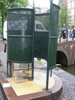
Urinal or mine? Functional, down-to-earth design


This attitude is culturally typical. From the outside, the Dutch may appear to be laid back and easy going. But actually, they are quite angst-ridden and deep. They agonise over the smallest details and take themselves surprisingly seriously. Unlike the British, who tend to skirt around difficult issues like Darcy and Elizabeth Bennett at a formal dance, the Dutch are far more direct and always prepared to ask frank, probing questions. Which is probably why the more down-to-earth ontwerpe has so much more kudos than the flaky vormgeving in Holland.

As for me, I sheepishly admit to liking a bit of both… I’m only half Dutch after all.
It’s one of those moments that makes you think, but you’d rather not dwell on it for too long. At around 8pm last night, as the winds gusted, a mighty 40-foot branch came crashing down from the 300-year-old cedar in our front garden. It made a sound like Armageddon, but miraculously missed the house and the car, and just slightly damaged the front gates. And of course, if anyone had been walking under it, as we do several times a day, they’d be stone dead. There may be more light in some of the rooms in the front of the house now, but for me it’s like Big Ben without a minute hand, or a seven-tentacled octopus. Looking out of the bedroom window first in the morning will – literally – never be the same again.