 I’m really pleased to have contributed to this rather classy pack showcasing this year’s Madonna and Child Christmas stamps. The set of five (plus two extended large-letter stamps) feature depictions of the Virgin Mary and Jesus through the ages, as well as a specially commissioned (and strikingly beautiful) new painting by neo-Coptic artist Fadi Mikhail, which sits on the £1.88 stamp. I helped Royal Mail tell Fadi’s story, including his tutelage under neo-Coptic master Isaac Fanous; his process and thinking; and the heavy symbolism of this very prescribed genre of painting. On the reverse side of the sheet, there’s a potted history of Madonna and Child paintings by art historian Rowena Loverance. You can get hold of a special Christmas presentation pack, designed by Robert Maud and Sarah Davies here. Or of course, pick up Christmas stamps for all your cards from your local Post Office.
Showing posts with label packaging. Show all posts
Showing posts with label packaging. Show all posts
I’m really pleased to have contributed to this rather classy pack showcasing this year’s Madonna and Child Christmas stamps. The set of five (plus two extended large-letter stamps) feature depictions of the Virgin Mary and Jesus through the ages, as well as a specially commissioned (and strikingly beautiful) new painting by neo-Coptic artist Fadi Mikhail, which sits on the £1.88 stamp. I helped Royal Mail tell Fadi’s story, including his tutelage under neo-Coptic master Isaac Fanous; his process and thinking; and the heavy symbolism of this very prescribed genre of painting. On the reverse side of the sheet, there’s a potted history of Madonna and Child paintings by art historian Rowena Loverance. You can get hold of a special Christmas presentation pack, designed by Robert Maud and Sarah Davies here. Or of course, pick up Christmas stamps for all your cards from your local Post Office.
 |
| Mind your own biscuit... retrotastic packaging from Crabtree & Evelyn |
I don’t know how Mark Farrow does it. Year after year,
he produces standout graphic design, sweeping young pretenders aside in his
majestic wake. If anyone wants a lesson in immaculate modernism, they should
look no further than ‘Format’,
his latest collaboration with pop stalwarts Pet Shop Boys.
 |
| Strip off the old block... Farrow pulls another rabbit out of the hat |
A collection of obscure B-sides and rarities spanning 1996
to 2009, Mark has used the coloured spines of the original release formats to inform the stripy illustration on the cover. A graphic device, of course, that harks back to previous PSB releases, notably 1998’s
‘Introspective’
and 2008’s
‘Yes’.
(By the way, there are some great song titles on ‘Format’
—
‘The
Truck Driver and his Mate’, ‘Sexy Northerner’, ‘We’re
All Criminals Now’,
‘I
Didn’t
Get Where I Am Today’, and ‘Gin and Jag’.)
Like Peter Saville at Factory Records or Vaughan Oliver at
4AD, a long-standing, hugely productive relationship has helped Mark develop a formidable house
style for PSB. But it’s
his perfectly judged graphic restraint and ferocious attention to detail that
always sets the work apart. Design critic Adrian Shaughnessy believes Farrow
was “the
first record sleeve designer to master the art of designing for CD”,
a bold but justifiable claim.
I was lucky enough to get to know Mark in the 1980s, just after he’d
come down from Manchester and was working in a small studio above a shop in
Neal Street, Covent Garden. At the time, he was working closely with
restauranteur/entrepreneur Oliver Peyton (still a client) on press ads for
Sapporo Japanese lager. It struck me that Mark’s work is like sushi – delicate, dextrous and extremely tasty.
After a 20 year hiatus, I’ve invested in a new needle and some cleaning fluid, and started buying vinyl again. The first thing you notice is the sky-high price — around £20 for a new album, as opposed to £9 for a CD or £7 for a download. But you forget how much richer and more satisfying the whole experience is.
The vast expanse and beauty of the sleeve; the ritual of undressing the black stuff and placing it in the turntable; the indulgence of listening to a whole side as opposed to the usual fickle flicking from song to song. You actually listen to the music rather than consume it. You give it more attention, approach it with far more generosity of spirit.
And I’m lucky that there’s a half decent Oxfam Books and Music store near me. Last week, seemingly waiting for me, were two of my favourite-ever albums — Stevie Wonder’s ‘Songs in the Key of Life’ and ‘Innervisions’. I’ve never owned them on vinyl before, as I didn’t have much opportunity or cash to buy records when I was at school.
Written discreetly in biro inside the gatefold of ‘Innervisions’ is a date — ‘3 March 1975’. There’s something terribly touching to know that this physical artefact meant something to someone out there, that there’s a story attached to it. It’s been very well looked after, I can tell you that much.
Have a think about that next time you download 89p’s worth of soulless music data from iTunes.
The vast expanse and beauty of the sleeve; the ritual of undressing the black stuff and placing it in the turntable; the indulgence of listening to a whole side as opposed to the usual fickle flicking from song to song. You actually listen to the music rather than consume it. You give it more attention, approach it with far more generosity of spirit.
And I’m lucky that there’s a half decent Oxfam Books and Music store near me. Last week, seemingly waiting for me, were two of my favourite-ever albums — Stevie Wonder’s ‘Songs in the Key of Life’ and ‘Innervisions’. I’ve never owned them on vinyl before, as I didn’t have much opportunity or cash to buy records when I was at school.
Written discreetly in biro inside the gatefold of ‘Innervisions’ is a date — ‘3 March 1975’. There’s something terribly touching to know that this physical artefact meant something to someone out there, that there’s a story attached to it. It’s been very well looked after, I can tell you that much.
Have a think about that next time you download 89p’s worth of soulless music data from iTunes.
 |
| Wonderwall... what goes around comes around |
 Among the goodies waiting for me under the Christmas tree this year were two pairs of decidedly retro underpants. Based on the original Jockey Y-front design which ruled the pre-boxer short roost, they’ve been restyled with a slightly longer leg, catering to the demands of today’s discerning trunk-wearer. One pair is a rather flashy mandarin, the other a handsome turquoise, complete with the familiar strategically placed white piping and a faithfully recreated elasticated waistband. Takes my backside back, I must say.
What struck me most though, was the accompanying label, bearing the rather braggy strapline “The original Jockey® Y-Front® brief — a true American legend”. And a photo of what can only be described the kind of dubbered old pants your granddad might wear. Heritage is one thing, but here, I think we’re hitting something of a bum note.
 For those of us brought up in 1970s Beirut – and there were one or two – this should bring back some memories. Chiclets were the chewing gum of choice, always right there next to the till in the small cornershop, packed to the gunnels with plump fruit, fresh spices, cigarettes and cold drinks, in an order that made sense only to the wonderfully lugubrious shopkeeper.
This is a pack of Johnnie-come lately cinnamon gum, the original classic was exactly the reverse – yellow with red trimming. The rather gothic Roman type and the Arabic script has been streamlined and modernised. The small cellophane window, which gave you a glimpse of the actual gum inside replaced by a drawing in the same position. But it’s still unmistakeably Chiclets. And to me, anyway, it’s a design classic.
 Thought this would be the perfect date to share one of my all-time favourite pieces of packaging. I’ve had it quite a few years now, and picked it up at my local Budgens, so I have no idea who was responsible. It certainly makes a change from the usual flimsy string bag – and shows eloquently how tapping into a shared mythology can add character and humour, even to a humble bulb of garlic. The gradiated colour, gothic type and creative folding techniques are great. The die-cut crucifix lifts it into the realms of pure genius.
I’ve just realised the past three posts have all been a tad ghoulish. Pure co-incidence, I assure you. ’Scuse me... just off for a quick pint of the red stuff.
Happy Halloween everyone.

“Here at Kromland Farm, we’ve been cultivating rooibos since 1902. But that's nothing – South Africa’s indigenous Khoisan people have been enjoying its rich flavour and potent heath benefits for millennia”.
Unfortunately, it seems I won’t be. Sainsbury’s seem to have stopped stocking Kromland Farm.


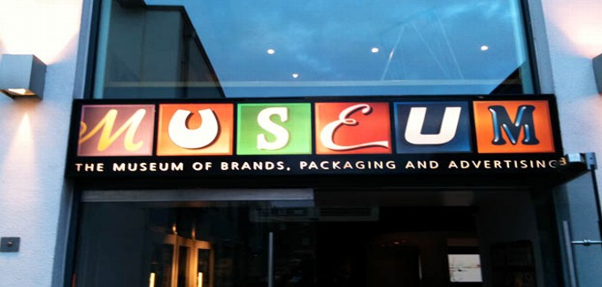
Tucked away in a corner mews, MoBPaA is home to a regiment of glass cabinets housing countless pieces of old packaging carefully arranged in date order. Being of a certain age, the 1970s and 1980s stuff had most resonance. I found it refreshingly direct, without the trills and swirls of the older stuff, or the show-off 3D rendering and glitzy metallic foils of today’s computer-fuelled graphics. The no-nonsense bright orange 70s Crunchie packaging with its punchy sans type was a particular favourite.
What was really curious, however, was seeing these everyday, disposable objects treated with such awe and reverence. We can’t deny that the Curly Wurly wrapper or Branston Pickle jar represents a small part of our heritage, but it’s only a small step away from regarding supermarkets as contemporary art galleries. That Andy Warhol was on to something.


Designed and art directed by Aboud Creative, the range features striking ‘photogram’ pictures of live plants by Richard Green. Plants and herbs, sourced from all over the UK, were painstakingly laid on to photographic paper, and then exposed to light. Now almost a fine art process, this harks back to the earliest days of photography, which literally means ‘painting with light’. Shimmering out of a deep blue background, the photograms perfectly reflect the brand’s heritage, natural qualities and iconic blue bottles.

The words, painstakingly retyped on one of Paul’s ancient Olivetti machines, were overlayered on to photographs of a bespectacled young man, representing ‘the writer’ and his thoughts. Jim drew on his own personal experiences and referenced the George Orwell essay ‘Why I Write’, adopting an expressionistic, free-flowing style.
The words appear on advertising, POS packaging and carrier bags. You’ll only be able to read snatches of Jim’s work on these items because the words have been artfully laid over each other – unless, that is, you visit www.paulsmithstory.com, where they have been reproduced in full.
Subscribe to:
Posts (Atom)