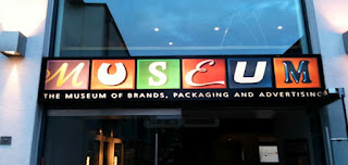
Tucked away in a corner mews, MoBPaA is home to a regiment of glass cabinets housing countless pieces of old packaging carefully arranged in date order. Being of a certain age, the 1970s and 1980s stuff had most resonance. I found it refreshingly direct, without the trills and swirls of the older stuff, or the show-off 3D rendering and glitzy metallic foils of today’s computer-fuelled graphics. The no-nonsense bright orange 70s Crunchie packaging with its punchy sans type was a particular favourite.
What was really curious, however, was seeing these everyday, disposable objects treated with such awe and reverence. We can’t deny that the Curly Wurly wrapper or Branston Pickle jar represents a small part of our heritage, but it’s only a small step away from regarding supermarkets as contemporary art galleries. That Andy Warhol was on to something.

0 comments:
Post a Comment