Showing posts with label posters. Show all posts
To the letter... publicity poster for the fictitious 'Dig It Festival', calligraphy by Ann Bowen
It’s been a while since I took part in a collaborative project with 26, the writer’s group I co-founded with seven others ten years ago. ‘26 Words’, was a kind of reprise of ‘26 Posters’, one of our very first efforts, which randomly paired writers with designers, gave them a letter of the alphabet and asked them to go off and produce a poster together. Back then I got editorial design legend Derek Birdsall and the letter I. Both wonderful.

This time round 26 writers were paired with 26 lettering artists from the crafts-based lettering association Letter Exchange. I was teamed with the hugely talented calligrapher Ann Bowen and given the letter D, but there was also a twist this time. In a slightly shamanistic ceremony held in the basement of the Betsy Trotwood pub in Clerkenwell, we were asked to stick a knife into a dictionary to pick out a word starting with our given letter. In our case, the tip of knife pointed to ‘dig’.
Remember the Higsons, spiky purveyors of ‘funk-punk? Back in the 1980s, studying publishing at the London College of Printing, I was a huge fan, avidly following their progress in the NME and buying every single the day it came out.

And then this great silk-screen poster appeared on the LCP refectory wall. I was too law-abiding to pinch it myself, but luckily a friend of mine was more than happy to do the deed on my behalf. Just call me ‘the Don’.

Ever since then, frontman Charlie Higson has been something of a hero. He just kept popping up everywhere producer, performer, comedy writer, Vic and Bob, Fast Show, Have I Got News For You, QI, and many more. And now my boys are huge fans of his Young James Bond and vampire books. A prolific and versatile talent.

Some 30 years later, it turns out we have a mutual friend Andy Altmann of Why Not Associates. Earlier this week, I told Andy about my coveted poster, and he forwarded this pic on to Charlie. His response “Wow. that’s a lovely poster wish I had one!

Probably the only time Charlie Higson will be envious of me.
Just taken delivery of this utterly brilliant limited-edition poster by Rob Ball, creative director of the Partners by day, Super Illustrator Guy by night.

It features Rob’s interpretations of 50 bad-ass baddies from the movies, and comes complete with a niftily designed key, so you can tell who’s who and what film they appeared in. Each face is beautifully observed and rendered, and the printing detail is so good, you’d swear you’re looking at the real thing.

Last year, I commissioned Rob to draw the chimps for totalcontent’s typewriting monkey posters, and he tells me, this has reawakened his inner illustrator. Off to the framers tomorrow. Rob’s baddies will rub shoulders in the studio with a couple of Barnbrooks, a Peter Grundy and a Mark Denton.

You can round up some of your own villains by ordering a poster from here. But hurry, he’s only printed 50 of the blighters. Click on the image for a closer look.
Parp, parp. I’m the kind of person who just about knows one end of a car from the other. You certainly wouldn’t catch me waxing lyrical about alloy wheels or torque. Or watching Top Gear.


That’s why I’d given the Heritage Motor Centre at Gaydon a wide berth, despite it being a mere 10-minute ride from the totalcontent studio. However, they’d recently laid on a one-off exhibition called ‘Science Fiction at the Movies’, which promised plenty of Star Wars and Dr Who relics — the kind of thing my boys are deeply into. And we had friends coming for the weekend, so it seemed an ideal opportunity to check the place out.


Parked in the middle of a former RAF base, in the middle of nowhere, the imposing circular building looks like a covert high-security government headquarters. You might expect to find all kinds of Roswell-like experiments going on in there, but actually it’s packed with over 200 significant British cars — from decidedly the humble, to land-speed record breakers and James Bond stalwarts. But it’s not at all fetishistic or petrol-heady. In fact, the place offers more of a social and cultural history, the outer perimeter representing a road travelling through time, with the earliest cars at one end, gradually making way for more contemporary fare.


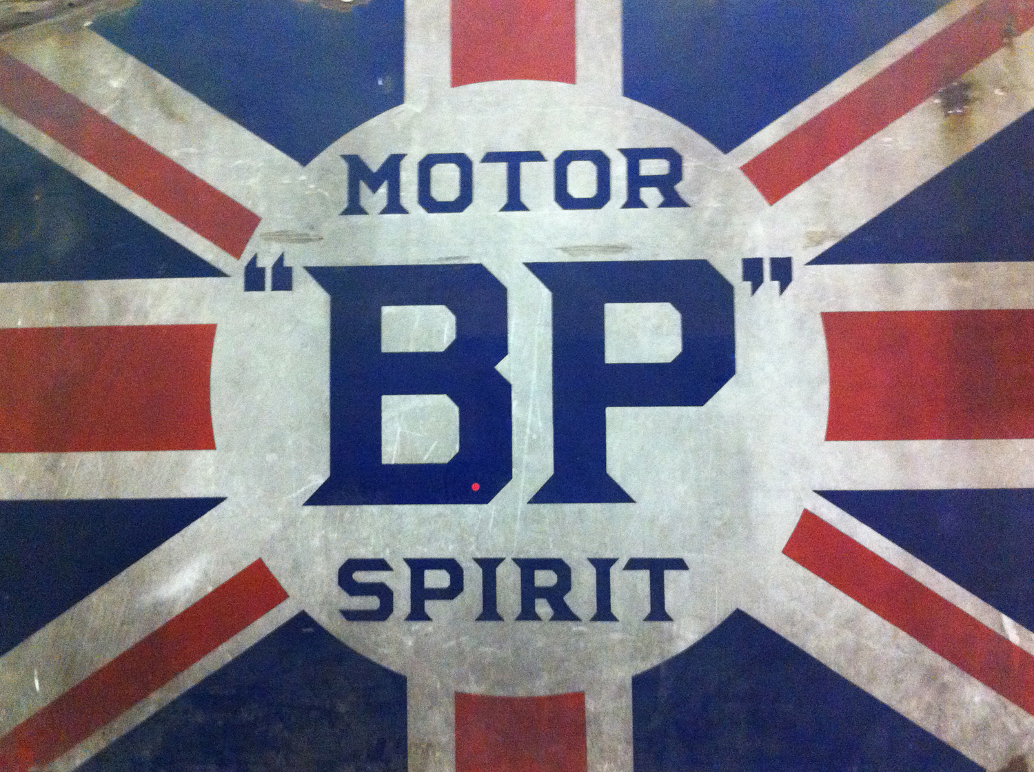
For me — apart from the astonishing FAB 1, Lady Penelope’s pearly-pink wheels from the 2004 live-action Thunderbird’s movie — the great revelation was the trove of retro type and ephemera. The place was chock full of posters, ads, signage, logos and hand-rendered typography. I found myself slavishly photographing walls, grilles and odd bits of lettering, and reminding myself not to be so closed-minded in future. Particularly loved a poster for Dunhills’ Bobby Finders, glasses-cum-binoculars which promised to “spot a policeman at half a mile even if disguised as a respectable man”.


Cars, whether we like it or not, are a telling symbol of progress and popular culture. With headlights on full beam, Gaydon took us on a nostalgic and occasionally quirky tour of Britishness through the ages. I’ll be jumping into my car with a better camera for a return visit soon.

A recent poster we worked on for GAP through ycn passed the ultimate test and now hangs proudly on our studio wall. It was a lovely customer giveaway marking a hugely ambitious 3D paper installation in GAP’s Milan superstore, created specially for Milan Furniture Week, which you can read all about here.

totalcontent
 were asked to come up with no more than 50 words to express the sights, sounds and smells of city life. These were then beautifully hand-lettered and illustrated by Jamie Brown, and sit on one side of a poster explaining the genesis and development of the paper sculpture project.

It’s our second collaboration with ycn, whose quirkiness, imaginative flair and tireless championing of illustration we love.

I’m pretty sure this has never happened to me before, and it’s unlikely to happen again. I’d just treated myself to a copy of new book, entitled ‘Alphabets: A Miscellany of Letters’, and was idly flicking through its handsome pages. It’s a charming, quirky compendium of applied letterforms, arranged in themed chapters — B for ‘Bestiary’, F for ‘Found’, H for ‘Hand’, J for ‘Journey’, and so on. It features games, posters, signage, packaging, furniture… in fact, virtually anything’s considered fair game so long as it references the alphabet.

And there, staring back at me on page 56, was something that looked decidedly familiar. A poster I’d worked on with the great Derek Birdsall back in 2004. You could have knocked me down with a feather (shaped like a letter f, perhaps). Our effort was based on the letter i, and featured in a exhibition at the British Library organised by 26. Originally, it was printed on a reflective surface, so that people would see their faces in the poster as they read the text, picking up of the idea of I as shorthand for identity.

Here’s what some of the text in ‘Alphabets’ says about the poster: “Birdsall is an influential book designer who, therefore, works closely with letters in his day-to-day work. Davies, a writer, has contributed works of fiction and non-fiction to a variety of publications, and his humorous interpretation of the letter’s history is characteristic of his work. The letter is given a pompous voice and lists its many uses in language and technology, drawing attention to its strong aesthetics, which make it suited to graphic art.”

After I’d recovered from the surprise, I felt pretty pleased with myself. But on reflection I thought, shouldn’t someone have at least asked first?

‘Alphabets: A Miscellany of Letters’ is published by Black Dog. You can pick it up on Amazon for £16.96.
I’m grappling with my sixth Royal Mail Yearbook at the moment, and it’s taking me down the usual interesting avenues – obscure places I’d never go in the course of my usual business writing. I don’t think I’m giving anything away to reveal that one of the chapters is on King George V stamps. He was a near-obsessive philatelist who amassed a priceless collection which now belongs to the Crown. There’s a great story about the king paying a record £1,450 for a rare Mauritius 2d blue in 1904. One of his secretaries remarked that he’d read about ‘some damned fool’ who’d blown a fortune on a single stamp. Without skipping a beat, George replied, ‘I am that damned fool’.

But to get to the point... George also set up the British Postal Museum and Archive, which houses some real graphic treasures. Don’t worry, I’m not just talking stamps here, but all kinds of printed ephemera, including some achingly cool posters. These gems from the 1930s were recently picked up and released by zeitgeisty London greeting card specialists Umpen Editions. And you can see why… the designer-illustrators of the era were superb – witty, stylish and attention grabbing. Pat Keeley (top – a promotional poster for the famous Auden-scripted ‘Night Mail’ film) and Tom Eckersley (below – get the bubblewrap out, quick), as well as Hans Schleger (aka Zero) and Edward McKnight Kauffer were quite brilliant, and have a retro quality that’s bang on trend.
Response to the totalcontent monkey mailer has been phenomenal, and we’ve not even started sending out to the list of juicy prospects we’ve put together. Through the power of twitter and facebook, the posters were picked up by the popular design blogs acejet170 and formfiftyfive, and we’ve been getting over 500 hits a day on the web site. As well as wonderfully positive comments, we've been inundated with requests for posters from far and wide, so the studio currently looks more like a Royal Mail sorting office than the usual oasis of writerly calm. A gallery has even been in touch asking if they can exhibit our monkeys. Deborah is questioning whether stuffing orange tubes is in her job description, and my tongue is protesting at all the stamp licking. We got a rubber stamp of one of Rob’s monkeys made up, which we think works pretty well on our NB:Studio designed address stickers.
At last. After several false starts and many months in the making, here'stotalcontent’s very first mailshot. It's a series of three A2 posters designed byRichard Scholey and Simon Morrow at Elmwood, with the illustrated chimps provided by Rob Ball of the Partners. Jim had hours of fun coming up with suitable misquotes from Shakespeare, which had to be close enough to be familiar, but surreal enough to be funny. The idea is based on the ‘infinite monkey theorem’, which suggests that given an infinite amount of time a group of randomly typing monkeys would produce the complete works of Shakespeare. 

The sign-off copy at the bottom reads: 

‘If they stuck at it forever, a thousand typewriting monkeys would eventually tap out the complete works of Shakespeare. But if you haven’t got time to monkey around for copy, better call Jim Davies on 01926 812286.’ 

The letters are keys culled from an ancient typewriter, while the sign-off is set in a suitable typewriter font. 

Many thanks to everyone involved for making this happen. If you want one for your studio wall please email us here and we’ll mail you some hot-off-the-press monkeys.
Finally. totalcontent’s very first mailer is drying off at the printers as we speak. It was designed by the good people at Elmwood, and features illustrations of monkeys by the highly talented Rob Ball of the Partners. Of course we’ll reveal all as soon as we get our hands on them, but in the meantime, here’s one of Rob’s excellent simian creations. Hope I wasn’t too much of a pain-in-the-arse client.