Bye-bye to bylines... in commercial writing your words aren’t your own
A couple of years ago, I spoke at a D&AD copywriting event. During the Q&A session at the end, I was asked whether I felt threatened by a new generation of talent coming through. In a rare and rash moment of of bravado, I answered “no, of course not”. But having had a few months to chew it over, I think a more balanced (if less illuminating) answer would be “I don’t know”. 

The point is, in commercial writing the author is very rarely credited. I occasionally read copy that makes me smile or prompts a pang of envy. I read plenty that makes me cringe. But, unless I happen to know who’s ‘in’ with the client or design company involved, I have little idea who to pat on the back or poke in the eye.
A Fieldingesqe romp set in belle epoque Amsterdam, Pleasure Seeker is the story of devilishly handsome country boy Piet Barol’s introduction to the mores (sexual and otherwise) of the big, bad city. An incorrigible charmer who manages to turn any situation to his advantage, the libidinous Barol is hired as a tutor to the son of a wealthy hotelier, and quickly sets pulses racing upstairs and downstairs. South African novelist Richard Mason writes with a deftness of touch and fine eye for historical detail. One online reviewer described HoaPS as “smutty and pretentious”, which is probably why I enjoyed it so much. The cover is excellent too. A sequel is apparently already in the works, and if it isn’t made into a movie soon, I’m a Dutchman.

We’re delighted to have played a part in the recent relaunch of Reeve. They’re wood flooring and fittings specialists based in Norfolk, who work extensively with architects and designers.

That’s how they fell in with the good folks at Felt Branding, who duly persuaded them to undertake a complete brand overhaul that would chime better with their main client base. Felt created a light, contemporary identity system, making it easier for clients to understand the Reeve range and specify accordingly. The rebrand included an ingenious ‘r’ logo that also manages to look like a tree.


It fell to totalcontent to develop Reeve’s tone of voice and write website and sample book copy. We wanted to put over the company’s deep appreciation of wood as a material, as well as their knowledge and experience. All wrapped up in a friendly accessible style, of course. The website was developed by Mesh London, while the sample book was immaculately printed by Generation Press, the go-to printers for the design cognoscenti.

It was great to get a write up and name check on the CreativeReview blog too.
“You might think the Olympic Games are all about being number one. But that’s only a small fraction of the story…”

How timely... on Day 5 of the London Games, we bring you our latest effort for Royal Mail. Part of a series of commemorative philatelic goodies, ‘Welcome to the 2012 Olympic Games’ is a special stamp pack that takes a look at the impressive facts and figures behind the XXX Olympiad, and the city of London itself. It houses a miniature sheet with four stamps designed by hat-trick, who also created the pack. I was charged with writing a narrative which tied all the key numbers together in an enlightening and entertaining way. If you want to read the full text (you know you do), you can view a pdf on the downloads page of this site. And if you’re suitably impressed, you can always buy the pack from the Royal Mail shop.
How does it eel?... smoker at work
totalcontent is just back from its annual away-weekend in Holland. This time we took in the Stanley Kubrick show at Eye, the impressive new film museum on the north bank of the Ij, as well as a noteworthy North Sea Jazz Festival in Rotterdam.

But it was one of those chance, totally bizarre encounters that lingers in the memory. Or should that be nostrils? On the Sunday between showers, we decided to take a stroll through Monnickendam, one of a series of picturesque medieval villages perched on the banks of the Ijsselmeer.

Apart from its less-than-charitable attitude towards witches in the olden days, Monnickendam is best known for its ancient tradition of fish smoking. And this happened to be the day of the annual smoke off, when over 100 competitors from the Amsterdam area converged to see who could smoke the tastiest eel (paling) or mackerel.

stamp of approval.

I’ve written plenty of words about stamps for Royal Mail, and I’ve contributed to Design Week’s Vox Pop several times. But you could have knocked me down with a feather when my name appeared in an answer to the question...

‘Who in the design industry would you like to see celebrated in stamp form?

Here’s what Phil Jones, founder of Real Time Consultancy and old friend had to say:

I live in Bloomsbury and my house has a blue plaque on it for the writer Dorothy Sayers who lived here in the 1930s. Other houses around my area have the same blue plaques recognising great writers, Charles Dickens in the next road to me for instance. Wouldn’t it be nice if we recognised the writers who make the design industry tick? Every annual report, brochure, ad campaign is written by great wordsmiths and many of them are unsung heroes. People like Patrick Baglee, Jim Davies, Tim Rich etc., are worth their weight in gold and how nice if we saw them smiling back at us from a stamp?


Thanks Phil, always good to feel appreciated.

Bleedin’ ’eck... the ink went straight through 
The writer’s trustiest companion is his notebook. Over the years I’ve become something of an aficionado, and when I occasionally stray from the tried-and-trusted path, I usually regret it. Like this seemingly attractive £2 sale bargain from Sainsbury’s (top), which turned out to have a really bad case of bleed through and was abandoned after just six pages.

My preference is for an A5 hardcover (orange if possible) with 90gsm gridded paper. Quo Vadis Havanas are particularly durable and satisfying to write on, and I’m also partial to Rhodia Webnotebooks, which come in a really great dot gridded option. As a work essential that you’re going to live with for six or so months, it’s worth plumping for something with decent quality paper that can take all kinds of inks and abuse.
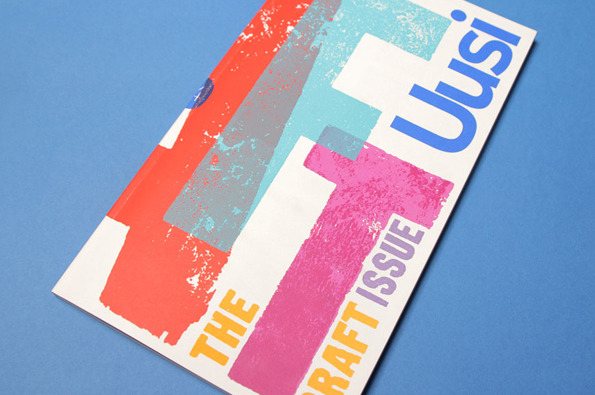
For a large proportion of 2011 and the beginning of this year, we were working with Nokia’s Head of Art Direction Richard Crabb and DesignStudio on Uusi magazine. It’s a quarterly brand publication that goes to Nokia internal marketing types and external agencies to keep them up to speed with all the creative work that’s going on in different parts of the world… and to get them fired up.

Kitching cabinet... cover art by the master of letterpress
In an odd way, it’s been like going back to our roots working on design publications — only Uusi is more creatively ‘out there’ than most regular industry mags. DesignStudio’s background is more branding than editorial, so their take on magazine design is pretty expressive and experimental, all held together by a modernist, grid-based aesthetic.
Stefan Sagmeister and Jessica Walsh... as nature intended
Stefan Sagmeister has his kit off again. This time to announce that his New York design practice is becoming Sagmeister & Walsh, with 24-year-old designer Jessica Walsh getting her name on the door and her very own naked photo alongside the great man.

Of course this bare-faced stunt prompted all kinds of barbs from the design industry… Alan Aboud tweeted “designers reaching new extreme depths in self promotion. Awful.”, Rob Ball of The Partners weighed in with “you know what would be eye-catching? Something involving Sagmeister without his cock in it #tiresome”.

What most struck me though was how grumpy Sagmeister and Walsh looked. There seemed to be no joy in the occasion, just a sense of morose resignation and even boredom. Sagmeister had left his socks on, Walsh perched on a stack of magazines, they stare straight at camera, stark miserably naked. You’re just left wondering what’s the point and what’s the fuss?

Newcastle studio onebestway on dress-down Friday 
A couple of years ago I wrote a Design Week column (no innuendo intended) centred around onebestway, an eight-strong Newcastle design agency who went naked for a day on the advice of a business psychologist. Their publicity photo was more ‘Carry On Designing’ than a po-faced art piece, with strategically placed laptops, chairs and fruit bowls hiding their modesty. Mind that stapler. At least they seemed to be enjoying themselves.

There’s certainly nothing clever about taking your clothes off... I strip every day and barely give it a second thought. And it’s been done so many times and in so many contexts, that as a gesture it’s barely provocative any more. But I think the reason that Sagmeister has ruffled so many feathers this time is that designers feel they should be judged by their work rather than talent for exposure. After all, they’re supposed to drive the car, rather than pose naked on the bonnet.