Showing posts with label new work. Show all posts
Over the past 18 months or so, we’ve been working extensively with branding consultancy Bostock & Pollitt, mainly on (London) property projects. Their particular strength is unearthing something unique about a given development, and then bringing this to life through their branding ideas. We’ve been helping out by expressing B&P’s creative theme in words, naming, straplines, developing an appropriate tone of voice, and then creating copy for digital and printed collateral.

One of these projects was Devonshire Square, an architecturally diverse campus with 630,000 sq ft of office space, shops, homes, restaurants and bars, tucked between the City and Shoreditch.


The Royal Mail Year Pack is the feisty little brother of the Year Book. It includes all the past year’s pictorial stamps, plus a quick run-down on the subject that inspired them. This is the tenth one I’ve written, and while it’s not a Marathon like the Year Book, it’s still a testing 1500 metres. You have around 200 words to cover anything from Space Science to Charles Dickens to British comics. Which means keeping the words punchy yet informative, finding an interesting angle, and casting a small but incisive spotlight on the subject in hand.

For the designer, it’s an equally demanding task. They need to encapsulate the visual spirit of 100 or so stamps on the front and back of a simple fold-out. This year, Magpie Studio did a sterling job of not only of bringing such disparate material together, but also in expressing a sense of British pride in the year of the Golden Jubilee and the Olympic Games.
We’re delighted to have played a part in the recent relaunch of Reeve. They’re wood flooring and fittings specialists based in Norfolk, who work extensively with architects and designers.

That’s how they fell in with the good folks at Felt Branding, who duly persuaded them to undertake a complete brand overhaul that would chime better with their main client base. Felt created a light, contemporary identity system, making it easier for clients to understand the Reeve range and specify accordingly. The rebrand included an ingenious ‘r’ logo that also manages to look like a tree.


It fell to totalcontent to develop Reeve’s tone of voice and write website and sample book copy. We wanted to put over the company’s deep appreciation of wood as a material, as well as their knowledge and experience. All wrapped up in a friendly accessible style, of course. The website was developed by Mesh London, while the sample book was immaculately printed by Generation Press, the go-to printers for the design cognoscenti.

It was great to get a write up and name check on the CreativeReview blog too.
“You might think the Olympic Games are all about being number one. But that’s only a small fraction of the story…”

How timely... on Day 5 of the London Games, we bring you our latest effort for Royal Mail. Part of a series of commemorative philatelic goodies, ‘Welcome to the 2012 Olympic Games’ is a special stamp pack that takes a look at the impressive facts and figures behind the XXX Olympiad, and the city of London itself. It houses a miniature sheet with four stamps designed by hat-trick, who also created the pack. I was charged with writing a narrative which tied all the key numbers together in an enlightening and entertaining way. If you want to read the full text (you know you do), you can view a pdf on the downloads page of this site. And if you’re suitably impressed, you can always buy the pack from the Royal Mail shop.
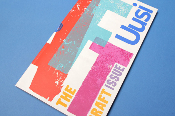
For a large proportion of 2011 and the beginning of this year, we were working with Nokia’s Head of Art Direction Richard Crabb and DesignStudio on Uusi magazine. It’s a quarterly brand publication that goes to Nokia internal marketing types and external agencies to keep them up to speed with all the creative work that’s going on in different parts of the world… and to get them fired up.

Kitching cabinet... cover art by the master of letterpress
In an odd way, it’s been like going back to our roots working on design publications — only Uusi is more creatively ‘out there’ than most regular industry mags. DesignStudio’s background is more branding than editorial, so their take on magazine design is pretty expressive and experimental, all held together by a modernist, grid-based aesthetic.
Mind your own biscuit... retrotastic packaging from Crabtree & Evelyn
Better late than never. Here's a project that I worked on with the wonderful Kate Shaw, Global Creative Director at Crabtree & Evelyn quite a few months ago. The words I contributed are pretty minimal, but I love the mad abandon of the packaging. Those flying Highland cattle on the shortbread pack in particular. The design was by Smith & Milton, but if the imagery looks familiar, that's because it had been used before back in the 1980s. This was C&E reestablishing its heritage by delving into its rich visual archive.
Another Royal Mail commission for Jim, this one a stamp presentation pack marking the issue of definitive stamps for the London Olympic and Paralympic Games in 2012.

Jim’s pack commentary considers the Games’ broad visual identity and how this reflects its ambitions for inclusivity and legacy. It explores the background and varied application of the much-debated Wolff-Olins designed emblem. It looks back to the circumstances and high points of previous London Olympics. And it picks out classic logos from the past — including every graphic designer’s choice, Otl Aicher’s black-and-white crown of rays for the Munich Olympics of 1972.

The pack was designed by Dana Robertson of Neon Creative, our first collaboration with the former Partners CD. The Olympic and Paralympic definitive stamps will be available from January until the end of the Games in July. And you can buy a copy of the presentation pack here.
Back in October, totalcontent helped Nokia Design with the words for an absorbing exhibition called ‘People Made — Nokia Products that Changed the World’. It was held at the Design Museum in Shad Thames, London, and will form the basis for a larger event in Helsinki as part of the city’s World Design Capital celebrations in 2012.

As well as the catalogue, invite and posters, we wrote all the explanatory texts that appeared alongside the exhibits. These included large illuminated panels describing Nokia’s most iconic, breakthrough phones, and explaining why they made such a huge impact at the time of their release. We had to keep things suitably short and entertaining, but at the same time pin-point why and how these products were technologically significant. Our text also explored the four main themes of the show: mobility, patterns, sustainability, and craft.

This is the latest in a series of wonderfully simulating projects for Nokia we’ve helped with over the past few years. Most are covered by NDAs, so we can’t talk about them, but we’re hoping that one or two more will emerge from the woodwork soon.

For the second year on the trot, Jim has written the Royal Mail Year Pack. In case you didn’t know, this is the sprightly baby brother of the Royal Mail Year Book, and tells the stories behind the stamps in super-condensed form (click on the image for a closer look). For 2011, the typically eclectic subject matter included Gerry Anderson’s supermarionation series, William Morris, Musicals, Thomas the Tank Engine and the House of Hanover, all conveyed in a 100 or so words. The Year Pack was designed by our old friends Why Not Associates, and you can get your hands on a copy, which includes all the year’s stamps, here.

Jim also conjured up the introduction and design stories for the more substantial Year Book, designed with some aplomb by the super-talented Magpie Studio. He’d previously authored six entire Year Books, but this year Royal Mail decided to invite eminent subject experts to contribute individual chapters. Year Books are available from Royal Mail’s website.
A recent poster we worked on for GAP through ycn passed the ultimate test and now hangs proudly on our studio wall. It was a lovely customer giveaway marking a hugely ambitious 3D paper installation in GAP’s Milan superstore, created specially for Milan Furniture Week, which you can read all about here.

totalcontent
 were asked to come up with no more than 50 words to express the sights, sounds and smells of city life. These were then beautifully hand-lettered and illustrated by Jamie Brown, and sit on one side of a poster explaining the genesis and development of the paper sculpture project.

It’s our second collaboration with ycn, whose quirkiness, imaginative flair and tireless championing of illustration we love.
Millington Associates are designer/makers for retail environments. Based in south London, they create spectacular window displays and retail interiors for big brands — everyone from Nike and De Beers to Next and Diesel. Multi-skilled and multi talented, MA’s work is dramatic, ambitious and witty, needing to grab people’s attention as they walk down the street.

We were asked by Thoughtomatic, MA’s branding agency, to write the copy for their rather stylish website. This included coming up with the strapline ‘Imagination made real’, and as many words with MA in them as possible. To take a quick peek at what we came up with, just follow this link.
In November last year I got a call from Ben Casey at The Chase asking if I’d help out with some posters they were putting together for the photographer Paul Thompson.


The idea was brilliantly simple. Pick a photo from Paul’s online portfolio and write 1000 words inspired by it. Anything that took my fancy. These 1000 words would then be used on promotional posters, postcards and T-shirts with a sign-off line pertaining to the old ‘picture paints a 1000 words’ chestnut. Friend and fellow writer Nick Asbury, as well as Ben and Lionel Hatch from the Chase would be writing 1000 words too.


Choosing was the hard part. Paul’s website was packed with intriguing stuff — slightly odd looking portraits of people who’s heads and bodies didn’t seem to match; eerie landscapes; curious moments captured in time. His work has a sense of the surreal, as if something’s not quite as it should be.

I eventually plumped for an image of a slightly forlorn-looking park bench. There were no people around, and it looked like a perfectly grey, hum-drum day. There was something remarkable in the ordinariness of the shot.


It struck me that this park bench must have witnessed all kinds of things, if only it could articulate them. So I gave it a slightly curmudgeonly voice and set about telling a kind of first-person day in the life, which gradually spirals out of control.

The Chase then set the words beautifully to the shape of the picture. The results not only look rather fine, but gently subvert the idea of a photographer’s mailer. They work just as a grey block of text, or if you go in and actually read the pieces, which are remarkably different from each other. It was a great brief, and I’m really chuffed to have been involved in a project like this. And I’m pleased to say the project was picked up by the Creative Review blog too.

You can read my 1000 words by clicking on the image below.

It’s certainly not the most complex project we’ve been involved in. Even so, there’s a beautiful simplicity about the new Viaduct website. Which is fitting, as Viaduct supplies elegant, often minimalist, European furniture to a discerning clientele of architects, interior designers and design-savvy punters.

Owner and main man James Mair was adamant that people don’t want to trawl through a lot of copy, before getting to grips with the product. Nevertheless, he wanted the words to set the scene and subtly convey the Viaduct personality.

As usual, James and his colleagues were a pleasure to work with... we’d previously provided the text for a Made Thought-designed brochure, which Viaduct is still using after ten years. A timeless classic, you might say — like a piece of furniture you might find in the Viaduct showroom.

www.viaduct.co.uk
Our work with Chadwick Nott, the UK’s largest legal recruitment consultancy, has been featured in the news pages of Design Week. totalcontent were brought in by branding consultancy Deep to develop an intelligent-yet-accessible tone of voice to complement their rebrand work, and help set the ambitious agency apart from the competition. 

The guiding principle for all the work was to see things from candidates’ and clients’ perspectives, rather than trot out empty about claims about past achievements. And the tone needed to be sharp, well-informed and occasionally entertaining — appealing to an audience of lawyers. 

We created language guidelines, example headlines and copy, and and are currently editing Chadwick Nott’s rather extensive website.

new work – Lettuce.

Fashion label Lettuce relaunches at the Pure fashion trade show at Olympia this weekend, with a head-to-toe rebrand masterminded by Form Design & Art Direction. A young, happening Australian brand, Lettuce specialises in funky women’s scarves, which they position as year-round accessories rather than winter neck-warmers. 

totalcontent helped in establishing a suitably fresh and appealing tone of voice, coming up with the strapline ‘Your Scarf. Your Scene’, as well as mood copy describing the brand’s various collections, which provided the basis for the 2011 catalogue (shown left). You can read some of our longer copy on the Lettuce interim website here. 

It’s our first very collaboration with the highly talented Paul and Paula at Form, an outfit we’ve admired for some time.
Another interesting job with Cubic, this time for lighting manufacturers Abacus. We were asked to provide copy for six product-specific ads and a brochure, showcasing the company’s new range of energy-efficient LED luminaires (as we quickly learned to call them). To be honest, the copy needed to be fairly straightforward and to do a job, succinctly explaining different designs, functions and uses. The real creativity was in the concept and the photography, which took the lighting out of its usual urban environment and placed it in striking natural settings in the Peak District. Creating an arresting, slightly surreal ambience, the imagery emphasised the natural forms and structures of the luminaires, while suggesting a raw, elemental power.
totalcontent thoroughly enjoyed its first experience working with London design agency Felt. The task was to launch Bee Me, a new frozen yogurt/smoothie franchise, which opened it’s first outlet in Portobello Road a couple of weeks ago. 

Creating the tone of voice for a start-up, particularly one that treads ever-so-slightly on the toes of one of the most celebrated brands of recent years was demanding, but we hope that our efforts measured up. It also quickly transpired that every name you could possibly think of for a berry or mango drink was already taken, so we had to rustle up fresh ways of approaching the menu naming. We were quite chuffed with ‘Bumble Berry’ and ‘Get Up and Glow’, as well as the overall strapline we came up with, ‘an appetite for living’.

Apart from that, we worked on a series of articulations, which put across the brand’s healthy credentials and the idea that it’s important to find a bit of time for yourself. The work was picked up by Design Week and featured alongside a piece on Design Studio, who we’re also currently collaborating with.
In our time we’ve written dozens of mission statements, ‘about us’ sections, and promo materials for design companies. There’s no getting away from it, these are tricky beasts. Branding specialists spend so much time defining, positioning and articulating other folk, that more often than not they neglect themselves. While some have a very strong idea of who they are and what they stand for, others need to have something thrust in front of their noses before deciding perhaps that’s not really them. 

Either way, there tends to be a lot of self-analysis, head scratching and soul searching involved. And invariably plenty of drafts after every last person in the company has had their say. One particular consultancy who commissioned us took six months to agree a single (short) paragraph. There were ten rewrites. In the end they felt it lacked bite, but they were prepared to live with it. 

Clearly, it doesn’t have to be like that. Working with Nottingham-based Cubic went like a breeze. They wanted a series of three books – the first one a teaser, followed by two chunkier volumes. They encouraged Jim to develop his own tone and never took themselves too seriously. They created their own charming illustrations to support the writing. And for a short-but-sweet overview piece, the results are – we think – really lively and have plenty of bite. 

So thanks Cubic for asking us to help out… and being prepared to stick their necks out a bit. Oh, and you can download the whole book here if you're so inclined.
Jim has been working with The Liquid Way on a series of six press ads for G-Tech hard drives. They’re a line of tough, good-looking, Mac-friendly drives aimed fairly and squarely at the creative community – photographers, musicians, filmmakers, designers, animators – so-called ‘prosumers’. 

Each ad features a different creative type, telling their story and how various G-Tech drives have become central to the way they work, keeping their precious moments of inspiration safe, backed-up and accessible. Space was tight, so the knack was to get their character and working processes across as economically as possible. The first (pictured) stars the highly rated conceptual photographer Tim Flach, who specialises in fine art portraits of horses, and goes to the ends of the Earth to find them.
It’s finally out. The mighty, 64-page 2009 Royal Mail Yearbook represents around four months of Jim’s working life across this year and last – and goes some way to account for the recent dearth of entries on this section of the website.

But flicking through page after handsome page, the effort seems more than worthwhile. This year’s 14 stamp issues included British Design Classics, Mythical Creatures, Naval Uniforms and the Industrial Revolution, and the Yearbook delves into many of their more interesting nooks and crannies. We came up with the title ‘Feed Your Mind – A Great British Miscellany’ because of the bite-size editorial style, which cherry picks obscure facts and stories to bring each subject to life. It also fits in with the slightly unsettling custom-made phrenology head on the front and back covers.  

The designers, hat-trick, have done a grand job… they went for a ‘more is more’ approach, scatter-gunning many smaller subjects around a central theme and packing each spread with visual interest and graphic wit. The result is busy and intriguing, a dippable smorgasbord of a book rather than a meaty read.

The results speak for themselves, but the ambitious approach made for a research-intensive project, with Jim needing to get to grips with from everything from the rules of jousting, to the myth of the Giant’s Causeway, to the most people to fit into a phone box, to the Burns poem Tam O’Shanter. And plenty more besides. We’ll be posting more spreads and details when we get them.

This is Jim’s fifth Royal Mail Yearbook, and he’s just been commissioned to write his sixth for next year. Hat-trick will be designing again. You can get hold of your very own copy here.