Stone Foundation have been plying their tight Mod/Soul sound around the Midlands for around 10 years now, building a loyal following. And they may well be about to move up to the next level, with a confirmed date at Wayne Hemingway’s Vintage Festival next week and a coveted support slot on the upcoming Specials tour.

Joe ‘Pep’ Harris: who are these guys?


But last Friday night at Cox’s Yard in Stratford was all about Joe ‘Pep’ Harris, flown in from Detroit to front the band for a mind-blowing set of soul standards and floor stompers. Stone Foundation — supporting themselves, so to speak — warmed the place up nicely, but when Joe sauntered on in his immaculate, all-white safari suit, the temperature soared.

Even at 70, there’s an extraordinary raw power to his voice. From the moment he hit the first notes of ‘Papa Was a Rolling Stone’ (which he’d cut with the Undisputed Truth before the Temptations), you knew you were in for a rare treat. Looking slightly constrained on a tiny stage, Joe effortlessly moved from sweet-sweet soul to deep-down funk, clearly impressing the band as much as the audience. Highlights were the dramatic ‘Smiling Faces Sometimes’ and the full-on ‘Hole in the Wall’.

The Undisputed Truth: I’ll have to wear a bit of make-up, you say? 


A bit of background on the mighty Joe… after singing with The Preps and The Ohio Players in the 1960s, he moved to Motown to become the voice of the Undisputed Truth in the 1970s. This was producer/songwriter Norman Whitfield’s so-called ‘psychedelic soul’ experiment, which lasted eight years and 10 albums.

Catch him while you can, he’s a true talent.

In his first post-Design Week Private View, Jim Davies considers his relationship with Amsterdam, and how this squares with the Dutch perspective on design.

I’m always threatening to spend time in some of the great European cities — Florence, Barcelona, Berlin, Vienna. But somehow, when it comes round to it, I end up back in Amsterdam.

I’ve never actually lived in Holland, but because I’m half Dutch, I’ve visited the country virtually every year since I was born. The canals and bikes, the cobbled streets and low skyline, the cadence of the language, are both familiar and exhilarating. And of course I drool over the vernacular graphics, the street posters, local packaging and shop signage. Around every corner there’s déjà vu, I hear echoes of my childhood, remember my mother, feel a real or imagined connection with my forbears. Even in doing the most mundane things, have an almost spiritual experience.

Bridging the gap: View from our hotel window, The Toren on Prinsengracht


To me, that’s something deeper and more precious than traipsing round the most wonderful cathedral or art gallery in one of the more rarefied European capitals. And because I now know the place reasonably well, I’ve moved beyond the obvious — the Museumplein, canal boat cruises, Anne Frank etc — and have started to explore the next layer down, revelling in the quirkiness of the place, embracing its peccadillos and peculiarities, coming to understand why it is what it is.

Hello boys: The peccadillos and peculiarities of Amsterdam windows


It struck me that my evolving relationship with Amsterdam has similarities to the way the Dutch view and explain design.

Design is such a nebulous term, it can mean virtually anything we want it to. The word can be used in relation to a CD cover or an Airbus, a city signage system or a chair. Ask a hundred people to define it, and you’ll dredge up a hundred and one different answers. The extra one being from the person who couldn’t quite make his mind up.

For most non-practitioners however, design implies a surface sheen or prettification — anything from the cod-Georgian flounce Lawrence Llewelyn Bowen might dream up for one of those tiresome home décor TV shows, to the garish colourways on the latest pair of Nikes.

In Holland — perhaps to counteract this one-dimensional response — they have settled on two words for design (three if you include the English word, which is also in common usage.) The first is vormgeving, which literally means ‘to give form’, and refers to the more aesthetic side of design — making things pleasing to the eye and desirable. The other is ontwerpe, which is more about function and making things work properly — the less glamorous but essential nuts-and-bolts aspect of design.

It’s not exactly form and function, but not far off. Dutch designers who want to be taken seriously (and most do) tend to align themselves with the ontwerpe camp, even if they’re involved in primarily visual disciplines like graphics or packaging. Vormgeving tends to be looked down upon as vapid and superficial — a distantly related dumb blonde no one wants to be associated with.

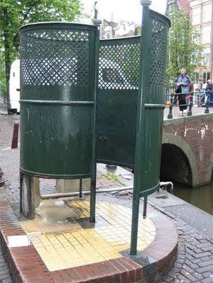
Urinal or mine? Functional, down-to-earth design


This attitude is culturally typical. From the outside, the Dutch may appear to be laid back and easy going. But actually, they are quite angst-ridden and deep. They agonise over the smallest details and take themselves surprisingly seriously. Unlike the British, who tend to skirt around difficult issues like Darcy and Elizabeth Bennett at a formal dance, the Dutch are far more direct and always prepared to ask frank, probing questions. Which is probably why the more down-to-earth ontwerpe has so much more kudos than the flaky vormgeving in Holland.

As for me, I sheepishly admit to liking a bit of both… I’m only half Dutch after all.

Like many, I was first shocked and then saddened by the news that Design Week (or at least the good old paper version) ceased publishing last week. I’d literally just stepped off the plane from a wicked weekend in Amsterdam, switched my mobile back on, and there was a message from editor Lynda Relph Knight saying she wouldn’t be needing my column this month. Or evermore, for that matter.

Volume 26/Number 26 – the final issue of DW


Deborah remarked that I looked as though someone had died when I picked up the message. Wan and somewhat perturbed. And in a way, that’s the case. There’s no argument that the magazine had been an integral part of the UK design landscape for the past quarter of a century. The only weekly design publication in the world, it had seen off plenty more pretentious pretenders, including my own monthly ‘alma maga’, Direction.

My first thoughts, of course, are with Lynda, who has tirelessly steered the good ship DW for over 20 years, and been instrumental in creating a lively, coherent design community in this country. She’s also been a great friend and supporter of mine, ever since I met her at an IBM press junket in Berlin ten years ago, when I was writing about design for the Daily Telegraph.

And for the past eight years, Design Week had become a regular part of my life too, as I scratched my head to come up with a suitably catchy or contentious Private View column each month. I was just two shy of my 100th effort, which would have been a satisfying personal milestone — but overall, I just feel lucky to have had such a good run.

My 98th and – though I didn’t realise it at the time – last column (online version)


I’d always tried to keep my Private Views slightly tongue in cheek, to poke some affectionate fun at the penchants and peccadillos of designers, to use my daily contact with the species to feed various gently amusing insights and observations. Over the years, I’d publicly chewed over traffic and toilet design, colour and crowdsourcing, mergers and modernism. I hope I raised a smile and occasionally touched on some home truths.

The PV subjects that really raised the temperature of the letters’ page, however, were the ones on free pitching, the lack of women in design, and perhaps less obviously, my rant against e-Christmas cards two years ago, which prompted one outraged reader to denounce my “archaic way of thinking”.

Perhaps he was right. Digital Christmas cards, digital magazines… maybe those Scandinavian pine forests have a right to rest easy. But of course Centaur’s decision to close Design Week doesn’t have a lot to do with embracing new media or a green agenda. It’s all about the commercial imperative.

The magazine was becoming more emaciated by the week. Without feature advertising, there were fewer features. And those that did appear were crammed on to a page or a spread at best. Even within the framework of Sam Freeman’s excellent redesign, it was impossible to give the work the space it deserved, especially compared to the lush ten-pagers in Eye magazine. So the balance tipped far more towards news, opinion and comment. Which, you could argue, is more suited to the immediacy of an online publication. That’s certainly the line Centaur are taking.

Almost by second nature, this blog post is running to 580 words, the length of a Private View column. I’ve decided to keep writing them. If anyone wants to publish them, great. If not, they’ll be appearing here, on the third Thursday of each month as usual.

I’ll miss you Design Week.