Showing posts with label Holland. Show all posts
How does it eel?... smoker at work
totalcontent is just back from its annual away-weekend in Holland. This time we took in the Stanley Kubrick show at Eye, the impressive new film museum on the north bank of the Ij, as well as a noteworthy North Sea Jazz Festival in Rotterdam.

But it was one of those chance, totally bizarre encounters that lingers in the memory. Or should that be nostrils? On the Sunday between showers, we decided to take a stroll through Monnickendam, one of a series of picturesque medieval villages perched on the banks of the Ijsselmeer.

Apart from its less-than-charitable attitude towards witches in the olden days, Monnickendam is best known for its ancient tradition of fish smoking. And this happened to be the day of the annual smoke off, when over 100 competitors from the Amsterdam area converged to see who could smoke the tastiest eel (paling) or mackerel.
As Englebert Humperdink gets cosy with the throat gargle on the eve of tomorrow’s Eurovision Song Contest, I thought I’d take a quick delve into the Netherlands’ fortunes over the years.

Like the UK, the Dutch glory days were the 1970s, notably when Teach-In scooped the top prize in 1975 with the quintessential Eurovision ditty ‘Ding-A-Dong’, and various other patriotic crooners snaffled second and third places. There have been another three Dutch winners all told, but you have to go right back to the 1950s and 1960s to sniff those out.

Some of the more curious names to represent the Netherlands include Frizzle Sizzle (1986), Mrs Einstein (1997), Mouth & MacNeal (1974), Hind (2008) and the curiously British-sounding Humphrey Campbell (1992). In latter years entries have tended to be sung in English, though personally I feel ‘Een speeldoos’ (‘A Musical’), ‘De mallemolen’ (‘The Whirligig’) and ‘Blijf zoals je bent’ (‘Stay As You Are’) have a certain authentic ring to them.

However, Teach-In’s strategy of using catchy but meaningless words clearly doesn’t always pay off… in 1967, Thérèse Steinmetz came last and managed only two points with ‘Ring-dinge-ding’.

The 2012 entry ‘You and Me’ by Joan Franka didn’t make the cut, which means the Netherlands have failed to make the Saturday night final for eight years on the trot. Still, so long as the boys in orange make it to the other Euro final, who cares?

In his first post-Design Week Private View, Jim Davies considers his relationship with Amsterdam, and how this squares with the Dutch perspective on design.

I’m always threatening to spend time in some of the great European cities — Florence, Barcelona, Berlin, Vienna. But somehow, when it comes round to it, I end up back in Amsterdam.

I’ve never actually lived in Holland, but because I’m half Dutch, I’ve visited the country virtually every year since I was born. The canals and bikes, the cobbled streets and low skyline, the cadence of the language, are both familiar and exhilarating. And of course I drool over the vernacular graphics, the street posters, local packaging and shop signage. Around every corner there’s déjà vu, I hear echoes of my childhood, remember my mother, feel a real or imagined connection with my forbears. Even in doing the most mundane things, have an almost spiritual experience.

Bridging the gap: View from our hotel window, The Toren on Prinsengracht


To me, that’s something deeper and more precious than traipsing round the most wonderful cathedral or art gallery in one of the more rarefied European capitals. And because I now know the place reasonably well, I’ve moved beyond the obvious — the Museumplein, canal boat cruises, Anne Frank etc — and have started to explore the next layer down, revelling in the quirkiness of the place, embracing its peccadillos and peculiarities, coming to understand why it is what it is.

Hello boys: The peccadillos and peculiarities of Amsterdam windows


It struck me that my evolving relationship with Amsterdam has similarities to the way the Dutch view and explain design.

Design is such a nebulous term, it can mean virtually anything we want it to. The word can be used in relation to a CD cover or an Airbus, a city signage system or a chair. Ask a hundred people to define it, and you’ll dredge up a hundred and one different answers. The extra one being from the person who couldn’t quite make his mind up.

For most non-practitioners however, design implies a surface sheen or prettification — anything from the cod-Georgian flounce Lawrence Llewelyn Bowen might dream up for one of those tiresome home décor TV shows, to the garish colourways on the latest pair of Nikes.

In Holland — perhaps to counteract this one-dimensional response — they have settled on two words for design (three if you include the English word, which is also in common usage.) The first is vormgeving, which literally means ‘to give form’, and refers to the more aesthetic side of design — making things pleasing to the eye and desirable. The other is ontwerpe, which is more about function and making things work properly — the less glamorous but essential nuts-and-bolts aspect of design.

It’s not exactly form and function, but not far off. Dutch designers who want to be taken seriously (and most do) tend to align themselves with the ontwerpe camp, even if they’re involved in primarily visual disciplines like graphics or packaging. Vormgeving tends to be looked down upon as vapid and superficial — a distantly related dumb blonde no one wants to be associated with.
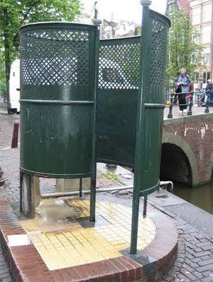
Urinal or mine? Functional, down-to-earth design


This attitude is culturally typical. From the outside, the Dutch may appear to be laid back and easy going. But actually, they are quite angst-ridden and deep. They agonise over the smallest details and take themselves surprisingly seriously. Unlike the British, who tend to skirt around difficult issues like Darcy and Elizabeth Bennett at a formal dance, the Dutch are far more direct and always prepared to ask frank, probing questions. Which is probably why the more down-to-earth ontwerpe has so much more kudos than the flaky vormgeving in Holland.

As for me, I sheepishly admit to liking a bit of both… I’m only half Dutch after all.
Arjen Robben, who Van de Vaart in Heaven

Oranje be thy name.

Heitinga come, and Nigel De Jong,

On Dirk and Giovanni build the eleven.

Give us this Allefay our Boulahrouz,

And Sneijder’s stupendous passes,

As Stekelenburg halts those who try pass against us.

And lead van Bommel not into temper tantrums;

But deliver us from egos.

For thine is Elia, Van Persie and Huntelaar,

Total football forever.

Amstel.


(With apologies to Nick Asbury)
Sometimes I feel as though there’s an invisible thread linking everything I write. It’s like one extremely long article reaching onwards and outwards to some wordy horizon. Seemingly disparate projects seem to piggy back each other quite naturally, and there are overlaps and connections where you wouldn’t necessarily expect them.

Work spills surprisingly over into life too, like it did recently when Deb and I made our annual pilgrimage to Amsterdam a few weeks ago. I’m not generally in the habit of visiting churches, but we had ten minutes to spare and were in the neighbourhood, so we slipped into the 17th-century Westerkerk. It boasts the tallest tower in the city and Rembrandt is said to be buried there, although no one’s actually found the great man’s grave. I’d just been researching stained glass windows for the forthcoming Royal Mail Yearbook, and writing in glowing terms about the ethereal atmosphere they create. The thing about the Westerkerk though is that there’s no stained glass at all, just these massive domed windows that let in incredible light, even on the dullest day. You’d expect this no-frills approach in a country where the ‘low church’ predominates, but it struck me that natural light is a far more powerful metaphor for God than man-made imagery, no matter how beautiful. Even as an unbeliever, I was impressed.