More years ago than I care to remember, I was between jobs and — through a friend of a friend — ended up working a few weeks on that most eminent publication ‘A Taste of Safeway’ magazine. This, I can assure you, was purely a temporary wolf-from-door measure.

The gig’s highlight was probably interviewing professional Scouser and sexpert Margi Clarke about what she had stashed in her fridge (pasta ready meals, Cadbury’s Creme Eggs and a bottle of Jacob’s Crack [sic], for the record). She may have thought I was “dead posh”, but we got on pretty well, particularly after I mentioned I was a great admirer of her husband, punk artist Jamie Reid.

However, this was also around the time ‘A Taste of Safeway’ was putting its Christmas issue to bed, and I was also roped in to doing a spot of (free) modelling, playing the part of a busy dad, getting some shopping together for his family.

Imagine my stinging embarrassment a couple of months later when I was at an über-cool design agency touting for some copywriting work. Right there on one of the Vitra desks was said publication, open on the offending spread showing me laden down with seemingly half a Safeway store, a colander and a teddy bear. Hold that pose and smile please.

By way of explanation, this is part of Nick Asbury’s Creative Amnesty for Creative Review — jobs/projects you’d rather not own up to.
Parp, parp. I’m the kind of person who just about knows one end of a car from the other. You certainly wouldn’t catch me waxing lyrical about alloy wheels or torque. Or watching Top Gear.


That’s why I’d given the Heritage Motor Centre at Gaydon a wide berth, despite it being a mere 10-minute ride from the totalcontent studio. However, they’d recently laid on a one-off exhibition called ‘Science Fiction at the Movies’, which promised plenty of Star Wars and Dr Who relics — the kind of thing my boys are deeply into. And we had friends coming for the weekend, so it seemed an ideal opportunity to check the place out.


Parked in the middle of a former RAF base, in the middle of nowhere, the imposing circular building looks like a covert high-security government headquarters. You might expect to find all kinds of Roswell-like experiments going on in there, but actually it’s packed with over 200 significant British cars — from decidedly the humble, to land-speed record breakers and James Bond stalwarts. But it’s not at all fetishistic or petrol-heady. In fact, the place offers more of a social and cultural history, the outer perimeter representing a road travelling through time, with the earliest cars at one end, gradually making way for more contemporary fare.


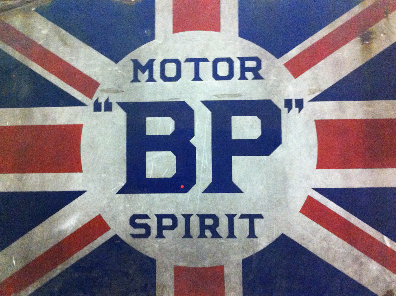
For me — apart from the astonishing FAB 1, Lady Penelope’s pearly-pink wheels from the 2004 live-action Thunderbird’s movie — the great revelation was the trove of retro type and ephemera. The place was chock full of posters, ads, signage, logos and hand-rendered typography. I found myself slavishly photographing walls, grilles and odd bits of lettering, and reminding myself not to be so closed-minded in future. Particularly loved a poster for Dunhills’ Bobby Finders, glasses-cum-binoculars which promised to “spot a policeman at half a mile even if disguised as a respectable man”.


Cars, whether we like it or not, are a telling symbol of progress and popular culture. With headlights on full beam, Gaydon took us on a nostalgic and occasionally quirky tour of Britishness through the ages. I’ll be jumping into my car with a better camera for a return visit soon.

A recent poster we worked on for GAP through ycn passed the ultimate test and now hangs proudly on our studio wall. It was a lovely customer giveaway marking a hugely ambitious 3D paper installation in GAP’s Milan superstore, created specially for Milan Furniture Week, which you can read all about here.

totalcontent
 were asked to come up with no more than 50 words to express the sights, sounds and smells of city life. These were then beautifully hand-lettered and illustrated by Jamie Brown, and sit on one side of a poster explaining the genesis and development of the paper sculpture project.

It’s our second collaboration with ycn, whose quirkiness, imaginative flair and tireless championing of illustration we love.
I know, I know… recommending a dictionary probably makes me sound like Lynne Truss’s long-lost half-brother. But, apart from being written in a refreshingly easy-going, contemporary style, a small but genius touch that won me over to the 11th edition of Chambers, published in 2008. The title page for each new letter is set in a different and appropriate typeface – Baskerville for B, Futura for F, Novarese for N, and so on. They give you the full alphabet, plus designer, date and country of origin. A simple, but great idea. 


Chambers Harrap
£21.25 on Amazon
Millington Associates are designer/makers for retail environments. Based in south London, they create spectacular window displays and retail interiors for big brands — everyone from Nike and De Beers to Next and Diesel. Multi-skilled and multi talented, MA’s work is dramatic, ambitious and witty, needing to grab people’s attention as they walk down the street.

We were asked by Thoughtomatic, MA’s branding agency, to write the copy for their rather stylish website. This included coming up with the strapline ‘Imagination made real’, and as many words with MA in them as possible. To take a quick peek at what we came up with, just follow this link.
In November last year I got a call from Ben Casey at The Chase asking if I’d help out with some posters they were putting together for the photographer Paul Thompson.


The idea was brilliantly simple. Pick a photo from Paul’s online portfolio and write 1000 words inspired by it. Anything that took my fancy. These 1000 words would then be used on promotional posters, postcards and T-shirts with a sign-off line pertaining to the old ‘picture paints a 1000 words’ chestnut. Friend and fellow writer Nick Asbury, as well as Ben and Lionel Hatch from the Chase would be writing 1000 words too.


Choosing was the hard part. Paul’s website was packed with intriguing stuff — slightly odd looking portraits of people who’s heads and bodies didn’t seem to match; eerie landscapes; curious moments captured in time. His work has a sense of the surreal, as if something’s not quite as it should be.

I eventually plumped for an image of a slightly forlorn-looking park bench. There were no people around, and it looked like a perfectly grey, hum-drum day. There was something remarkable in the ordinariness of the shot.


It struck me that this park bench must have witnessed all kinds of things, if only it could articulate them. So I gave it a slightly curmudgeonly voice and set about telling a kind of first-person day in the life, which gradually spirals out of control.

The Chase then set the words beautifully to the shape of the picture. The results not only look rather fine, but gently subvert the idea of a photographer’s mailer. They work just as a grey block of text, or if you go in and actually read the pieces, which are remarkably different from each other. It was a great brief, and I’m really chuffed to have been involved in a project like this. And I’m pleased to say the project was picked up by the Creative Review blog too.

You can read my 1000 words by clicking on the image below.

We thought we’d take this opportunity to show some spreads from the 2010 Royal Mail Yearbook — ‘The Big Picture’ — which came out back in November last year. First published in 1984, the Yearbook tells the back stories of the year’s pictorial stamps, and is always impeccably printed and produced. This edition is a beautifully considered piece of editorial design by hat-trick, which uses extreme close-up photography to reveal the unexpected about subject in hand. John Ross took the striking shots which open each section.


I wrote two essays for each chapter — one an introductory overview, to provide context and colour, the other a more focused, detailed piece which expands on illuminating particulars. So for the Classic Album Covers, there was a longer piece on Peter Saville and Factory Records; for Endangered Mammals chapter, a piece on Hedgehogs; for the House of Stuart chapter, a piece on the Restoration, and so on.


The way hat-trick handled the relationship between the slip case and the front cover was particularly interesting: the slipcase cover shows a close up of an elaborate R on a painted red post box, then when you pull out the book, there’s the same R sandblasted back to the metal. It’s a subtle visual metaphor to show the reader that all will be revealed inside. The endpapers print all the words in the book in miniature, playing on the juxtaposition of scale that continues throughout the pages. You can order your very own copy — which includes all the stamps issued in 2010 — here.


Super direct mail follow-up to White Stuff’s super-hero themed catalogue (see below). Cut to the shape of a pair of crime-bustin’, worn-over-the-tights Y-fronts, they’re promoting a forthcoming 20% off day. And if you can’t make it into your local store, you can claim your discount by entering ‘flash’ at the checkout — nice touch.

Have you noticed how the latest posts on this blog are all about old-skool pants and super-powers? Read into that what you will.
It’s certainly not the most complex project we’ve been involved in. Even so, there’s a beautiful simplicity about the new Viaduct website. Which is fitting, as Viaduct supplies elegant, often minimalist, European furniture to a discerning clientele of architects, interior designers and design-savvy punters.

Owner and main man James Mair was adamant that people don’t want to trawl through a lot of copy, before getting to grips with the product. Nevertheless, he wanted the words to set the scene and subtly convey the Viaduct personality.

As usual, James and his colleagues were a pleasure to work with... we’d previously provided the text for a Made Thought-designed brochure, which Viaduct is still using after ten years. A timeless classic, you might say — like a piece of furniture you might find in the Viaduct showroom.

www.viaduct.co.uk