New work. Book reviews. Ideas. Likes and gripes. The following blog is something of a random visual and written notebook brought to you by totalcontent. We’ll be covering a wide range of topics, from projects and prospects, to words and writing, to typography and technology, graphics and popular culture… and much more besides. Hope it tickles your fancy and feel free to have your say.
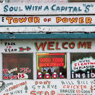
I’m always a sucker for a bit of ‘vernacular’ type. That is, street lettering that’s been hand-rendered by someone with little training, but a lot of enthusiasm. So this CD cover from Californian funksters Tower of Power immediately struck a chord. I’m still not sure how much of it has been ‘staged’ and is therefore an elaborate double bluff, but even so, this really is a case of so bad it’s good. (And I just love “T-bone 75c. With meat $5”).
Labels:
design,
music,
typography
Subscribe to:
Post Comments (Atom)

0 comments:
Post a Comment