Well, nothing was going to live up to last year’s Black Pencil at the D&AD Awards. But we were chuffed enough to have had another piece of work accepted into the 2009 annual in the Writing for Design section. 

 ‘The Yellow Book – A Prototype Wayfinding System for London’ was one of only 13 to make it into the hallowed pages this year, so that’s pretty good going. Particularly when you consider how many of the successful entries were self-promotional projects, where the writer had no client to answer to and could really cut loose (see totalblog for details). The Yellow Book, by contrast, had to satisfy four clients – Transport for London, the Mayor’s Office, the London Development Agency and ORB (Oxford Street, Regent Street & Bond Street Action Plan). Not to mention AIG, the information designers who developed the prototype and got Jim in to write the text. 

The Yellow Book’s accolade at D&AD follows a top prize for promotional brochures at the Design Week Awards. You can download a full pdf version of the Yellow Book and see what all the fuss was about here.
It was one of those surreal moments. This afternoon, there I was standing outside Marylebone station minding my own business, when I noticed a rather portly photographer giving it some ‘exude’. I couldn’t make out what he was shooting as the subject was hidden from my eye-line in an alcove. By the time he wrapped, I’d more or less lost interest and was looking the other way, as one by one, the New York Dolls shuffled straight past me and into M&S food hall. And the thing was, they really looked like dolls… they were tiny gnarled things, who seemed like miniature caricatures of themselves. Still, it was a thrill to be inches away from the seminal proto-punk crew, and I’m sure they too will be dining on the encounter for years to come.
The votes have been counted, the nominations and in-books have been revealed… so I can safely share some thoughts about judging Writing for Design without fear of vicious reprisals from the D&AD police. First of all, entries were up (though surprisingly there was not a single digital entry), and the overall standard was far superior to four years ago, the last time I donned the old horse-hair wig. We also had two quite brilliant, stand-out nominations in Nick Asbury’s Corpoetics booklet and the Christopher Doyle™ Identity Guidelines.

In Corpoetics, Nick takes boring ‘about us’ sections from web sites and mission statements and transforms them into poetry. He does this simply by changing the order of the words around, editing some and repeating others. The results are astonishing – telling, poignant, and amusing – and oddly, they often convey the spirit of the company better than the original.

Our foreman, Adrian Shaughnessy quite rightly asked the question ‘what’s the point of this, what’s it trying to say?’ To which I’d answer, it shows that there’s poetry hidden somewhere – in even the most mundane paragraph – if only you know how to find it. It’s also a wonderful calling card for Nick – without puffing out his chest and telling everyone how great he is, he’s demonstrated that he has a talent for an original idea and a great appreciation of words. Corpoetics really is one of those ‘wish I did that’ pieces.

Christopher Doyle™ Identity Guidelines is a beautifully observed, po-faced spoof of corporate guidelines. The eponymous hero of the piece is an Australian graphic designer, who stars on every page. The tone of voice is spot on, totally undercutting the language of the genre and the hackneyed notion that a brand is like a person. “This is a guide to how I should look, feel and sound as a person; a guide that should serve as an aid for myself and for those around me in ensuring my identity remains clear, consistent and correct.” My two favourite bits are a photo of Christopher packing some weight a few years ago captioned “My identity as it appeared between 2001and 2006 in Extra Bold”, and him sitting cross-legged on a chair captioned “Full Colour Seated_Casual”.

While I’m a huge fan of both these projects, my only slight niggle is that the only two nominations in the section went to self-initiated, self-promotional projects. (And there were others that made the book too like Mike Reed’s ‘And…’ and Radley Yeldar’s ‘The sad story’). You have to admire the initiative and effort involved in getting these pieces out there, but when there’s no client to answer to and no commercial imperative, such quietly subversive, lateral work is far more achievable.
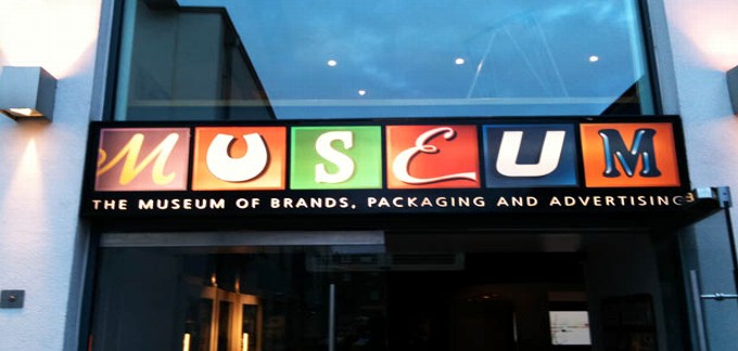
I was judging ‘Writing for Design’ at D&AD earlier in the week (more of that later when the results are made public). As part of the entertainment laid on the night before, us judgy-types were invited along to the Museum of Brands, Packaging and Advertising in Notting Hill. If you’re in the environs with a half hour to spare, and you’re in the mood for a whiff of nostalgia, it’s certainly worth a quick browse.

Tucked away in a corner mews, MoBPaA is home to a regiment of glass cabinets housing countless pieces of old packaging carefully arranged in date order. Being of a certain age, the 1970s and 1980s stuff had most resonance. I found it refreshingly direct, without the trills and swirls of the older stuff, or the show-off 3D rendering and glitzy metallic foils of today’s computer-fuelled graphics. The no-nonsense bright orange 70s Crunchie packaging with its punchy sans type was a particular favourite.

What was really curious, however, was seeing these everyday, disposable objects treated with such awe and reverence. We can’t deny that the Curly Wurly wrapper or Branston Pickle jar represents a small part of our heritage, but it’s only a small step away from regarding supermarkets as contemporary art galleries. That Andy Warhol was on to something.
Yesterday in the Swedenborg Hall, Holborn, a thorny debate raged long into the night. It was the latest 26 event ‘Words and Design – The Best of Enemies’, and around 80 people showed up to hear design luminaries Malcolm Garrett, Jonathan Barnbrook and Simon Esterson discuss how the visual and the verbal joust and jostle, and how they might become better friends in the future. The questions were ably put by Patrick Burgoyne, editor of Creative Review, and there was healthy contribution from the floor.

I’d organised the do, and roped my old mates into doing it. Considering the event was rather ‘organic’, and no-one quite knew what to expect, the conversation was remarkably free flowing, touching on everything from building closer relationships, to the old advertising model, to standards in education. Catching up informally at the Old Crown afterwards was a real pleasure too. Many thanks to everyone involved.

Big thumbs up (or should that be tick?) for big Mark Farrow’s latest collaboration with the Pet Shop Boys. Mark has been designing PSB’s sleeves for over 20 years to a consistently wonderful standard. His great talent is that he always knows when to stop. The irresistible cover artwork for ‘Yes’ reflects the pop sensibility of the new CD, and was influenced by the Gerhard Richter 4900 exhibition at the Serpentine Gallery, which featured panels of brightly coloured squares. The central tick image is made up of eleven differently coloured squares, one for each track on the album.

Now the burning question is, would this have been better without the title and artist top left, or would that just have been gratuitous?
John Simmons, fellow board director and founder of 26, has a new book out. It’s called ‘Twenty-six Ways of Looking at a BlackBerry: How to Let Writing Release the Creativity of Your Brand’, and explores different approaches to business writing.

Basically, John has taken a piece of generic corporate writing – the ‘base text’, and rewritten it in 26 different ways, each following a particular constraint. For example, as a fairy story; without using the letter ‘e’; written in the style of Dickens; as a letter to a friend; as a six word story; as a sonnet. It’s surprising just how revealing this exercise can be.

There’s also an engaging themed web site to promote the book, where John has asked 26 of the UK’s leading commercial writers to write in the tone of voice of a fruit. I chose banana, for its obvious comic potential, and created a laid back, West Indian tone of voice. You can see my efforts, and check out the other fruity offerings here.

marking a milestone.

Thursday was Podge, the annual lunch for movers and shakers of the design industry, organised by Phil Jones, the man with the fattest address book in London. But this was no ordinary Podge… the whole shebang had been put together to celebrate Lynda Relph-Knight’s 20 years at the helm of Design Week. Deep in the bowels of the Arts Club in Piccadilly, I was delighted to find myself on the top table, next to Sir John Sorrell and opposite one of my big heroes, Sir Peter Blake. And fittingly enough, the place had been decked out as a homage to Sgt Pepper, inspired by the line ‘It was twenty years ago today’.

As usual, Podge was a chance to catch up with friends old and new, to do a welcome spot of networking, and enjoy a couple of drinks in top company. For me the moment of the day was talking to Nick Bell, now visiting professor of graphic design at Royal College of Art, who reminded me of a comment I’d made in an article about him many years ago. “You said my sock drawer was probably immaculate… and the thing is, you were right.”

As a Design Week columnist, I’d been asked to write a small tribute to Lynda, which was printed on the Podge menu. Here’s what it said…

“Feisty, friendly, formidable… but enough about me. Over the past 20 years, Lynda has become part of our lives, supporting us (always), cajoling us (where necessary), telling it like it is. She’s never less than honest in her opinions, and has our best interests at heart, collectively and individually. What’s more, she’s a great friend and drinking companion. We’re all lucky to have Lynda around.”
I’ve been a long-time admirer of Howies – who tongue-in-cheekily style themselves ‘Cardigan Bay’s third-biggest clothing company’. They’re right-on without being preachy or self-righteous, trying to do the right thing as far as they can by providing organic, low-impact goods. As my bulging T-shirt drawer will attest, I’ve bought plenty of stuff from them – even when I haven’t particularly needed it – just to support what they’re doing. (I’m not quite sure whether this is acceptable or not).

Howies’ copywriting is always spot on too, particularly their emails and collectable quarterly catalogue. And they use every opportunity – from labels in jeans to blogs and booklets – to spread the word. The writing is never over-chummy, but has a simple, easy-going tone of voice, which is difficult to resist. A recent wheeze is the T-shirt of the week… a limited edition by an artist or illustrator available only for seven days, and hand printed in Howies’ customised shed in deepest West Wales. Thought-provoking, smile-inducing, and seriously good-looking, they’re a regular graphic treat.